Pointillism isn’t just an artistic style; it’s a sophisticated hack of the human visual system, creating colors that exist only in the viewer’s brain.
- The technique relies on the scientific limit of our eye’s “angular resolution,” forcing the brain to merge distinct color dots into new, luminous hues.
- The physical properties of the paint are critical; acrylics, with their high surface tension, are superior to oils for creating the crisp, individual dots this illusion requires.
Recommendation: When viewing a Pointillist work, consciously shift your distance. Observe the moment the dots disappear and the “emergent colors” ignite—you are witnessing a neurological event, not just looking at a painting.
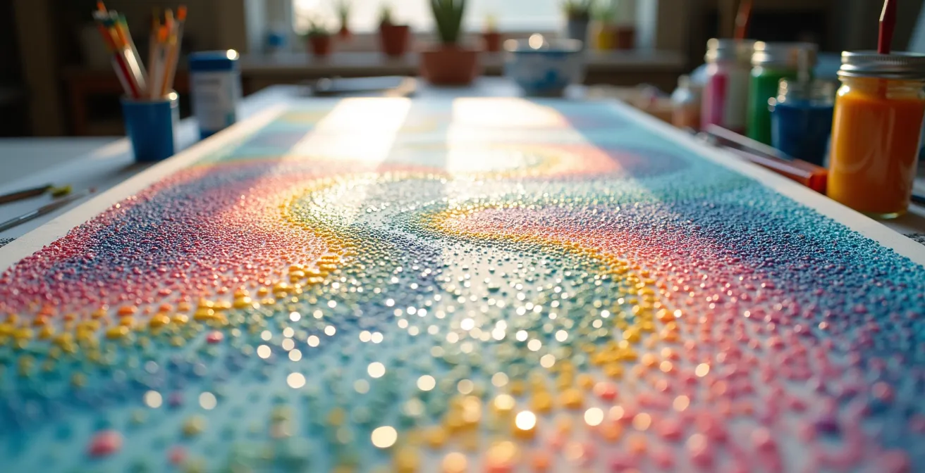
At first glance, a Pointillist painting seems almost magical. Step close, and you see a constellation of individual, unmixed dots of pure color. Step back, and a luminous, vibrant image emerges, shimmering with hues that seem far richer than any mixture on a palette. How can simple dots of yellow and blue create a green that feels more alive than pre-mixed green paint? This phenomenon is not magic, but a profound application of science. While many art guides discuss Pointillism and its more methodical cousin, Divisionism, as mere techniques, they often overlook the fundamental truth: these artists were not just painters, they were practical neuroscientists.
The common understanding is that “the eye mixes the colors.” This is a simplification that misses the beautiful complexity of the process. The real key is not in the eye itself, but in the brain’s visual cortex and the physical limitations of our perception. This article bypasses the simple “how-to” and delves into the scientific “why.” We will explore how Pointillism exploits the biology of our vision to generate “emergent colors”—hues that do not physically exist on the canvas but are constructed entirely within our minds. We will examine the physics of the paint itself, understanding why modern acrylics are uniquely suited to this task, and quantify the incredible human effort required to master this art form. This is the science behind the dots, revealing an art form that is a dialogue between pigment, light, and the very architecture of human perception.
For those who prefer a visual synthesis, the following video offers a compelling look into a modern artist’s process, showcasing the meticulous dot-by-dot creation that defines this art form.
To fully grasp this interplay of art and science, this article breaks down the core principles, from the mechanics of vision to the practicalities of creation and analysis. The following summary outlines the journey we will take into the heart of optical mixing.
Summary: Deconstructing the Optical Magic of Pointillism
- At What Distance Do the Dots Merge into a Single Image?
- How to Calculate the Price of a Painting That Took 500 Hours of Dotting?
- Hand-Painted Dots or Digital Pixels: Which Has More Soul?
- The Physical Cost: Why Pointillist Artists Produce Fewer Works per Year?
- Why Acrylic Dots Retain Their Shape Better Than Oil in Pointillism?
- How to Spot Sophisticated Color Palettes vs. Amateur Mixtures in 10 Seconds
- At What Distance Does Cross-Hatching Blend into a Solid Tone?
- Texture, Color, and Line: How to Analyze a Painting Like a Museum Curator?
At What Distance Do the Dots Merge into a Single Image?
The merging of dots into a coherent image is not an arbitrary effect; it’s governed by a precise biological limit of the human eye. This limit is known as angular resolution, which defines the smallest angle between two points that allows them to be perceived as distinct. For a person with 20/20 vision, this threshold is remarkably small. Scientific studies on vision confirm that the human eye’s angular resolution is approximately 1 arcminute. If two dots are closer together than this angular threshold from the viewer’s perspective, the brain’s visual cortex can no longer resolve them as separate entities. Instead, it averages their color and luminance information, creating a single, blended color.
Pointillist artists, particularly Georges Seurat, were intuitive masters of this principle. They understood that the perceived size of the dots—and the space between them—changes with viewing distance. A dot that is clearly visible up close will shrink below the 1-arcminute threshold as the viewer moves away, forcing the optical mixing effect to occur. The artist’s goal is to find the perfect dot size and spacing so that this blending happens at a specific, intended viewing distance, where the entire composition snaps into focus.
This led to a practical rule of thumb for displaying such works. Historical analysis of Seurat’s methods suggests a formula: three times the diagonal measurement is supposedly the correct viewing distance for a Pointillist painting. This isn’t an aesthetic preference; it is a calculated distance required for the neuro-perceptual illusion to function as the artist intended, turning a field of isolated points into a luminous, unified whole.
How to Calculate the Price of a Painting That Took 500 Hours of Dotting?
Valuing a work of Pointillism goes beyond its aesthetic appeal; it requires an understanding of the extraordinary labor invested. The technique is fundamentally inefficient, demanding immense time and concentration. Unlike a broad brushstroke that can cover a large area in seconds, each dot is a discrete, deliberate action. When you consider that a large-scale work can contain hundreds of thousands of dots, the true scale of the endeavor becomes clear. A prime example is Georges Seurat’s masterpiece, “A Sunday on La Grande Jatte.” It is documented that Seurat’s masterpiece required approximately 220,000 individual dots, a task that took him nearly two years of relentless work to complete.
This immense time investment forms the primary basis for calculating the price of a contemporary Pointillist work. However, time is not the only factor. A comprehensive valuation model must also account for technical complexity, material costs, and the artist’s reputation. The dot density per square inch, for instance, serves as a powerful multiplier for complexity; a work with dense, tiny dots is exponentially more difficult to execute than one with larger, sparser dots. The quality of materials, such as archival-grade canvas and lightfast pigments, also adds significant base cost.
Therefore, a fair valuation is not a simple hourly wage calculation. It is a multi-layered formula that respects the physical labor, technical mastery, and artistic vision embedded in the work. For artists and collectors, understanding these components is key to accurately assessing the value of a piece that measures its creation not in days, but in hundreds or even thousands of hours.
Action Plan: Valuing Time-Intensive Pointillist Artwork
- Calculate a base rate by multiplying the artist’s standard hourly rate by the total hours invested in the piece.
- Factor in dot density per square inch, applying a complexity multiplier for works with higher density and smaller dots.
- Add the total cost of materials, including high-quality acrylic paints, archival canvas, and any specialized tools.
- Incorporate a premium based on the artist’s reputation, exhibition history, and previous sales records.
- Assess the “optical durability” of the effect—how well the color blending maintains its integrity from various viewing angles and distances.
Hand-Painted Dots or Digital Pixels: Which Has More Soul?
In a world saturated with digital screens, the comparison between a hand-painted dot and a digital pixel is inevitable. Both are elemental units of color that combine to form an image. A digital screen uses a perfectly uniform grid of Red, Green, and Blue (RGB) pixels to create millions of colors through additive mixing. Pointillism uses a seemingly chaotic arrangement of physical pigment dots to create emergent colors through optical mixing. While the goal is similar, the perceptual experience is profoundly different. The perfection of the digital grid is clean and efficient, but it lacks the subtle signature of human creation.
The “soul” of a hand-painted dot lies in its imperfection. Each dot carries a unique signature: a slight variation in size, a subtle difference in pressure, a minute irregularity in shape. These tiny imperfections are evidence of the artist’s hand, a concept known as human agency. Our brains are exquisitely tuned to recognize these patterns. This connection is more than just philosophical; it’s neurological. As noted in research on neuro-aesthetics, the organic quality of handmade marks can trigger a deeper cognitive and emotional response.
The imperfect, organic pattern of hand-painted dots engages brain regions associated with recognizing human agency and even empathy (mirror neuron system), creating a deeper connection.
– Research on neuro-aesthetics and visual perception, scienceinschool.org
A digital pixel, by contrast, is anonymous and uniform. It conveys information with perfect fidelity but carries no trace of its origin. The hand-painted dot, with all its flaws, tells a story of human effort, intention, and fallibility. This is why a Pointillist painting can feel more “alive” than a high-resolution digital image of the same scene. We are not just seeing an image; we are subconsciously sensing the presence of another human being.
The Physical Cost: Why Pointillist Artists Produce Fewer Works per Year?
The methodical nature of Pointillism imposes a significant physical and temporal toll on the artist. This is a primary reason why true Pointillist masters are rare and their annual output is often remarkably low compared to artists working in more expressive styles. The process is a marathon of repetitive, high-precision movements that can lead to significant physical strain. Artists often spend hundreds of hours in a fixed posture, focusing intensely on a small area of the canvas, which can cause repetitive strain injuries in the wrist, neck, and back.
The time commitment is staggering, even for small-scale pieces. While a large painting’s two-year timeline is daunting, the effort required for more modest formats is just as revealing. It has been noted that even small-scale pointillist works demand extraordinary time, with a postcard-size pointillist drawing potentially requiring thousands of individual dots to achieve a solid field of color. This intense, dot-by-dot coverage is not just tedious; it’s a test of endurance that filters out all but the most dedicated practitioners. The sheer number of dots needed to fill a small area can be a shocking realization for anyone attempting the technique for the first time.
This physical and mental barrier is a core part of the Pointillist experience, as one artist’s testimony vividly illustrates:
As a teenager, inspired by Seurat, I decided to be a pointillist artist too. I was barely able to finish a postcard size drawing. I couldn’t believe how many small dots are needed to fill even a small blank area! I was almost traumatized by that experience!
– Artist’s experience with pointillism
This “trauma” is the gateway to understanding the art form’s rarity. The immense physical and temporal investment means that each finished piece represents a significant portion of an artist’s productive life. Consequently, they produce fewer works, making each one a more concentrated vessel of time, effort, and commitment.
Why Acrylic Dots Retain Their Shape Better Than Oil in Pointillism?
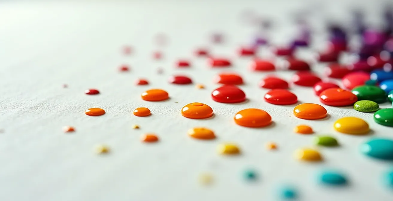
The choice of medium is critical in Pointillism, as the entire optical effect depends on the creation of clean, distinct dots of color. While the original Pointillists used oil paints, modern artists often prefer acrylics for a key scientific reason: its superior ability to hold a defined shape. This property is rooted in the fundamental physics and chemistry of the paint itself, a field known as paint rheology. Oil paint consists of pigment suspended in a drying oil, like linseed oil. It dries slowly through oxidation, a process that can cause the paint to level out and spread slightly, softening the edges of the dots and potentially muddying the optical effect.
Acrylic paint, on the other hand, is a polymer emulsion—acrylic polymer particles suspended in water. It dries by evaporation. As the water leaves the paint, the polymer particles draw closer together and fuse into a stable, flexible film. Crucially, research on paint rheology shows that acrylic paints maintain their three-dimensional dome shape due to the polymer emulsion’s high surface tension during water evaporation. This high surface tension pulls the paint inward as it dries, preventing it from slumping and allowing each dot to cure into a crisp, well-defined hemisphere.
This physical characteristic is a significant advantage for Pointillism. The raised, “domed” profile of each dried acrylic dot creates a distinct physical texture on the canvas. These tiny lenses catch the light individually, enhancing the separation between colors and making the subsequent optical blending in the viewer’s brain cleaner and more vibrant. Oil paints can achieve a similar effect with thickeners (impasto techniques), but acrylics do so naturally, providing the ideal combination of rapid drying time and structural integrity. This makes acrylic the superior medium for achieving the perfect, isolated dots that the neuro-perceptual illusion of Pointillism demands.
How to Spot Sophisticated Color Palettes vs. Amateur Mixtures in 10 Seconds
Armed with an understanding of optical mixing, one can quickly learn to differentiate a master’s palette from an amateur’s. A sophisticated Pointillist work is not simply a mosaic of primary colors. It is a carefully orchestrated system where every dot serves a purpose in creating depth, luminosity, and vibrancy. An amateur might place yellow and blue dots side-by-side to make green. A master, however, will create a far richer, more atmospheric green by introducing subtle, almost hidden dots of other colors—perhaps a touch of red to create a more natural, earthy tone, or a speck of orange to make the green vibrate with energy.
The key to a sophisticated palette lies in its use of broken and tertiary colors to create neutrals and complex hues. Masters rarely use pure black or gray from a tube; they create rich, vibrant darks by placing complementary colors (like red and green, or blue and orange) so close together that they optically mix into a deep, shimmering neutral. Another hallmark of mastery is the value structure. Within an area that appears to be a single color from a distance, a sophisticated artist will use dots of slightly different tonal values—lighter and darker versions of that color—to create a sense of form and volume without resorting to traditional shading.
To quickly assess a palette’s sophistication, you can use these visual tests:
- Look for vibrant neutrals: Are the grays, browns, and darks created from complementary color mixtures, giving them a subtle vibrancy, or are they flat colors from a tube?
- Check for complementary vibration: Notice how tiny, almost hidden dots of a color’s complement are used to enhance the saturation and “pop” of the main color areas.
- Examine the value structure: Within a single color field, are there subtle variations in the lightness and darkness of the dots to suggest form and depth?
- Observe from a squinting distance: When you squint, blurring the details, does the painting maintain its clear form and depth, or does it dissolve into a muddy mess? A strong value structure will hold the image together.
- Identify optical mixing zones: Pinpoint areas where the color you perceive clearly does not exist in the individual dots, confirming the artist’s successful manipulation of optical mixing.
At What Distance Does Cross-Hatching Blend into a Solid Tone?
The principle of optical mixing is not exclusive to dots. It is a universal phenomenon of perception that also applies to any fine, repeating pattern, most notably cross-hatching in drawing and printmaking. Just as dots merge into a solid color, closely spaced lines can blend into a continuous tone. However, the characteristics of this blend are different. Dots, being non-directional, create a smooth, atmospheric, and shimmering blend. Lines, by their very nature, possess directionality, which imparts a different kind of energy and texture to the final blended image, even from a distance.
The optimal viewing distance for cross-hatching to blend into a solid tone is generally less than that required for Pointillism. This is because the lines create a more structured and aggressive pattern on the retina. The brain can tolerate their distinctness for longer before being forced to average them out. The angle of the cross-hatching also plays a crucial role. Lines at 90 degrees tend to create stable optical grays, while lines at more acute angles (e.g., 30 degrees) can produce dynamic, almost disruptive moiré-like patterns. Artists like Albrecht Dürer were masters of using varied line density and angles to create a vast range of perceived tones and textures from a single color of ink.
This comparative table, based on an analysis of optical art techniques, highlights how different mark-making strategies produce unique visual effects at varying distances.
| Technique | Blending Characteristic | Visual Effect | Optimal Viewing Distance |
|---|---|---|---|
| Pointillism (dots) | Non-directional, smooth blend | Atmospheric, shimmering quality | 3× canvas diagonal |
| Cross-hatching (90°) | Creates optical gray | Maintains texture even when blended | 2-2.5× canvas diagonal |
| Cross-hatching (30°) | Creates moiré-like patterns | Dynamic, directional energy | Variable based on line spacing |
| Van Gogh’s directional dots | Combines color-blending with directional energy | Expressive, dynamic movement | 2-3× canvas diagonal |
This comparison reveals that Pointillism is part of a larger family of techniques that all exploit the same fundamental principle of neuro-perception. The choice between dots and lines is an artistic one, dictating whether the final image will feel serene and atmospheric or textured and energetic.
Key Takeaways
- Pointillism’s magic is rooted in the eye’s limited angular resolution, forcing the brain to create “emergent colors” that don’t exist on the palette.
- The physical properties of acrylic paint (high surface tension) make it superior to oil for creating the crisp, stable dots necessary for clean optical mixing.
- Analyzing a pointillist work involves spotting sophisticated techniques like creating neutrals from complementary colors and using value variation within single hues to build form.
Texture, Color, and Line: How to Analyze a Painting Like a Museum Curator?
Analyzing a Pointillist painting like a curator requires synthesizing all the concepts we’ve discussed. It means looking beyond the subject matter and deconstructing the artist’s decisions. A curatorial analysis focuses on how the final perceptual effect is achieved. The first step is to distinguish between physical texture and optical texture. Physical texture is the literal, three-dimensional surface of the paint—the tiny domes of acrylic—which can be seen in raking light. Optical texture is the shimmering, vibrant pattern created by the arrangement of color dots when viewed from the proper distance. A great Pointillist work excels in both.
Next, a curator analyzes the use of line—or rather, the lack thereof. In pure Pointillism, there are no hard outlines. Forms are defined by the edges of color fields. These are known as implied lines, and they are fundamentally different from a drawn contour. They feel softer, more atmospheric, and allow forms to “breathe” and integrate with their surroundings. Finally, and most importantly, a curator describes the color in terms of its perceptual result. The focus is on the “emergent colors.” The analysis would not state, “The artist used yellow and blue dots.” Instead, it would describe the effect: “The artist achieves a luminous, atmospheric green that seems to vibrate with light.”
This approach centers the analysis on the viewer’s experience, which is the ultimate canvas for any Pointillist work. The painting itself is just the catalyst; the true masterpiece is the image that emerges in the viewer’s mind. By adopting this curatorial mindset, you shift from being a passive observer to an active participant in the artistic process, appreciating the work on a deeper, more scientific level.
Frequently Asked Questions on Acrylic Pointillism
How do curators distinguish between physical and optical texture in pointillism?
Physical texture refers to the actual 3D profile of paint dots visible in raking light, while optical texture is the shimmering visual pattern created by the arrangement of color dots when viewed from the proper distance.
What is meant by ‘implied line’ in pointillist analysis?
In pointillism, there are no hard outlines. Implied lines are suggested contours formed by the edge of a field of dots, creating softer, more ‘breathable’ forms compared to traditional drawn lines.
How should emergent colors be described in curatorial notes?
Describe the effect, not the components: ‘The artist achieves a luminous, atmospheric green’ instead of ‘The artist used yellow and blue dots’ – focusing on the perceptual result rather than the mechanical process.