
The transformative power of art in a room comes not from matching the decor, but from strategically dictating it with visual weight and spatial purpose.
- Artwork should be scaled to the wall, not the furniture, covering 50-70% of the available space to create a strong visual anchor.
- Use art to establish the room’s color story with the 60-30-10 rule, rather than trying to find a piece that matches existing accessories.
Recommendation: Begin your design process by selecting a foundational art piece, and let its scale, color, and tone guide your furniture and decor choices, not the other way around.
Walking into a beautifully furnished room that still feels… unresolved. It’s a common frustration for homeowners and even seasoned designers. The sofa is perfect, the lighting is moody, yet an invisible disharmony lingers. Often, the culprit is hiding in plain sight: the art on the walls. For too long, art has been treated as a final decorative flourish, an accessory chosen to “match the sofa cushions” or fill a blank space. This approach relegates a powerful design tool to the role of a mere afterthought, leaving its true potential untapped.
The conventional wisdom to “just choose what you love” is a wonderful starting point for a collector, but for a designer, it’s incomplete advice. The real secret to a cohesive, atmospheric space isn’t about finding art that fits in; it’s about selecting art that takes charge. But what if the key wasn’t finding a piece that matches, but one that leads? What if, instead of being an accessory, the art became the primary architectural anchor of the room, defining its scale, mood, and color palette from the very beginning?
This guide reframes the conversation. We will move beyond decoration and into spatial strategy, treating each canvas and frame as a tool for shaping experience. By exploring the principles of visual weight, color dialogue, and strategic placement, you will learn how to make your art the undeniable soul of your space, the anchor from which all other design decisions flow naturally and harmoniously.
To navigate this spatial approach, we will explore the core principles that transform art from a simple object into the anchor of a room’s atmosphere. This journey will cover everything from mastering scale and layout to making strategic choices about color, height, and even the art’s finish.
Summary: A Guide to Using Art as a Foundational Design Element
- Why Your Art Looks Like a Postage Stamp on that Large Sofa Wall?
- How to Layout a Gallery Wall so it Looks Curated, Not Cluttered?
- Blend In or Pop Out: Should Your Art Match the Sofa Cushions?
- The Neck Strain Error: Why You Are Hanging Your Art Too High?
- Kitchen and Bath Art: How to Choose Pieces That Survive Heat and Steam?
- Drama or Mystery: Which Tonal Strategy Suits a Bedroom Environment?
- Expressive vs. Academic: Which Style Suits a Modern Minimalist Interior?
- Matte Form Aesthetic: Why Non-Reflective Art is Taking Over Modern Interiors?
Why Your Art Looks Like a Postage Stamp on that Large Sofa Wall?
The most common mistake in placing art is a misunderstanding of scale and its relationship to visual weight. When a piece of art is too small for the wall it occupies, it lacks the presence to hold its ground. Instead of anchoring the space, it floats aimlessly, making both the art and the wall feel diminished. The goal is not to match the size of the furniture below it, but to command the space of the wall itself. Think of the artwork as a architectural element, not a decorative one.
Professional designers follow a simple but powerful guideline to avoid this “postage stamp” effect. According to established design standards, artwork should cover between 50% to 70% of the available wall space it’s intended to occupy. This principle ensures the art has enough mass to create a focal point and balance the other elements in the room, like a large sofa or a high ceiling. This isn’t just about filling space; it’s about claiming it with intention.
The concept of visual weight is critical here. As demonstrated in principles of residential architecture, a large-scale piece—such as artwork measuring over 60 inches on its shortest side—creates an immediate and undeniable sense of visual presence. A massive painting doesn’t just decorate the wall; it defines it, becoming a spatial anchor that the rest of the room must respond to. Choosing a piece with significant scale is the first and most crucial step in ensuring your art doesn’t just hang on the wall, but truly inhabits the room.
How to Layout a Gallery Wall so it Looks Curated, Not Cluttered?
A gallery wall is an opportunity to tell a rich, layered story. However, without a clear strategy, it can quickly descend from a curated collection into a chaotic jumble. The difference lies in spatial relationships and intentional grouping. The goal is to make a collection of smaller items read as one cohesive visual statement, rather than a series of disconnected thoughts. This requires treating the entire collection as a single, large-scale artwork with its own internal logic.
The key to a curated look is discipline in spacing. A museum-like effect is achieved by maintaining tight, consistent gaps between frames. Keeping these gaps to a maximum of 1.5 to 2.5 inches creates a visual field where the eye reads the collection as a whole. It’s also crucial to apply the two-thirds rule here: the entire gallery display should occupy roughly two-thirds of the width of the furniture it hangs above, creating a pleasing sense of balance and proportion.
Beyond pure mechanics, a successful gallery wall has a thematic or stylistic through-line. This doesn’t mean every piece must be identical. Instead, look for connections: a shared color palette, a common subject matter, or a similar frame style. These relationships are what elevate a grouping from a random assortment to a purposeful collection. To achieve this, consider these professional guidelines:
- Keep gaps between frame edges to 1.5 to 2.5 inches maximum for a clean, unified look.
- The overall display should be roughly two-thirds the size of the furniture it hangs over.
- Group pieces based on thematic or stylistic relationships to create a narrative.
- Treat the entire collection as one large piece to ensure it has sufficient visual weight.
Blend In or Pop Out: Should Your Art Match the Sofa Cushions?
The question of color is where many feel most adrift. The common impulse is to find art that “matches” the existing decor—pulling a blue from the rug or a gray from the cushions. While this creates a safe, monochromatic look, it misses a powerful opportunity. A more strategic approach is to use art to initiate a color dialogue. Instead of matching, think of the art as either a unifying force for the existing palette (blending in) or a bold statement that introduces a new, intentional accent color (popping out).
The classic 60-30-10 rule is an invaluable tool here. In a balanced room, 60% of the color is a dominant hue (like the walls), 30% is a secondary color (upholstery, curtains), and 10% is a sharp accent. Your art can either reinforce the 60% or 30%, creating a serene, layered space, or it can *become* the 10% accent. A vibrant piece of art can introduce a pop of yellow or magenta that is then subtly echoed in a few small accessories—a vase, a book spine—creating a room that feels dynamic and professionally styled.
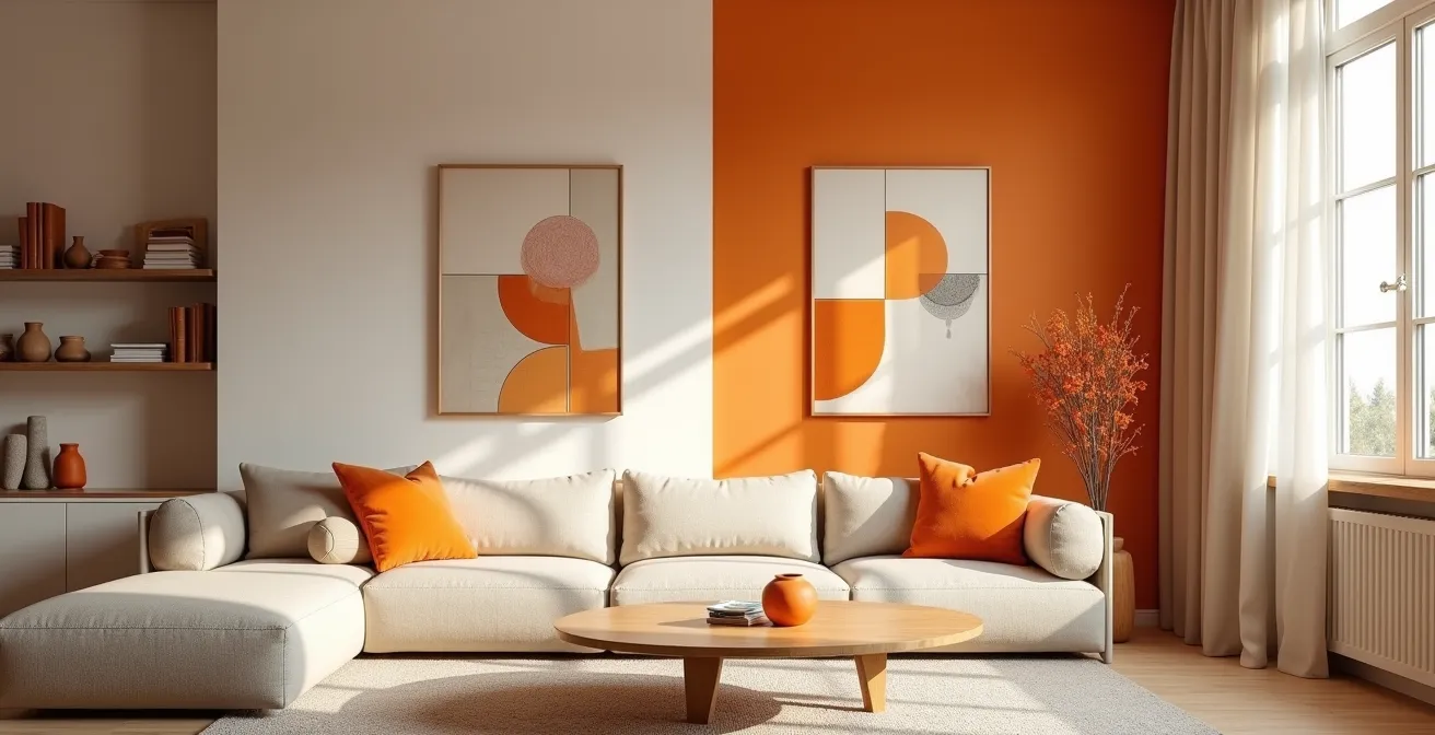
This image perfectly illustrates the two paths. On one side, monochromatic art creates a calm, blended atmosphere. On the other, a vibrant abstract piece acts as the 10% accent, transforming the same neutral room into something far more expressive. The choice isn’t about right or wrong, but about intention. As interior design professional Emily Santangelo notes, the result of a thoughtful search is profound:
When a client takes the time to search for a great work of art that both complements the space and makes them feel good, the result is transformative.
– Emily Santangelo
The Neck Strain Error: Why You Are Hanging Your Art Too High?
Even the most magnificent piece of art will fail to connect if it’s placed improperly on the wall. The most frequent and jarring mistake is hanging art too high, forcing viewers to crane their necks. This disconnects the art from the human scale of the room and the furniture within it, making it feel like a detached object rather than an integrated part of the living space. The correct height isn’t a random guess; it’s a specific measurement designed to place the art in direct relationship with the viewer’s eye.
The universally accepted standard comes from the world of galleries and museums. In these professional settings, artwork is hung so its center is 57 to 60 inches from the floor. This height represents the average adult eye level, ensuring the piece can be viewed comfortably without strain. Adhering to this “eye-level” rule immediately makes a space feel more considered and professional. It grounds the artwork and invites engagement, rather than holding it at a formal distance.
However, this rule is a starting point, not a rigid law. The optimal height must adapt to the context of the room and the furniture arrangements. Art above a sofa in a living room, for example, should be hung lower to relate to a seated viewer. In a hallway where people are always standing, the 57-inch rule is perfect. This nuanced approach ensures the art always feels connected to its immediate environment. The following table provides a clear guide for adjusting hanging height based on the specific context of the space.
| Room Type | Recommended Height | Reasoning |
|---|---|---|
| Hallways | 57-60 inches to center | People walk through standing, so eye-level height works best |
| Living Rooms (seated viewing) | 50-54 inches to center | Lower placement for comfortable viewing from sofas and chairs |
| Above Furniture | 6-10 inches above furniture top | Creates clear connection between furniture and art |
| High Ceilings (10ft+) | 65-68 inches to center | Higher placement looks proportional in tall spaces |
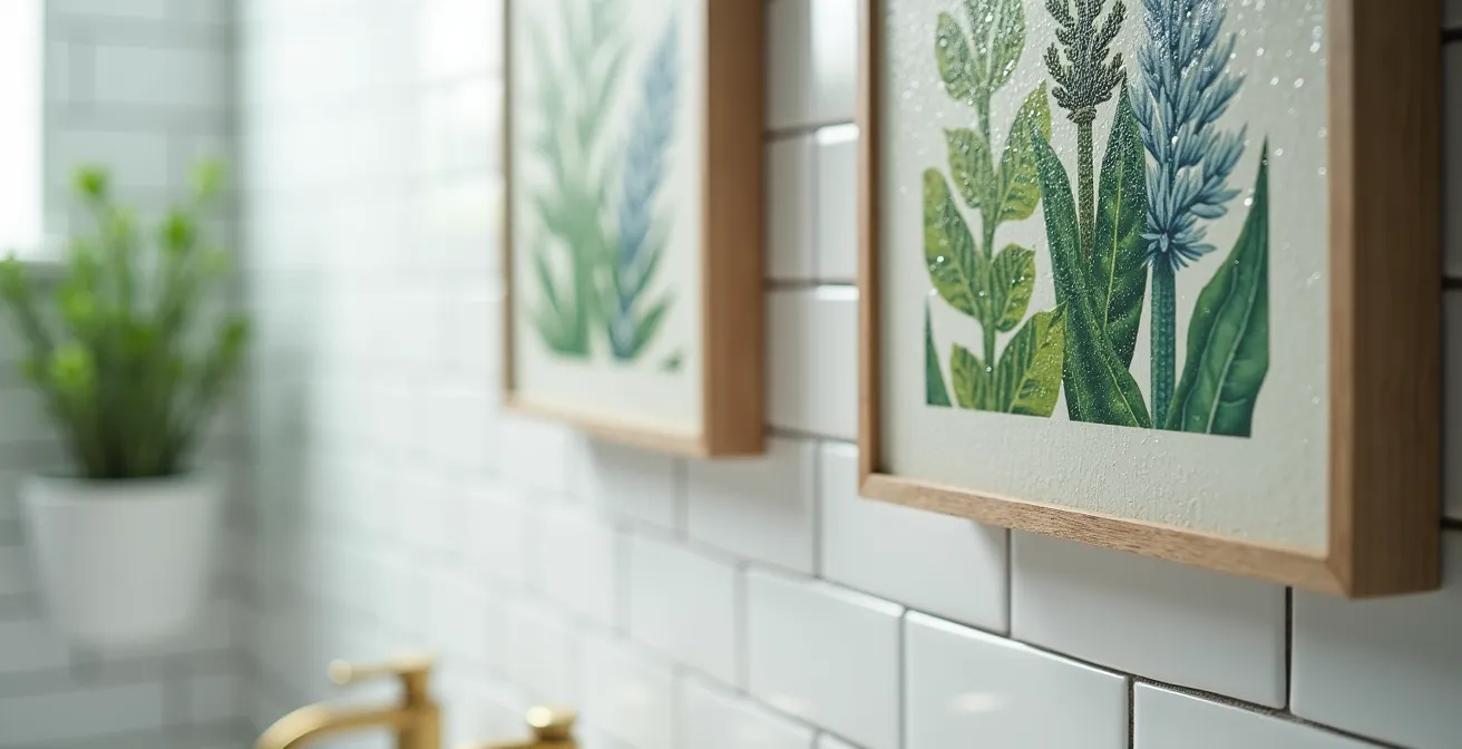
Kitchen and Bath Art: How to Choose Pieces That Survive Heat and Steam?
Kitchens and bathrooms, with their fluctuating heat and humidity, are often considered no-go zones for fine art. The fear of warping, mold, and water damage leads many to leave these walls bare. Yet, these functional spaces benefit enormously from the personality and warmth that art provides. The solution isn’t to avoid art, but to choose materials and formats that are inherently resilient to these challenging environments. With the right selection, you can bring artistry into every corner of the home.
Forget delicate works on paper or unsealed canvases. The key is to embrace non-porous and sealed surfaces. Acrylic-mounted photography is an excellent choice, as the acrylic itself acts as a waterproof barrier, protecting the print from steam. Similarly, art printed directly onto metal or wood panels that have been properly sealed can withstand the rigors of a kitchen or bathroom. These materials not only protect the art but also add a sleek, modern texture to the space.
Another creative strategy is to think beyond the traditional frame. Collections of ceramic plates, custom-printed art tiles used as a backsplash, or even small metal sculptures on a floating shelf can serve as durable and impactful art installations. These choices integrate the art directly into the functional fabric of the room, making it feel both beautiful and purposeful. The following plan outlines key strategies for selecting pieces that will thrive in these spaces.
Action Plan: Selecting Resilient Art for Humid Spaces
- Choose acrylic-mounted photography for its inherent waterproof properties.
- Consider ceramic plate collections as functional and durable wall displays.
- Install custom-printed art tiles as a feature backsplash.
- Use sealed wood or metal sculptures on floating shelves.
- Frame botanical illustrations with moisture-resistant materials and proper sealing.
- Select vintage food advertisements (often on tin) for a retro kitchen theme.
Drama or Mystery: Which Tonal Strategy Suits a Bedroom Environment?
A bedroom is a sanctuary, a space for rest and intimacy. The art chosen for this room plays a crucial role in setting its emotional tone. The decision goes beyond mere aesthetics; it’s a choice between creating an atmosphere of expansive drama or one of cozy mystery. This tonal strategy is directly influenced by the art’s visual weight and scale. Through careful manipulation of these elements, you can make a room feel larger and more open, or smaller and more intimate, as desired.
A strategy of drama often involves using a single, oversized piece of art. As The Interior Collective notes in a piece of professional guidance, this can have a surprising effect: “As for size, I always opt for larger pieces in smaller spaces; it may feel counterintuitive, but it makes a tight space feel larger.” This approach creates a powerful focal point that expands the perceived boundaries of the room, lending it an air of confidence and drama. A large, bright abstract or a sweeping landscape photograph can energize a bedroom and give it a sense of grandeur.
Conversely, a strategy of mystery aims to create a cozy, enveloping atmosphere. This can be achieved with art that has a heavier visual weight through darker colors or denser compositions. According to design theory, visual weight is key to establishing hierarchy and guiding the viewer’s gaze within a space. A piece with deep, moody tones—like a dark floral still life or a shadowy portrait—draws the viewer in, making the room feel more intimate and secluded. This approach is less about expanding the space and more about enriching it with depth and introspection.
Expressive vs. Academic: Which Style Suits a Modern Minimalist Interior?
A modern minimalist interior, defined by clean lines, a neutral palette, and a lack of clutter, presents a unique challenge for selecting art. In a space that is so carefully edited, the art cannot be a passive element. It becomes the primary carrier of personality and emotion. The choice often comes down to two opposing forces: the controlled, intellectual rigor of academic art (think geometric abstraction, architectural studies) versus the raw, emotional energy of expressive art (gestural painting, bold color fields).
Academic or minimalist art complements the aesthetic by reinforcing its core tenets. A piece with clean lines, a simple geometric composition, or a monochromatic palette speaks the same language as the space around it. It adds a layer of intellectual curiosity without disturbing the room’s serene, low visual weight. This approach creates a harmonious and deeply calming environment where the art feels like a natural extension of the architecture.
The alternative is to use art as a “single point of chaos”—a deliberate and controlled burst of energy in an otherwise tranquil space. This is where expressive art thrives. A large, gestural abstract with vibrant colors or chaotic brushstrokes can act as a powerful counterpoint to the room’s quiet order. It doesn’t disrupt the minimalism; it highlights it by contrast. This is a sophisticated use of visual weight, where one element is intentionally given high impact to balance the quietness of the whole. Understanding how to manipulate visual weight is fundamental for creating aesthetically pleasing interiors.
Key Takeaways
- Scale Dictates Presence: Art must be scaled to the wall, not the furniture. Aim for it to cover 50-70% of the available space to create a strong visual anchor and avoid the “postage stamp” effect.
- Art Directs Color: Use the 60-30-10 rule to let your art establish the room’s color story. It can either blend with the dominant palette or act as the powerful 10% accent that introduces a new, intentional hue.
- Placement Connects to People: Hang art at a human scale. The gallery standard of 57-60 inches to the center is your starting point, but adjust it down for seated viewing areas to maintain a visual connection.
Matte Form Aesthetic: Why Non-Reflective Art is Taking Over Modern Interiors?
In the world of interior design, there is a quiet but powerful shift away from high-gloss, reflective surfaces towards a more tactile and subtle aesthetic. This is the rise of the matte form, an approach that prioritizes texture, depth, and authenticity over shine and polish. When it comes to art, this trend manifests in a preference for non-reflective finishes that absorb light rather than bouncing it. This allows the viewer to connect with the artwork’s color and texture without the distraction of glare, creating a more intimate and immersive experience.
The appeal of the matte aesthetic lies in its subtlety and focus on materiality. An unvarnished painting, a raw wood sculpture, or a photograph framed with non-reflective museum glass invites a closer look. It encourages an appreciation for the physical properties of the object—the weave of the canvas, the grain of the wood, the texture of the paper. As a recent report notes, “Current trends in wall decor highlight a return to minimalism, where subtle details and intentional design create a lasting impression.” The matte finish is the embodiment of this philosophy.
Achieving this look involves a holistic approach, considering not just the art itself but the surrounding environment. Pairing matte art with chalky limewash paints on the walls or unglazed ceramic pieces enhances the overall tactile quality of the space. Lighting also plays a crucial role; side lighting is often used to graze the surface of the art, emphasizing its physical texture, rather than frontal illumination which can flatten it. To embrace this aesthetic, consider the following strategies:
- Frame with non-reflective museum glass to eliminate glare and enhance clarity.
- Choose unvarnished paintings or prints on matte paper to showcase authentic texture.
- Incorporate unglazed ceramic art or raw wood sculptures for tactile appeal.
- Apply chalky or limewash paints on surrounding walls to create a soft, light-absorbing backdrop.
- Use side lighting to emphasize the physical texture of the artwork.
Now that you are equipped with the strategic principles of scale, color, placement, and finish, you can approach art not as a final decoration, but as the foundational element of your design. By moving from a reactive to a proactive mindset, you unlock the ability to craft spaces that are not just beautiful, but are also cohesive, atmospheric, and deeply personal. The next step is to confidently select a piece that will not just decorate your space, but truly define it.