Chiaroscuro is far more than a simple technique of high-contrast light and shadow. It is a psychological technology that manipulates the viewer’s primal brain. By creating a clear perceptual hierarchy that directs the eye and manufacturing a sense of mystery through what is concealed, it exploits our evolutionary relationship with light and darkness to generate profound emotional resonance.
There are moments when a work of art stops you in your tracks. It’s not just the subject or the colours, but a palpable intensity, a feeling that the scene is alive with unspoken tension. Often, this power comes from a technique refined in the Baroque period but with roots in our most primal instincts: chiaroscuro. For the psychology-minded collector, understanding this effect is key to appreciating the true impact of art. It’s the difference between owning a beautiful object and curating an environment that actively shapes emotion.
Many discussions of chiaroscuro begin and end with Caravaggio and the idea of creating “drama.” While true, this barely scratches the surface. It fails to answer the fundamental question: why is it so dramatic? Why does a strategic sliver of light on a face or a hand plunged into shadow feel so significant? The answer lies not in art history alone, but in the very wiring of our perceptual system. This isn’t just about aesthetics; it’s about a controlled manipulation of our innate survival mechanisms.
But what if the true genius of chiaroscuro is not what it reveals, but what it conceals? If the power isn’t in the light, but in the darkness it commands? This article peels back the layers of shadow to reveal the psychological machinery at work. We will explore the neurological basis for its attention-grabbing power, trace its evolution from canvas to cinema, and provide practical guidance on how to leverage—and not lose—its emotional force within your own space. It’s time to see darkness not as an absence, but as the most potent tool in an artist’s arsenal.
This guide will delve into the science and soul of chiaroscuro, exploring its psychological impact and practical application for collectors. Below is a summary of the key areas we will illuminate.
Summary: The Emotional Power of Light and Shadow
- Why the Brightest Spot in Chiaroscuro Controls Where Your Eye Goes First?
- How to Photograph Dark Paintings Without Losing Shadow Detail or Getting Glare?
- Caravaggio or Kubrick: How Cinematic Lighting Borrowed from Baroque Painting?
- The Visibility Issue: Why Chiaroscuro Art Disappears in Low-Light Dining Rooms?
- Gold or Black Frame: Which Enhances the Drama of Chiaroscuro Best?
- Drama or Mystery: Which Tonal Strategy Suits a Bedroom Environment?
- How to Position Your Home Lighting to Enhance Texture Without Creating Glare
- Tonal Contrast in Art: Why High-Contrast Pieces Anchor Modern Interiors Best?
Why the Brightest Spot in Chiaroscuro Controls Where Your Eye Goes First?
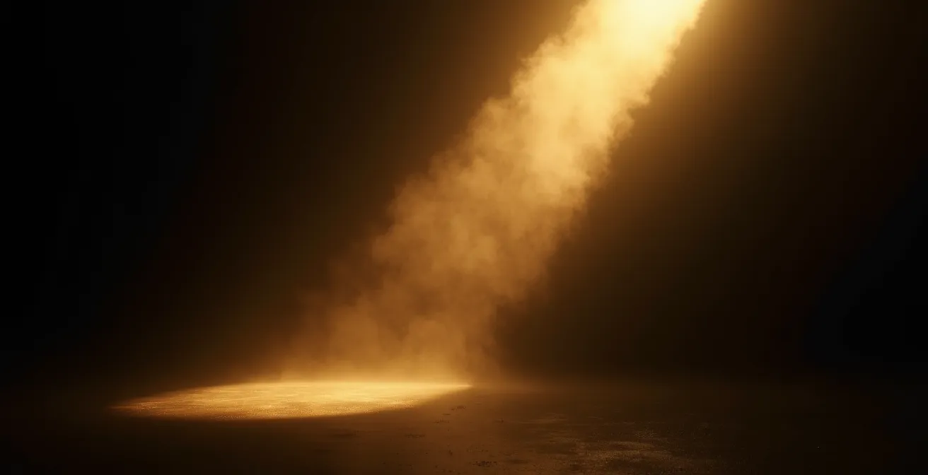
Your gaze is not a democratic process. When you look at a chiaroscuro painting, your eyes are not freely choosing where to land; they are being commanded. This is due to a fundamental principle of perception: perceptual hierarchy. Our brain, a product of millions of years of evolution, is hardwired to prioritize potential sources of information, and nothing is more critical for survival than light. The brightest point in our visual field is instinctively interpreted as the most important, the place where we must look first.
This response is so deeply ingrained that it operates below the level of our traditional photoreceptors. It’s a neurological reality driven by cells like melanopsin, a primal photoreceptor so fundamental that melanopsin can increase brightness perception by up to 10%. Research has even documented a blind individual, without functioning rods or cones, who could still detect the presence of light, proving our brain’s innate, non-negotiable pull towards illumination. A chiaroscuro artist is, in essence, a neuro-hacker, using the brightest spot as an unmissable “start here” sign for the viewer’s eye.
This diagram of an eye-tracking scan path demonstrates the principle in action. The eye does not wander; it is captured by the brightest point and then follows the pathways of diminishing light that the artist has laid out.
As you can see, the scan path is not random but a deliberate journey from light into shadow. The artist doesn’t just paint a scene; they choreograph your perception. The shadows then create a sense of cognitive scarcity. By hiding information, the artist forces your brain to engage, to fill in the blanks and actively participate in the creation of meaning. This forced engagement is what transforms passive viewing into a visceral, emotional experience.
How to Photograph Dark Paintings Without Losing Shadow Detail or Getting Glare?
For a collector, capturing the soul of a chiaroscuro piece in a photograph is a notorious challenge. The very darkness you love in person turns into a muddy, detail-less void on camera, while the highlights blow out or reflect a distracting glare. The key is to control the light with the same precision as the original artist, but with modern tools. One of the most critical variables is the angle of your light source relative to the artwork. Different angles produce dramatically different results in texture and reflection.
The following table, based on professional cinematography techniques, breaks down how lighting angles affect the final image. It is an essential reference before you even pick up a camera.
| Lighting Angle | Effect on Texture | Glare Risk | Best Use Case |
|---|---|---|---|
| Grazing (parallel) | Maximum texture visibility | Low | Thick impasto paintings |
| 30-degree angle | Balanced texture | Minimal | General artwork |
| 45-degree angle | Moderate texture | Medium | Flat surfaces |
| Direct front | No texture | High | Documentation only |
Beyond the angle, several professional techniques are essential for translating the deep tones of chiaroscuro into a digital format. These methods are designed to maximize the information captured by the camera’s sensor, giving you the most flexibility in post-production to recreate the painting’s intended mood.
- Use Cross-Polarization: This is the single most effective technique for eliminating glare. It involves placing a polarizing filter on your light source and another on your camera lens, oriented perpendicularly to each other. This cancels out specular reflections without altering the painting’s colours.
- Expose to the Right (ETTR): A counter-intuitive but crucial method. You slightly overexpose the image in-camera, pushing the histogram to the right without clipping the highlights. This technique forces the sensor to capture the maximum amount of data in the shadow areas, reducing noise and allowing you to bring the exposure back down in post-processing while retaining rich, clean shadow detail.
- Use a Single, Large, Diffused Light Source: To replicate the soft-yet-directional light of many Baroque paintings, avoid multiple small, harsh lights. A single large softbox or a light bounced off a large white surface mimics the quality of light from a large window, creating natural-looking highlights and soft-edged shadows.
Caravaggio or Kubrick: How Cinematic Lighting Borrowed from Baroque Painting?
The emotional language of chiaroscuro was too powerful to remain confined to canvas. When moving pictures emerged, filmmakers were faced with the same challenge as painters: how to guide the viewer’s eye and convey complex emotions in a purely visual medium. They found their answer in the Baroque masters. The techniques of Caravaggio became the blueprint for the cinematic lighting of directors like Stanley Kubrick, Alfred Hitchcock, and Francis Ford Coppola, creating a direct lineage of emotional manipulation through light.
Case Study: Gordon Willis and ‘The Godfather’
Cinematographer Gordon Willis, nicknamed the “Prince of Darkness,” fundamentally translated Caravaggio’s vision to cinema in his work on The Godfather. He employed a very low-key, single-source lighting setup. Often, the powerful key light was the sole source, plunging backgrounds into near-total blackness and carving subjects out of the dark. This wasn’t a stylistic whim; it was a narrative choice. The oppressive shadows represented the pervasive, dangerous world of the mafia. Characters are frequently shown with only half their face illuminated, a direct visual translation of their moral ambiguity and the constant battle between their public and private selves. This is Caravaggio’s harsh, single-source ‘cangiante’ technique reborn for the silver screen.
This technique of partially obscuring a character’s face became a cornerstone of film noir and psychological thrillers. The shadows create a space for the audience’s imagination to project fear, suspicion, and doubt. What is hidden becomes more potent than what is shown. As noted by cinematic analysts, this is a defining characteristic of the genre.
Francis Ford Coppola’s The Godfather is a film that is known for its dark lighting, often only lighting half of a character’s face, a critical component in chiaroscuro.
– StudioBinder, What is Chiaroscuro in Film? Definition, Techniques, & Examples
From the stark, isolated figures in a Rembrandt painting to the silhouetted face of a conflicted anti-hero in a modern film, the underlying psychological principle is the same. The strategic use of light and shadow is the most direct way to communicate a character’s internal state and the moral atmosphere of their world, a timeless technique for telling stories about the duality of human nature.
The Visibility Issue: Why Chiaroscuro Art Disappears in Low-Light Dining Rooms?
There is a tragic irony often faced by collectors: a magnificent chiaroscuro painting, purchased for its dramatic depth, is hung in a tastefully dim dining room and promptly vanishes into the wall. The deep, velvety blacks and subtle transitions in the shadows merge into an indecipherable gloom. This happens because the human eye and the artwork are being starved of the one thing they need to communicate: a full spectrum of light.
Our perception of colour is not absolute; it is entirely dependent on the quality of the light source. Most ambient home lighting, especially the warm, moody lamps used in dining rooms, has a very poor spectral output. They are missing large portions of the blue and green spectrums. When this impoverished light hits a painting, the pigments have nothing to reflect back to our eyes. A complex, dark green mixed by the artist simply appears black because there are no green wavelengths in the light to reveal it. This phenomenon, where colours change appearance under different light sources, is called metamerism.
To combat this and render the artist’s true intentions, you must re-introduce a high-quality light source. This means using a dedicated accent light with a high Colour Rendering Index (CRI). CRI is a scale from 0 to 100 that measures a light’s ability to reproduce colours faithfully compared to natural sunlight. For art, anything less than 90 is inadequate. Professional galleries and museums insist on lighting that meets a stringent standard, typically requiring a light source with a Color Rendering Index of at least 95 to ensure absolute fidelity. This is the single most important factor in properly illuminating art.
Furthermore, the lighting must be strategic. Use a fixture with a narrow beam angle (10-20 degrees) to “re-light” the painting, essentially recreating the artist’s original lighting setup within the frame. The goal is not to flood the wall with light, but to precisely place a small pool of high-quality light onto the artwork itself, allowing the deep shadows and subtle colours to emerge from the darkness as intended, independent of the room’s ambient mood.
Gold or Black Frame: Which Enhances the Drama of Chiaroscuro Best?
Choosing a frame for a chiaroscuro painting is not a finishing touch; it is the final act of composition. The frame is not a passive border but an active participant in the artwork’s emotional effect. It acts as a crucial transition between the meticulously controlled world within the painting and the unpredictable environment of the room it inhabits. The choice between a gold or black frame—or their many variations—fundamentally alters the painting’s narrative and its interaction with shadow.
A frame does one of two things: it either absorbs the light and shadow from the painting, extending its darkness, or it reflects light, creating a new light source that dialogues with the piece. A matte black frame is an act of extension. It absorbs all light, creating an “infinity edge” where the deepest shadows of the painting bleed out into the frame, suggesting a darkness that is boundless. This maximizes the drama by making the void feel tangible. A burnished gold frame, by contrast, is an act of containment and reflection. It catches ambient light from the room and the highlights from the painting, creating a warm, divine glow. It acts as a secondary, internal light source, framing the dark scene with a halo of hope or sanctity.
The specific material and finish of the frame have a profound impact on this dynamic. A glossy black frame will pick up subtle reflections, while an antique gold frame introduces a layer of historical context and decay. The choice depends entirely on the emotional note you wish to strike.
| Frame Type | Visual Effect | Shadow Interaction | Best For |
|---|---|---|---|
| Matte Black | Absorbs all light, emphasizes void | Creates infinite darkness bleed | Maximum drama |
| Glossy Black | Creates subtle highlights | Interacts with painting lighting | Contemporary feel |
| Burnished Gold | Suggests warmth and divinity | Acts as secondary light source | Classical elegance |
| Antique Gold | Adds historical decay layer | Reflects ambient light | Period authenticity |
| Black Floater | Shadow box effect | Painting hovers in darkness | Modern galleries |
Ultimately, the best frame serves the artwork’s core message. For a piece intended to feel unsettling and vast, a matte black frame is an amplifier. For a work that contrasts worldly darkness with spiritual light, a gold frame reinforces the narrative. The frame is the first word in the viewer’s conversation with the art; choose it wisely.
Drama or Mystery: Which Tonal Strategy Suits a Bedroom Environment?
The bedroom is a unique and challenging space for art. It’s a room of transition—from the bright, functional light of morning to the soft, intimate glow of evening. The emotional tenor of an artwork must be able to resonate across these different states. When choosing a piece with strong tonal contrast for a bedroom, the collector is faced with a critical choice: the high-impact energy of drama or the quiet, sustained pull of mystery?
A “dramatic” piece, characterized by stark, high-contrast chiaroscuro, might feel powerful and commanding in the evening. Its sharp divisions between light and dark create clear focal points and a strong emotional statement. However, in the cool, blue-toned light of a new day, this same starkness can feel aggressive or jarring. The high energy that was compelling at night can become a source of visual agitation in the morning.
A “mysterious” piece, by contrast, typically employs a more low-key, Tenebrist approach. The transitions between light and dark are softer, and a greater portion of the canvas is given over to deep, nuanced shadow. This strategy is less about a sudden “pop” of contrast and more about a slow reveal. Its emotional impact is more consistent across different lighting conditions. This is not just an aesthetic consideration; it’s a biological one. As a case study from sleep science reveals, the color and intensity of light we are exposed to directly impacts our internal state.
Case Study: Circadian Rhythm and Art Perception
Extensive research on light as a central modulator of circadian rhythms shows our sensitivity to light’s color temperature changes throughout the day. Morning light is rich in blue wavelengths, promoting alertness, while evening light is warmer. A high-drama chiaroscuro piece, with its crisp edges and stark highlights, can feel emotionally out of sync with the body’s desire for calm in the evening or its gentle awakening in the morning. A mysterious piece with softer transitions and deeper shadows remains more emotionally consistent, making it a more suitable and calming long-term companion for a space dedicated to rest and intimacy.
For a bedroom, the goal is often to create a sanctuary. A mysterious, low-key piece invites quiet contemplation and holds its secrets close, offering a stable emotional anchor in a room of constant change. It doesn’t shout for attention; it rewards it.
How to Position Your Home Lighting to Enhance Texture Without Creating Glare
Once you have selected the right high-CRI fixture, the final piece of the puzzle is positioning. The placement of your light source is what separates a flat, washed-out appearance from a dynamic, three-dimensional experience. The goal is to make the texture of the paint—the impasto, the brushstrokes, the canvas weave—an active part of the artwork’s story. This requires sculpting the surface with light, which is achieved by mastering specific angles.
Improper lighting, usually from a fixture placed too directly in front of the art, flattens all this beautiful detail and creates hotspots or glare. The secret lies in using oblique angles to cast minute shadows across the surface, making the texture visible to the eye. For collectors who want to bring their art to life, a few professional techniques are indispensable.
Your Audit for Flawless Texture Lighting
- Master the ‘Grazing’ Angle: For works with thick impasto or significant texture, position your light source almost parallel to the artwork’s surface (either from the top, bottom, or side). This “grazing” light rakes across the surface, casting long shadows from the peaks of paint and making the texture dramatically visible.
- Apply the 30-Degree Rule: For most general artwork, the industry standard is to position the center of the light beam to hit the center of the artwork from a 30-degree angle. This provides a perfect balance, revealing texture without creating distracting shadows or reflecting light back into the viewer’s eyes.
- Use Asymmetrical Beams for Wide Pieces: For panoramic or very wide artworks, a standard symmetrical beam will create a bright “hot spot” in the middle and leave the edges dim. Use a wall-washer fixture with an asymmetrical beam, which throws light more evenly across a horizontal plane.
- Cast Shadows from Peaks: The aim is not to eliminate shadows but to control them. Position the light so it casts long, subtle shadows from the highest points of texture. This models the surface and gives it a tangible, sculptural quality.
- Adjust Beam Width to Frame the Art: Use a fixture with an adjustable beam spread. The cone of light should be just slightly larger than the artwork itself. This contains the light, making the art “pop” from the wall while avoiding distracting light spill onto the surrounding area.
By treating the light fixture as a sculptor’s chisel, you can transform a painting from a flat image into a living, breathing surface. The texture is part of the artist’s voice; proper lighting is what allows you to hear it.
Key Takeaways
- Chiaroscuro is a psychological tool that directs the viewer’s eye using primal brain mechanisms.
- Properly lighting, photographing, and framing a chiaroscuro piece requires recreating the artist’s original intent, not just illuminating a room.
- The emotional impact of a high-contrast piece is context-dependent and interacts with its environment, from the mood of a room to the lines of its architecture.
Tonal Contrast in Art: Why High-Contrast Pieces Anchor Modern Interiors Best?
In the visually restrained world of modern and minimalist interiors—defined by clean lines, neutral palettes, and open spaces—the eye can often be left to wander, searching for a place to rest. A high-contrast chiaroscuro piece does not merely decorate this space; it gives it a center of gravity. It functions as a powerful visual anchor, a deliberate point of focus that commands attention and organizes the entire room around itself.
This function is more than just aesthetic; it’s psychological. In a quiet visual field, a sudden, strong signal becomes the undisputed focal point. It provides a necessary punctuation mark in the calm sentence of a minimalist room. Without it, the space can feel undefined or even empty; with it, the space feels composed and intentional.
In minimalist and modern interiors, which often feature clean lines and neutral palettes, a high-contrast piece acts as a deliberate ‘visual stop’. It commands attention and prevents the eye from wandering aimlessly in a visually quiet space, serving the same function as an exclamation point in a sentence.
– Design Theory Expert, Modern Interior Design Principles
Furthermore, the organic, dynamic nature of the shadows within a chiaroscuro painting offers a vital counterpoint to the rigid geometry of modern architecture. The straight lines and right angles of the room create a sense of order and rationality. The swirling, deep, and often unpredictable forms within the painting introduce a dose of organic energy and emotional complexity. This creates a dynamic tension that enlivens the entire space.
The artwork and the architecture enter into a dialogue. The painting’s dramatic shadows disrupt the room’s monotony, while the room’s clean lines provide a stable, grounding framework for the painting’s emotional intensity. This interplay energizes the negative space around the artwork, transforming a simple wall into a fully composed visual statement. The high-contrast piece doesn’t just hang on the wall; it claims it, giving purpose and power to the surrounding emptiness.
By understanding the deep psychological principles at play, from the neurological hijacking of your gaze to the art’s role as a visual anchor in your home, you transform from a passive owner into an active participant in the art’s life. This knowledge allows you to make conscious choices that amplify the emotional resonance the artist intended. To continue building this mastery, it is essential to always return to the foundational principles of how we see.