The premium value of a chromogenic print stems not from nostalgia, but from its unique physical depth—light passing through embedded dye layers creates a luminosity that surface-level ink cannot replicate.
- Unlike inkjet dots sitting on paper, a C-print’s image is formed by continuous-tone dye clouds within a gelatin emulsion, offering superior detail and a distinct optical quality.
- While more fragile to light (cyan shift), its gelatin surface offers superior abrasion resistance, presenting a different set of archival challenges and trade-offs compared to pigment prints.
Recommendation: For collectors, valuing a C-print means investing in its specific conservation needs—controlled storage, UV-filtered lighting, and expert mounting—to preserve its unique material integrity.
In an era dominated by the flawless precision of digital pigment printing, the enduring allure of the chromogenic print—or C-print—can seem like an anachronism. For many, the conversation ends with a simple binary: the archival superiority of pigment inks versus the perceived fragility of chemical dyes. We are told modern technology has solved the problems of the past, rendering the traditional darkroom process obsolete. This view, however, misses the fundamental point that drives purists and savvy investors to continue paying a premium for these remarkable objects.
The essence of a C-print’s value isn’t a sentimental attachment to a bygone era. It lies in its very materiality. The experience of viewing a C-print is fundamentally different from looking at an inkjet print. It’s the difference between looking at a stained-glass window and a painted wall. One transmits light through color; the other reflects it off a surface. This article moves beyond the simple “chemical versus digital” debate to explore the technical and aesthetic reasons that justify the C-print’s prestigious position.
We will delve into the physics of how light interacts with dye layers, the specific archival science needed to protect these prints, and the meticulous craft involved in mounting and presenting them. By understanding the unique properties and challenges of the chromogenic process, we can appreciate why it remains not just a valid artistic choice, but a coveted one. This is not about nostalgia; it’s about a deep, technical appreciation for a medium with unparalleled depth and character.
This guide breaks down the essential technical and conservation knowledge needed to truly understand the value of a C-print. The following sections will provide a detailed look into the science, preservation, and presentation that define this classic photographic medium.
Summary: A Deep Dive into the World of Chromogenic Prints
- Why Light Passing Through Dye Layers Looks Deeper Than Ink on Paper?
- How to Stop Cyan Shift: The Storage Conditions Your C-Prints Demand
- Chemical Dye or Mineral Pigment: Which Print Will Outlast You?
- The Acrylic Scratch: Can You Polish a Diasec Mount Without Ruining It?
- Why LED Lighting with Low UV is Critical for C-Print Survival?
- How to Mount a 2-Meter Photo Without It Rippling or Bowing?
- How to Spot Color Discrepancies on Your Screen Before Spending $5,000
- Analog Exposure: Why the ‘Film Look’ Grain is Making a Comeback in Fine Art?
Why Light Passing Through Dye Layers Looks Deeper Than Ink on Paper?
The core difference between a chromogenic print and a pigment (inkjet) print is not just chemical versus digital; it’s a fundamental distinction in how the image is formed and perceived. An inkjet print consists of microscopic dots of pigment sitting on top of the paper’s surface. The light you see is reflected off this layer of ink. A C-print, conversely, is a true photographic object. During the RA-4 process, light-sensitive paper is exposed to light, and color is formed by dye couplers that are embedded within distinct gelatin layers—cyan, magenta, and yellow.
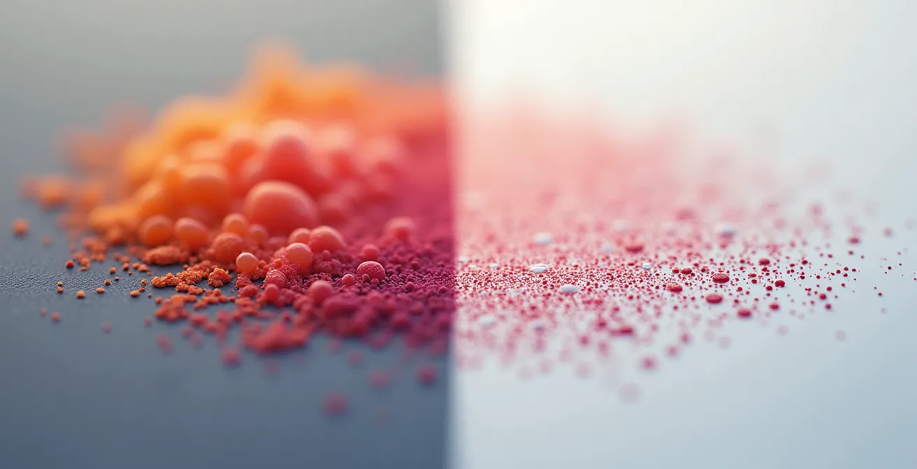
The result is not a series of dots, but continuous-tone clouds of translucent dye. When you view a C-print, light penetrates these layers, refracting through the color itself before bouncing off the paper base and returning to your eye. This transmission of light through the emulsion creates an optical depth and luminosity that surface-level ink struggles to match. It’s this inherent materiality that gives C-prints their signature rich, vibrant, and almost three-dimensional quality. The trade-off for this visual depth is a more delicate chemical stability; revised Wilhelm Imaging Research studies show that C-prints last 30-40 years under typical display conditions before noticeable fading occurs.
How to Stop Cyan Shift: The Storage Conditions Your C-Prints Demand
The Achilles’ heel of the C-print is its relative instability when exposed to light, heat, and humidity. The yellow and magenta dyes are particularly fugitive, fading at a faster rate than the cyan dye. This differential fading process is what leads to the infamous “cyan shift,” where the image gradually takes on a blue-green cast. While this degradation is inevitable, its pace can be dramatically controlled through meticulous archival storage. This is not a flaw to be lamented but a characteristic of the medium to be expertly managed.
The key is to slow down the chemical reactions that cause the dyes to break down. The Museum of Modern Art, in a detailed condition survey, underscored the vital role of environmental control. As their study on face-mounted photograph conservation protocols shows, professional preservation is a science. The primary enemies are high temperature and fluctuating relative humidity, which accelerate dye degradation and can cause physical damage to the gelatin emulsion, such as cracking or mold.
For any serious collector, implementing museum-standard storage is not optional; it is a core responsibility of ownership. Managing these conditions ensures the print’s vibrancy and value are preserved for decades, transforming the “problem” of fading into a testament of proper care.
Your Action Plan: Museum-Standard Storage for C-Prints
- Maintain temperature below 18°C (65°F) to slow chemical degradation.
- Control relative humidity between 30-40% RH to prevent emulsion damage.
- Store prints in acid-free, archival enclosures away from all direct light sources.
- Consider cold storage (below 0°C) for maximum long-term preservation of particularly valuable prints.
- Monitor environmental conditions continuously with professional data loggers to ensure stability.
Chemical Dye or Mineral Pigment: Which Print Will Outlast You?
The choice between a chromogenic print and a pigment print is a decision of trade-offs. There is no single “better” option, only the right option for a specific artistic intent and collecting goal. A pigment print’s primary advantage is its exceptional archival longevity. Using stable mineral pigments instead of organic dyes, a high-quality pigment print can last for 200 years or more without significant fading. However, this permanence comes at a cost to its physical durability.
Artists like Candida Höfer are often associated with the art market’s embrace of photography as an artistic medium in the 1980’s, chromogenic prints have earned a reputation as a more “serious” process than pigment printing.
– Artspace Editorial, From C-Print to Silver Gelatin Guide
The C-print, on the other hand, boasts a tough, scratch-resistant gelatin surface that protects the embedded dye layers from physical harm. A pigment print’s image sits exposed on the paper surface, making it extremely vulnerable to scuffs and abrasion. This difference in failure mode is critical: a C-print ages gracefully through a gradual color shift, which can be slowed by proper care. A pigment print can look perfect for a century and then be instantly ruined by a single scratch. This distinction is crucial in the art market, where historic prestige and the artist’s original intent often favor the chromogenic process.
| Factor | C-Print (Chromogenic) | Pigment Print |
|---|---|---|
| Display Life | 30-40 years | 200+ years |
| Light Resistance | Moderate (cyan shift risk) | Excellent |
| Abrasion Resistance | Superior (gelatin layer) | Poor (surface fragility) |
| Failure Mode | Gradual color shift | Sudden delamination |
| Market Perception | Historic prestige | Technical superiority |
The Acrylic Scratch: Can You Polish a Diasec Mount Without Ruining It?
Face-mounting a C-print to acrylic, often known by the brand name Diasec, is the gold standard for presentation. This process sandwiches the print between a sheet of acrylic and a rigid backing like Dibond, creating a frameless, high-gloss object with incredible depth and saturation. The acrylic not only enhances the visual properties of the print but also provides crucial protection against UV light and physical damage. However, the acrylic face itself is not indestructible and is susceptible to scratches, posing a significant conservation challenge.
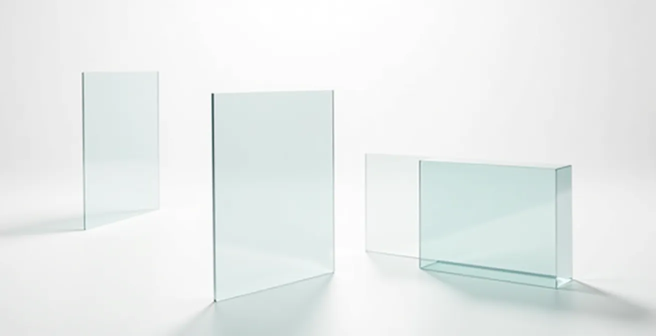
Attempting to polish out a scratch is a perilous task. The use of household cleaners, solvents, or abrasive cloths can cause irreversible damage, creating a haze of micro-scratches that ruins the flawless surface. Repair should follow a tiered approach, and anything beyond a minor surface scuff should be left to a professional art fabricator or conservator. It is also important to remember that acrylic is a dynamic material; data shows that acrylic glass expands and contracts by up to 0.8mm per meter at a 10°C change, a factor that expert mounters must account for. Prevention is therefore the best strategy, starting with the choice of material at the time of mounting.
Checklist: A Tiered Approach to Diasec Scratch Repair
- Tier 1 – Micro-scuffs: Gently wipe with a soft microfiber cloth dampened with water and a single drop of mild dish soap.
- Tier 2 – Visible scratches: This requires professional wet-sanding and polishing by an expert art fabricator; do not attempt this at home.
- Tier 3 – Deep gouges: Repair is not possible. A full acrylic sheet replacement is necessary, a complex and expensive conservation task.
- Prevention: Never use solvents, glass cleaners, or dry cloths on acrylic surfaces, as they will cause fine scratches.
- Proactive Choice: Consider investing in museum-grade anti-scratch or anti-static acrylic coating during the initial mounting process.
Why LED Lighting with Low UV is Critical for C-Print Survival?
All light is damaging, but not all light is created equal. For a C-print, the most destructive component of light is the invisible, high-energy ultraviolet (UV) radiation. UV light dramatically accelerates the breakdown of the organic dyes in the emulsion, hastening the onset of color shifting and fading. The second critical factor is the quality of the visible light itself, measured by the Color Rendering Index (CRI). A low CRI light source will distort the perceived colors of the artwork, misrepresenting the artist’s original intent.
This is why the transition to LED lighting in galleries and homes has been a double-edged sword. While LEDs produce significantly less UV radiation than older halogen or fluorescent bulbs, their quality varies wildly. For displaying fine art, it is imperative to use high-CRI LEDs. While standard consumer LEDs may have a CRI of 80, professional photography and video production requires a 95+ CRI to ensure colors are rendered accurately and vibrantly. This is the standard a collector should demand for their collection.
Beyond the quality of light, the quantity must also be managed. Conservators use the concept of a “light budget,” measured in lux hours. By controlling the intensity of the light (lux) and the duration of exposure (hours), one can significantly extend the life of a print. This often involves a policy of rotating artworks between display and dark storage.
Action Plan: Light Budget Management for Your Collection
- Calculate annual light exposure: Multiply the light level in Lux by the number of display hours per year to get your Total Lux Hours.
- Set a maximum annual budget: For highly sensitive materials like C-prints, a conservative budget is 50,000 lux hours per year.
- Implement a rotation policy: A common strategy is 4 months on display followed by at least 8 months in dark, climate-controlled storage.
- Choose your source wisely: Use high-CRI (95+) LED sources for the most accurate color rendering with low UV output.
- Add a final barrier: Install museum-grade UV-filtering films on all windows and light fixtures that illuminate the artwork.
How to Mount a 2-Meter Photo Without It Rippling or Bowing?
As photographic prints reach monumental scales, the physical challenges of mounting them increase exponentially. A two-meter print is a massive object, and any minute imperfection in the mounting process will be magnified, resulting in disastrous rippling, bowing, or delamination. The choice of adhesive and substrate is absolutely critical to ensuring the long-term structural integrity of the piece.
Many commercial labs use pressure-sensitive adhesive films for face-mounting. While these can look good initially, they are prone to failure over time, especially at large sizes. Environmental changes can cause the print and the acrylic to expand and contract at different rates, leading to bubbles or peeling. The genuine Diasec process, by contrast, uses a different chemistry to create a permanent bond.
Case Study: The Professional Large-Format Diasec Mounting Process
The adhesive used in a true Diasec face-mount is a liquid silicone gel combined with a proprietary catalyst that ensures a complete and permanent bond as it cures. Unlike film-based adhesives that rely on stickiness, the liquid silicone forms a flexible, inert layer that moves with the print and the acrylic. This engineering is designed to never separate, peel, or fail, providing superior stability and longevity, which is especially critical for large-format works exposed to fluctuating environmental conditions.
For a substrate, a simple foam board is inadequate for large dimensions. The standard for rigidity is a Dibond or similar aluminum composite panel. This material consists of a polyethylene core sandwiched between two thin sheets of aluminum, providing exceptional flatness and resistance to warping or bowing while remaining relatively lightweight. When commissioning a large-scale work, vetting the lab’s materials and processes is as important as the print itself.
Frequently Asked Questions on Vetting a Mounting Lab
What is your material acclimation process before mounting?
The print, acrylic, and substrate should all be allowed to acclimate in a climate-controlled room for 24-48 hours. This ensures all materials are at a consistent temperature and humidity, minimizing future expansion or contraction issues.
Do you use liquid silicone adhesive or film-based mounting?
For maximum permanence, especially on large prints, liquid silicone adhesive (the true Diasec process) is superior. It provides a permanent, flexible bond that prevents bubbles and future delamination that can occur with film adhesives.
What substrate do you recommend for 2-meter prints?
For formats of this size, a Dibond aluminum composite panel is the professional standard. It provides the necessary rigidity to prevent bowing and ensures the artwork remains perfectly flat over time, with minimal reaction to thermal changes.
How to Spot Color Discrepancies on Your Screen Before Spending $5,000
The worst moment for any photographer or collector is unboxing a long-awaited, expensive large-format print, only to find the colors are completely wrong. A vibrant red on screen appears as a dull orange, or subtle skin tones have a sickly green cast. This costly disappointment is almost always the result of a broken color management workflow. What you see on your monitor is not what the printer will produce unless both devices are speaking the same language. This language is defined by ICC profiles.
Your monitor has a specific color gamut (the range of colors it can display), and the lab’s printer—whether a digital C-type machine like a Durst Lambda or an inkjet plotter—has its own, different gamut. As experts at Breathing Color note, “Photo lab print gamuts range from sRGB coverage (or less), to partial Adobe RGB coverage.” The key is to simulate the printer’s limited gamut on your wide-gamut monitor. This process, called “soft proofing,” is done in software like Photoshop and requires the lab’s specific ICC profile for the exact printer and paper combination you will be using.
A calibrated workflow goes beyond software. It requires a controlled physical viewing environment. Comparing a print to a screen in a room with colored walls or mixed, uncalibrated lighting is a recipe for failure. A professional setup involves neutral grey walls and a dedicated, color-correct viewing lamp.
Your Action Plan: The Professional Color Management Workflow
- Set up a controlled viewing environment with neutral grey walls (18% grey is the standard).
- Install a dedicated D65 (6500K) viewing lamp next to your monitor for accurate print-to-screen comparison.
- Download the specific ICC profile from your print lab for the machine and paper you’ve chosen (e.g., ‘Durst_Lambda_Fuji_Crystal_Archive.icc’).
- In Photoshop or similar software, enable the “Soft Proofing” feature using the lab’s ICC profile to simulate the final print’s appearance.
- Always order a small, inexpensive test strip or proof print to verify your colors before committing to a large, expensive final print.
Key Takeaways
- The value of a C-print is rooted in its optical depth, created by light passing through embedded dye layers, a quality distinct from surface-level ink.
- Proper archival care, including cold storage and UV-filtered lighting, is not just for preservation but is an integral part of owning and valuing a C-print.
- Choosing between a C-print and a pigment print is a technical trade-off between optical depth/abrasion resistance and lightfastness/archival longevity.
Analog Exposure: Why the ‘Film Look’ Grain is Making a Comeback in Fine Art?
Beyond the technical specifications and archival debates, the resurgence of interest in C-prints is tied to a powerful aesthetic preference: the ‘film look.’ In a world saturated with digitally perfect, noise-free images, the subtle, organic grain structure of a photograph originating from film has a powerful appeal. This texture is not a flaw; it’s a tangible connection to the physical process of capturing light on a silver halide emulsion. The C-print is the natural and historically authentic way to render that analog quality in color.
As Wikipedia’s history of the medium notes, while C-prints were popular in the commercial market, it wasn’t until the 1970s that they were embraced by fine-art photographers. Pioneers like William Eggleston and Stephen Shore, through their groundbreaking work, caused chromogenic prints to become the preferred medium for contemporary photography by the 1990s. Their choice legitimized the medium, proving its capacity for profound artistic expression. Today, that legacy continues, but with a new sense of preciousness. The number of available papers has dwindled; as of 2017, only two major professional chromogenic paper lines remain on the market.
This scarcity, combined with the unique aesthetic, elevates the C-print from a simple reproduction to an object with its own intrinsic character. It represents a deliberate choice by the artist to embrace a medium with a rich history, a distinct visual signature, and a specific set of material properties. For collectors, acquiring a C-print is an investment in that entire tradition—a tangible piece of photographic history that stands in defiant, beautiful contrast to the digital age.
To truly appreciate and protect these unique works, the next step is to ensure your collection is housed and displayed according to archival best practices. A consultation on environmental controls and lighting can secure your investment for generations.