Judging an ink drawing’s quality isn’t about counting lines; it’s about recognizing the artist’s control over light, space, and material permanence.
- Mastery is visible in the deliberate, controlled imperfections of the human hand, which distinguish it from mechanical reproduction.
- The choice of ink (archival pigment vs. fugitive dye) is as crucial as the technique for the artwork’s long-term value and stability.
Recommendation: Look for art that creates rich tonal shifts through line economy and changes its character with your viewing distance, as these are the hallmarks of a true master.
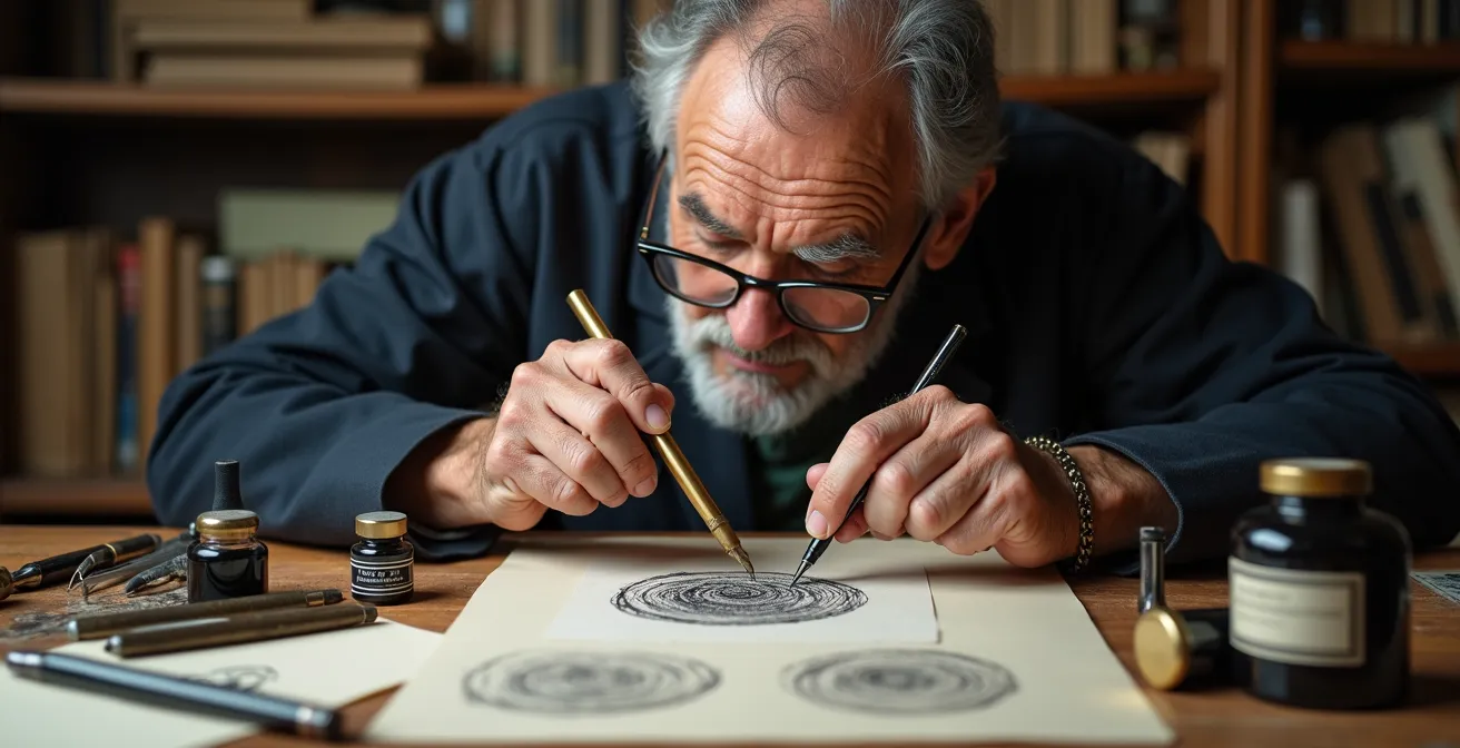
As a collector, when you stand before a pen and ink drawing, your eye is naturally drawn to the intricate web of lines. The common assumption is that quality in cross-hatching is a simple matter of density—more lines, darker tones, greater skill. While this is not entirely false, it is a profoundly incomplete picture. It is the equivalent of judging a novel by its word count. Many guides for artists will discuss basic principles like following the contour of a form or building up layers, but these are instructions for creation, not criteria for appreciation.
A connoisseur’s eye must learn to see beyond the surface. The true mastery of cross-hatching is not a mechanical process of filling space, but a nuanced performance of control, foresight, and material knowledge. It involves a command of what I call ‘optical physics’—the manipulation of light not with ink, but with the empty space *between* the ink. It’s about understanding that the most telling details are often the ‘perfect imperfections’ that no machine can replicate, and that the choice of ink can mean the difference between a work that lasts for centuries and one that fades into a purple ghost within a decade.
This guide is designed to arm you with that deeper vision. We will deconstruct the technique not from the artist’s perspective, but from the collector’s. We will explore how to discern the subtle signs of a master’s hand, from the physical properties of line work to the critical, often-overlooked aspect of archival integrity. You will learn to evaluate an ink drawing not just as an image, but as a testament to skill, patience, and a deep understanding of the medium’s timeless power.
This article will delve into the specific criteria that separate proficient work from true mastery. By exploring these eight distinct areas, you will gain a comprehensive framework for assessing the quality and long-term value of any cross-hatched ink drawing.
Summary: A Collector’s Framework for Evaluating Ink Mastery
- Why Closer Lines Create Darker Values Without Changing Ink Color?
- How to Detect the ‘Perfect Imperfections’ of Hand-Drawn Cross-Hatching
- Lines or Dots: Which Technique Requires More Hours and Costs More?
- The Dye-Based Ink Error: Why Your Drawing Might Turn Purple in 5 Years
- At What Distance Does Cross-Hatching Blend into a Solid Tone?
- Why a 9B Pencil Creates Depth That an HB Simply Cannot Achieve?
- Can Digital Tablets Replicate the Chaos of Spilled Ink on Paper?
- India Ink Washes: Why Black Ink Art Has Remained Timeless for Centuries?
Why Closer Lines Create Darker Values Without Changing Ink Color?
The most fundamental principle of cross-hatching is that line density creates tonal value. But a master understands this is not a matter of drawing, but of applied physics. The ink lines themselves are not the source of darkness; the shadows created between them are. When lines are drawn close together, they form microscopic valleys on the paper’s surface. These valleys trap ambient light, preventing it from reflecting back to the viewer’s eye. The denser the hatching, the deeper and narrower these light-trapping valleys become, resulting in a perceived darker tone. The ink color—a constant black—never changes.
A proficient artist knows to space lines closer for darker areas. A master, however, orchestrates this effect with an intuitive understanding of how different line arrangements will interact with light. This is where you, as a collector, can begin to judge. Look for a full and seamless range of values, from the lightest greys created by sparse, delicate lines, to the richest blacks formed by multiple layers of dense, overlapping strokes. In the work of a master, this transition is not abrupt but gradual and organic, demonstrating complete control over the optical blending of ink and paper. As demonstrated in Marc Kompaneyets’ workshops, artists develop this control by mastering various hatching strokes to manipulate density with precision.
This microscopic topography is where the magic happens. The ink lines act as tiny walls, and the more walls there are, the less light can escape.
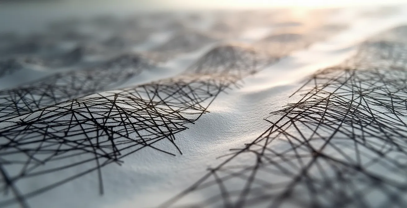
As this magnified view illustrates, the physical structure of the ink on paper is what dictates value. The artist is, in essence, sculpting with light at a microscopic level. The technique is not about adding black, but about strategically subtracting light. Look for how an artist uses not just straight lines, but also curved ones that follow the contours of a subject, creating an illusion of three-dimensionality by manipulating how light is trapped across a form.
How to Detect the ‘Perfect Imperfections’ of Hand-Drawn Cross-Hatching
In an age of digital precision and flawless prints, the most valuable quality in hand-drawn art is often its humanity. When judging cross-hatching, you should not be looking for mechanical perfection. Instead, you should train your eye to spot the ‘perfect imperfections’—the subtle, controlled variations that are the unmistakable signature of a human hand. These are not mistakes; they are evidence of a direct connection between the artist’s mind and the paper, a quality that digital tools can only simulate.
Look closely at the individual lines. Do they have a uniform, sterile quality, or do they exhibit slight variations in weight and thickness? A master using a traditional dip pen will instinctively modulate pressure, causing the nib to flex and alter the line’s character. This subtle dynamism breathes life into the work. As artist Sandy Allnock notes when describing her process, this is a feature, not a bug:
The difference between them can be handled with hatching for the soft feathered body, and crosshatching to create the darker, larger feathers of the wings… The NikkoG nib performs slightly different each way, so I can use that line weight to my advantage.
– Sandy Allnock, Pen and Ink Technique Series
This approach often has roots in historical techniques. Many contemporary masters, like the illustrator Bryan the Girl, base their style on historical printmaking methods, where the texture and character of each mark are paramount. Examine where lines terminate. Do they stop bluntly, or do they taper off with a delicate flick of the wrist? Does the artist use a single, monotonous hatching pattern, or do they vary the direction and type of strokes to build different textures? These are not signs of sloppiness but of confident, expressive mark-making. A drawing that is too perfect often feels cold and lifeless; the warmth of a masterwork lies in its controlled, human irregularities.
Lines or Dots: Which Technique Requires More Hours and Costs More?
For a collector, understanding the labor and skill invested in a piece is essential to appreciating its value. While ink wash is the fastest method for creating tone, the two most painstaking linear techniques are cross-hatching and stippling (creating tone with dots). Both are highly valued for the visible effort they represent, but they demand different kinds of patience and skill from the artist. Stippling allows for incredibly subtle gradations but is notoriously time-consuming. Cross-hatching is generally faster than stippling but requires a higher degree of skill to create seamless transitions and avoid a “grid-like” or messy appearance.
The marketplace often reflects this investment of time and skill. A well-executed stippling piece is valued for its sheer labor, while a masterful cross-hatched drawing is valued for the rarity of the skill itself. An artist must have a confident hand, as every line is permanent. The more layers of lines that are added to darken a value, the higher the risk of the texture becoming overworked or chaotic. The ability to lay down multiple layers of hatching while maintaining clarity and form is a hallmark of a master.
The following table, based on professional analysis, provides a clear comparison of the time investment and skill requirements for these primary ink techniques.
| Technique | Time for 4×4 inch 50% Gray | Skill Ceiling | Market Value Impact |
|---|---|---|---|
| Stippling | Time consuming but allows complete control of value application | Medium – Patience Required | High – Labor Visible |
| Cross-Hatching | Moderate – Faster than stippling | High – The more lines cross, the darker the value – High skill for seamless transitions | High – Skill Rarity Valued |
| Ink Wash | Fastest – Minutes | High – Requires watercolor skills | Medium – Less perceived effort |
Ultimately, a master chooses the technique that best serves their artistic vision. However, as a collector, recognizing the inherent difficulty and time commitment of cross-hatching adds another layer to your appreciation of the artist’s dedication and skill.
The Dye-Based Ink Error: Why Your Drawing Might Turn Purple in 5 Years
A drawing’s technical brilliance is meaningless if the work itself physically deteriorates. One of the most critical—and often overlooked—aspects of judging an ink drawing is the material integrity of the ink itself. This is not a matter of aesthetics, but of archival science. The crucial distinction lies between pigment-based inks and dye-based inks.
Dye-based inks are composed of colorants dissolved in a liquid. They often produce vibrant colors, but they are notoriously fugitive. Their molecules are small and susceptible to breaking down when exposed to UV light, humidity, or atmospheric pollutants. An ink drawing made with a black dye-based ink can, over a matter of years or even months, fade, shift color, and often develop a disappointing purple or brown hue. This is an irreversible chemical process that destroys the value of the artwork.
In contrast, archival pigment-based inks, like traditional India ink, are made from solid particles of carbon black suspended in a liquid binder. These carbon particles are chemically stable and physically robust. They do not dissolve, but rather sit on top of the paper fibers and bond with them as the binder dries. This makes them exceptionally lightfast and permanent. For a collector, an artwork created with pigment-based ink is an investment in longevity. The deep, rich black you see today is the same black that will be seen in a hundred years. Insisting on pigment-based ink is non-negotiable for any serious collection.
Checklist: Verifying the Archival Quality of an Ink Drawing
- Ask the artist or gallery about the specific ink used. Look for mentions of “pigment ink,” “carbon ink,” or “India ink.”
- Be wary of works described with “fountain pen ink” unless it is specified as a pigment-based formula, as most are dye-based.
- Examine the black tones under good light. Pigment inks often have a subtle, matte sheen, while some dye inks can appear thinner or soak into the paper more, blurring the line edges slightly.
- For your existing collection, ensure all ink works are stored away from direct sunlight and framed with UV-protective glass, regardless of the ink type.
- When cleaning traditional dip pens, remember that dried India ink is difficult to remove, a testament to its permanence. This is a quality, not a flaw.
At What Distance Does Cross-Hatching Blend into a Solid Tone?
A masterful ink drawing is designed to be experienced at multiple distances. While the close-up view reveals the intricate line work and human touch, the view from a few steps back should offer an entirely different, but equally intentional, experience. This is where the cross-hatching should perform its final act of magic: optical blending. At a certain distance, the individual lines should disappear, merging into smooth, solid fields of tonal value. The web of black ink and white paper should resolve in the eye to become a seamless grey.
This effect is not accidental. The artist calculates the frequency and density of their lines precisely to control the distance at which this blending occurs. It is a sign of immense skill and foresight. A simple test you can perform in a gallery is to observe the work from across the room and then walk slowly towards it. When do the solid grey tones resolve back into individual lines? Is the transition graceful, or do you see distracting patterns or “banding” at a middle distance? A master creates a work that is just as compelling as a tonal study from afar as it is as a linear drawing up close.
Artist Sandy Allnock gives a practical tip that you can use as a collector: “Squint at the drawing and you can see some of that difference… If lines are close together, you’ll get a darker value – but spread them out and get the appearance of a lighter grey.” This simulates viewing from a distance, helping your eye to perceive the overall tonal composition rather than the linear detail.
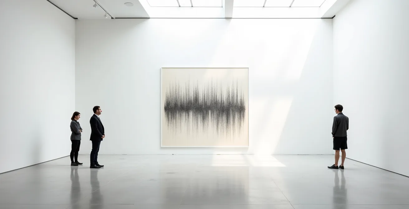
As this gallery scene depicts, the artwork’s perception is entirely dependent on the viewer’s position. The ability of an artist to create a work that functions beautifully on these multiple visual levels—the detailed micro-level and the tonal macro-level—is a profound indicator of mastery. It shows they are not just drawing lines, but composing an image that actively engages with the viewer’s own process of perception.
Why a 9B Pencil Creates Depth That an HB Simply Cannot Achieve?
While the title references pencils, the principle is directly applicable to the mastery of ink: creating a full range of value and texture with a single, unchangeable color. A beginner with a set of graphite pencils from hard (HB) to soft (9B) has a built-in tool for creating light and dark tones. The master of ink, however, has only one tool: pure black. Their ability to achieve a sense of profound depth and textural variety is therefore a far greater testament to their skill. They must create the *illusion* of a full tonal range through technique alone.
This is where the concept of line economy becomes a crucial criterion for judgement. Mastery is not about the quantity of lines, but the intelligence of their placement. A master can suggest a complex texture or a deep shadow with a few, well-chosen strokes, where a less experienced artist might use a frantic, dense web of ink. They combine different types of hatching—parallel, contour, basket—to create a rich visual tapestry. As The Virtual Instructor states, “The artist can choose to make marks in any manner that they choose. They may also combine linear techniques to create a variety of textures or patterns.”
When you evaluate a piece, ask yourself: does the artist use the same hatching style across the entire drawing, or do they adapt their marks to describe different surfaces? Is the shadow on a stone wall rendered with the same lines as the shadow on a silk cloth? A master like Jake Parker, creator of Inktober, demonstrates in his teachings how to focus purely on the craft of inking to make different materials feel distinct using only black ink. This ability to evoke texture and depth without the crutch of varying shades is a powerful sign of a highly developed artistic sensibility.
Can Digital Tablets Replicate the Chaos of Spilled Ink on Paper?
The rise of digital art has brought incredible tools for convenience and correction, but it has also highlighted what makes traditional ink work so compelling: its unforgiving nature. A digital artist has an “undo” button. An ink artist has only foresight and a steady hand. Every mark is permanent. This fundamental difference is a key factor in the value and appreciation of a traditional ink drawing. The inherent risk imbues every line with a sense of weight and intention.
As illustrator Jake Parker puts it, despite the versatility of digital tools, sometimes “you just want to lay down some old school ink on some plain ol’ paper.” This isn’t just nostalgia; it’s an acknowledgment of a different creative process. The inability to erase forces a level of mindfulness and deliberation that is palpable in the final work. You are not just seeing an image; you are seeing the record of a confident performance, where each stroke was placed with care and commitment. This “thoughtfulness,” as described by professional artists, is a direct result of the medium’s irreversibility.
Can a digital tablet replicate the texture of ink, the bleed on paper, or even the chaos of a spill? To a degree, yes. But it cannot replicate the psychological state of the artist working without a safety net. When you look at a complex, traditionally inked piece, you are witnessing the culmination of countless hours of practice that allow the artist to perform with such confidence. The value lies not just in the image, but in the evidence of the skill required to create it under such demanding conditions. The subtle tension and life in the lines come from the very real possibility of uncorrectable error, a quality that is, by its nature, absent in a digital work.
Key Takeaways
- True value in cross-hatching comes from the artist’s ability to trap light with the physical structure of ink lines, not just from line density.
- Look for the ‘perfect imperfections’—subtle variations in line weight and termination—as these are the authentic signatures of the human hand, distinct from mechanical perfection.
- Archival quality is a non-negotiable criterion for investment; ensure the work is made with permanent, pigment-based ink (like India ink) to prevent fading and color shifting.
India Ink Washes: Why Black Ink Art Has Remained Timeless for Centuries?
The tradition of drawing with black ink is ancient, and its appeal is enduring. From master etchings to contemporary illustrations, the stark contrast of black on white possesses a timeless power and clarity. The cross-hatching technique is a direct descendant of the engraving and etching traditions, where artists had to create tone and form through linear means. This historical lineage lends a sense of gravitas and permanence to the art form. The finished appearance is clean and definitive, a quality that has been prized by artists and collectors for centuries.
A key part of this timeless appeal is the “controlled, high-contrast image” that results, as The Virtual Instructor notes. Preliminary pencil sketches can be completely erased after the ink has dried, leaving behind nothing but the artist’s final, confident marks. This creates an object of profound finality and clarity. Today, artists like Bryan the Girl continue this legacy, traveling the world and applying techniques rooted in art history to contemporary subjects. Her work, featured by major art suppliers like Blick and Sakura, is proof that this traditional skill remains highly relevant and valued in the modern art world.
As a collector, when you acquire a masterfully cross-hatched piece, you are not just buying an image. You are becoming a custodian of a skill that has been refined over generations. You are investing in a tradition that values patience, precision, and the courage to make a permanent mark. The enduring appeal of black ink art lies in its honesty, its technical demand, and its direct connection to a long and rich history of mark-making.
By applying these critical criteria—from analyzing the optical physics of the lines to verifying the archival nature of the materials—you can elevate your eye from that of a casual observer to a true connoisseur. The next time you stand before an ink drawing, you will be equipped to see the full depth of the artist’s skill, intention, and mastery.