The enduring appeal of India ink art for collectors stems not just from its minimalist beauty, but from its verifiable, centuries-long permanence rooted in stable carbon chemistry.
- Pigment-based India ink offers unparalleled lightfastness due to its inert carbon structure, unlike modern dye-based inks which can fade dramatically within years.
- The medium’s true character emerges from the unpredictable interaction of ink and paper—a “controlled chaos” that digital tools can only simulate, not genuinely replicate.
Recommendation: For collectors, true value lies in understanding these material properties, from identifying waterproof shellac binders to employing proper archival framing to mitigate humidity effects.
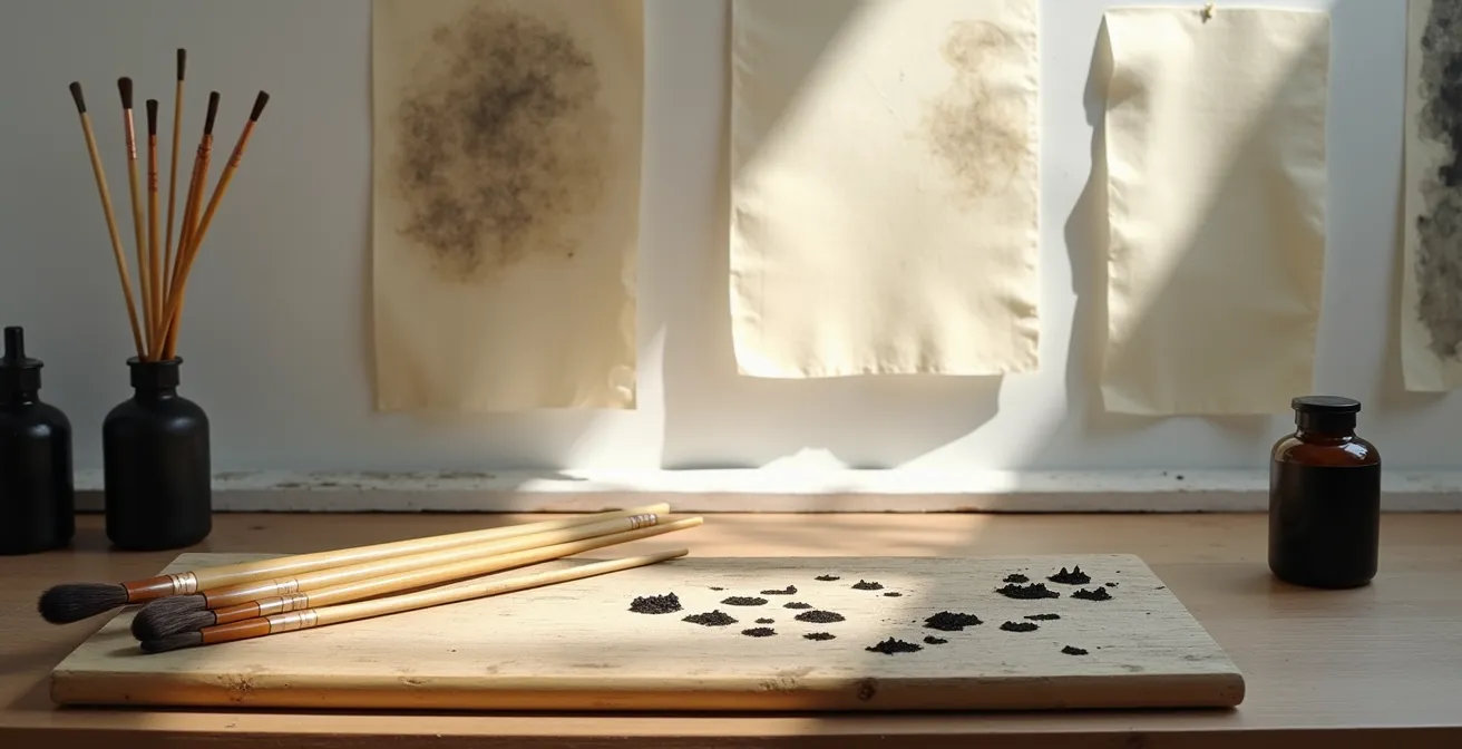
The legacy of India ink, or *sumi-e* in the Japanese tradition, stretches across dynasties and continents. For the discerning collector, its appeal is not merely in the stark, minimalist aesthetic it so often produces, but in a more profound quality: its endurance. In a world of fleeting digital images and fugitive colors, an artwork rendered in true India ink is a statement of permanence. It is a physical record not just of an artist’s vision, but of a unique material dialogue governed by immutable principles of chemistry and physics.
Many discussions around the medium touch upon its waterproof nature or the need for heavy paper, but these are merely symptoms of a deeper truth. The real mastery, and thus the true value for a collector, lies in understanding the *why* behind these properties. It is in appreciating the chemical stability of carbon pigment, the fluid dynamics of water on cellulose fibers, and the philosophical weight of empty space. This is not just about creating an image; it is about collaborating with materials that have an inherent character and memory.
This guide moves beyond the surface-level appreciation of black ink art. We will explore the scientific foundations of its longevity, the subtle signs that distinguish a masterwork from a fleeting imitation, and the practical considerations for preserving these treasures. Understanding this dialogue between artist, material, and chance is the key to recognizing why this ancient art form has remained, and will remain, timeless.
To fully grasp the nuances of this remarkable medium, this article explores the key characteristics that define its quality, permanence, and unique artistic challenges. The following sections provide a comprehensive overview for the dedicated collector.
Summary: A Deep Dive into the Enduring Qualities of India Ink
- Why India Ink is Lightfast for 100+ Years Unlike Modern Dye Markers?
- The Dye-Based Ink Error: Why Your Drawing Might Turn Purple in 5 Years
- How to Tell if It’s Waterproof India Ink or Re-Soluble Watercolor?
- Why Gouache Can Be Layered Light over Dark Unlike Traditional Watercolor?
- Cross-Hatching Technique: How to Judge the Quality of an Ink Drawing?
- Can Digital Tablets Replicate the Chaos of Spilled Ink on Paper?
- Why Empty Space (Ma) is as Important as the Ink in Wash Painting?
- The Buckling Problem: Why Your Ink Wash Art Looks Wavy in the Frame
Why India Ink is Lightfast for 100+ Years Unlike Modern Dye Markers?
The primary reason for India ink’s extraordinary longevity lies in its fundamental composition. Unlike modern markers that rely on synthetic dyes, true India ink is a pigment-based medium. The black pigment is carbon black, often derived from soot (historically, pine soot or oil lamp soot), suspended in a binder. This is not a trivial distinction; it is the very source of its archival quality. Carbon is a chemically inert element. Its particles are physically robust and too large to be broken down by the ultraviolet (UV) photons in sunlight.
Dye-based inks, conversely, derive their color from complex organic molecules called chromophores. These molecules are inherently unstable. As Wikipedia explains in its article on lightfastness, UV radiation breaks the chemical bonds of these chromophores, causing them to lose their ability to absorb light and thus, their color. This process is irreversible and leads to the familiar fading, or in some cases, a complete color shift in the artwork.
The difference is not theoretical. Rigorous testing confirms this dramatic gap in permanence. Professional artists’ materials are rated on the ASTM D4303 scale, where carbon-based India ink consistently achieves a lightfastness rating of I (Excellent). A real-world test conducted by artist Jay Perry powerfully illustrates this: traditional India ink remained unchanged after more than a year of light exposure, while a popular dye-based “graphite” ink faded beyond recognition. For a collector, this chemical inertia is the ultimate guarantee that the artwork will retain its intended contrast and form for generations.
The Dye-Based Ink Error: Why Your Drawing Might Turn Purple in 5 Years
Choosing an ink based on its initial appearance can be a costly mistake for both artists and collectors. The allure of a vibrant, smooth-flowing dye-based ink is often a trap, leading to what can be termed the “dye-based ink error.” These inks are composed of what are known as fugitive colors—pigments and dyes with poor lightfastness that will inevitably fade, shift, or even disappear when exposed to light over time.
The industry standard for measuring this is the Blue Wool Scale (BWS), where a rating of BW 7-8 signifies excellent lightfastness. A work created with such pigments should take over 150 years of typical indoor light exposure to fade. However, many dye-based inks fall into the BW 1-3 range, meaning noticeable fading can occur in as little as two to five years, sometimes even faster with direct sun exposure. The fading is not always uniform; some colors degrade faster than others, causing a drawing to shift hue, often turning a dull brown or purple as the less stable dye components break down first.
The window test mentioned previously, where a Robert Oster Graphite dye-based ink faded completely, serves as a stark case study. While the ink may have looked beautiful upon application, its lack of a stable pigment structure doomed it from the start. This is why a collector must look beyond the immediate visual appeal and inquire about the materials used. An artwork’s value is intrinsically tied to its longevity, and the use of fugitive, dye-based inks represents a fundamental flaw that compromises its very existence as a long-term piece of art.
How to Tell if It’s Waterproof India Ink or Re-Soluble Watercolor?
For a collector, distinguishing between a waterproof and a non-waterproof ink is crucial, as it speaks to the artist’s technique and the work’s stability. The key difference lies in the binder. Waterproof India ink contains a shellac binder. When the ink dries, the shellac hardens into a permanent, water-resistant film, locking the carbon pigment to the paper. This allows an artist to apply subsequent washes of watercolor or diluted ink without disturbing the initial line work.
In contrast, traditional non-waterproof inks (like those derived from Chinese ink sticks) or black watercolor use a watersoluble binder like gum arabic. When water is applied, even after drying, the ink will re-dissolve and can be lifted or blended. While this offers unique artistic possibilities, it also means the work is more vulnerable to moisture damage. An experienced collector can perform a simple test on a discreet corner of a study or test piece. Once the ink is fully dry, gently rubbing the area with a damp cotton swab will reveal its nature. If the pigment lifts and smudges, it is re-soluble. If it remains crisp and unaffected, it is waterproof.
Labels and branding can also provide clues. A mention of “shellac binder” on the ink’s specifications is a clear indicator of its water-resistant properties. For instance, the iconic spider logo on a bottle of Winsor & Newton Drawing Ink specifically denotes the waterproof formulation. This knowledge allows a collector to better understand the layers and techniques used in a piece and assess its inherent resilience.
Why Gouache Can Be Layered Light over Dark Unlike Traditional Watercolor?
Understanding the properties of adjacent media like gouache is essential for appreciating the full range of techniques available in ink-based art. While traditional watercolor is transparent, allowing light to pass through the pigment and reflect off the white paper, gouache is intentionally opaque. This fundamental difference is why an artist can layer light colors over dark with gouache—a feat impossible with watercolor.
The reason for this opacity is twofold. First, gouache has a much higher pigment-to-binder ratio than watercolor. Second, and more importantly, it includes an inert white filler, such as chalk or, in modern formulations, titanium white. As explained by art material experts, this dense combination of high pigment load and filler physically blocks light from passing through the paint layer. Instead of a translucent stain, gouache creates an opaque, matte film that covers whatever is beneath it.
This property allows for a fascinating interplay with India ink, where gouache can be used as a liquid masking fluid. An artist can paint areas with white gouache to preserve the white of the paper, then apply a black India ink wash over the entire piece. Once the ink is dry, the gouache can be gently rubbed off, revealing the stark white shapes beneath the black ink. This technique gives the artist incredible control over negative space and sharp-edged forms, a hallmark of sophisticated ink work.
Action Plan: Identifying Advanced Gouache and Ink Techniques
- Observe the whites: Check if the sharpest white areas in a composition show the subtle, matte texture of gouache, indicating its use as a mask rather than simply unpainted paper.
- Examine the edges: Note where solid black ink meets a perfectly preserved shape; this often signals that the ink was washed over a gouache-protected area.
- Look for metallic interactions: In mixed-media pieces, see if India ink has been applied over gold or other metallic inks, as it adheres well and creates unique textural effects.
- Assess textural remnants: In some cases, faint traces or a slight textural difference where the gouache was rubbed off can be detected under close inspection, revealing the artist’s process.
- Understand the composition: Recognize that any area not painted with gouache in this technique will become solid black, a deliberate compositional choice by the artist.
Cross-Hatching Technique: How to Judge the Quality of an Ink Drawing?
Beyond the choice of materials, the quality of an ink drawing is judged by the artist’s control over their mark-making. One of the most revealing techniques is cross-hatching, which involves building tone and form through overlapping sets of parallel lines. In the hands of a master, this is not a mechanical process but a highly expressive one. The quality of cross-hatching can be judged by several factors: the consistency of line, the clarity of form, and the control of line weight.
A skilled artist uses variable pressure to create lines of different thicknesses, a quality known as “line weight.” This allows them to suggest light, shadow, and texture with remarkable efficiency. Thicker, darker lines can suggest an object is closer or in shadow, while fine, delicate lines can describe a distant or light-struck surface. The precision required is immense; the artist must maintain a consistent angle and spacing while adjusting pressure with each stroke. This level of control, especially with the unforgiving nature of India ink, is a clear indicator of experience and skill.
As noted by professionals, this technique adds not just tone but also texture and depth, making the drawing visually dynamic. Judging the quality involves looking at how the lines wrap around a form. Do they feel flat, or do they successfully describe the three-dimensional volume of the subject? Is there a confident variation in line weight, or are the marks monotonous? A high-quality ink drawing will exhibit a sense of rhythm and structure in its hatching, where every line feels intentional and contributes to the overall form.
Can Digital Tablets Replicate the Chaos of Spilled Ink on Paper?
A common debate in the art world is whether digital tools can truly replicate traditional media. While software has become incredibly sophisticated, it fundamentally cannot reproduce the “controlled chaos” that is the soul of ink wash painting. Digital tools are programmatic; they operate on algorithms designed to simulate effects. An ink wash, however, is a physical event governed by fluid dynamics, capillary action, and the unique topography of each sheet of paper.
When wet India ink meets paper, a complex and unrepeatable dialogue begins. The ink spreads through the cellulose fibers, creating fractal-like patterns. Water tension creates organic “blooms” with delicate, cauliflower-like edges where pigment concentration varies. The sizing on the paper creates microscopic channels that guide the ink in unpredictable ways. As a China Artlover article notes, “Ink wash paintings are often improvised works… hard to copy or reproduce.” This is not an artistic choice so much as a physical reality. Each piece is a unique record of a fleeting moment of interaction between liquid and solid.
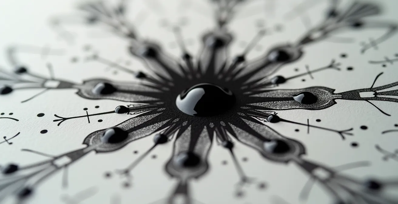
Digital brushes can simulate these blooms and textures, but they are simulations of an *outcome*. They cannot replicate the *process*. The artist working digitally chooses a “bloom” effect from a menu. The artist working with real ink coaxes the bloom into existence, reacting to its spontaneous formation. This element of chance, this collaboration with the material, is precisely what gives the medium its vitality. A digital work can be perfectly reproduced; an ink wash is, by its very nature, a singular artifact.
Key Takeaways
- Permanence is chemical: India ink’s longevity comes from inert carbon pigment, unlike degradable dye-based inks.
- Waterproof vs. Soluble: The presence of a shellac binder determines if an ink is waterproof, a key detail for collectors.
- Material dialogue: The unique, unrepeatable effects of ink on paper are a result of physics (capillary action, humidity) that digital tools can only simulate, not replicate.
Why Empty Space (Ma) is as Important as the Ink in Wash Painting?
In the tradition of East Asian ink painting, the unpainted areas of the paper are not merely a background; they are an active and essential component of the composition. This concept is known as Ma (間) in Japanese art, which can be translated as “gap,” “space,” or “pause.” It refers to the artistic interpretation of empty space, and its mastery is as crucial as the brushstroke itself. Ma is the eloquence of absence.
Unlike Western art traditions that often seek to fill the entire canvas, ink wash painting embraces emptiness as a positive form. The stark white of the paper provides the ultimate contrast, making every black mark more potent and deliberate. It allows the viewer’s eye to rest and their mind to engage, filling in the details and completing the scene. A few deft strokes suggesting a bird in flight are made more powerful by the vast, empty sky that surrounds them. The negative space defines and gives shape to the positive space.
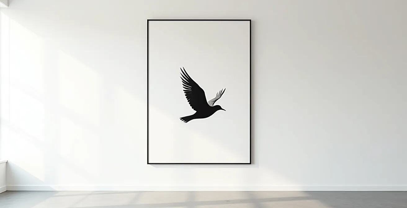
For a collector, judging the use of Ma is a way to assess an artist’s sophistication. Is the empty space just leftover paper, or does it feel intentional and balanced? Does it create a sense of breath, depth, and atmosphere? As one guide suggests, an artist can “embrace the concept of negative space” to create interesting forms and allow the “stark contrast of the ink to stand out.” The skillful balance between the inked and un-inked parts of the paper is what creates rhythm, harmony, and a sense of quiet contemplation, which are the hallmarks of a masterful ink painting.
The Buckling Problem: Why Your Ink Wash Art Looks Wavy in the Frame
One of the most common and distressing issues for collectors of works on paper is buckling—the wavy or warped appearance that can develop over time. This is not a sign of a flawed artwork but a natural consequence of the material’s properties. Paper is a hygroscopic material, meaning it absorbs and releases moisture from the environment. As the relative humidity and temperature change, paper expands and contracts.
The issue is compounded in ink wash art, where large amounts of water are applied to the paper. This causes the paper fibers to swell significantly. As the paper dries, it shrinks, but not always uniformly. This process can weaken the paper’s structure and create internal stresses, resulting in the characteristic waves. When the artwork is then placed in a frame, these humidity-driven expansions and contractions continue. If the art is taped down on all four sides, the paper has no room to move, and the stress manifests as buckling.
Proper archival framing is the solution. A key method is to avoid taping all edges. Instead, the artwork should be “hinged” at the top, allowing it to hang freely behind the mat board. The use of frame spacers is also critical, as they create an air gap between the artwork and the glazing (glass or acrylic). This allows for air circulation, helping to buffer against rapid humidity changes. Understanding paper’s reaction to its environment is essential for its long-term preservation.
The choice of paper itself also plays a role. Heavier, thicker papers tend to resist warping better, while certain resin-coated papers are also known for their stability. A collector should always inquire about the framing methods used to ensure the piece is protected against this inevitable material dialogue with its environment.
By understanding the deep material science and artistic disciplines behind India ink art, a collector can move beyond simple appreciation to a state of true connoisseurship. Evaluating an artwork with this knowledge transforms the act of viewing into a richer, more informed dialogue with the piece and its creator’s intent.