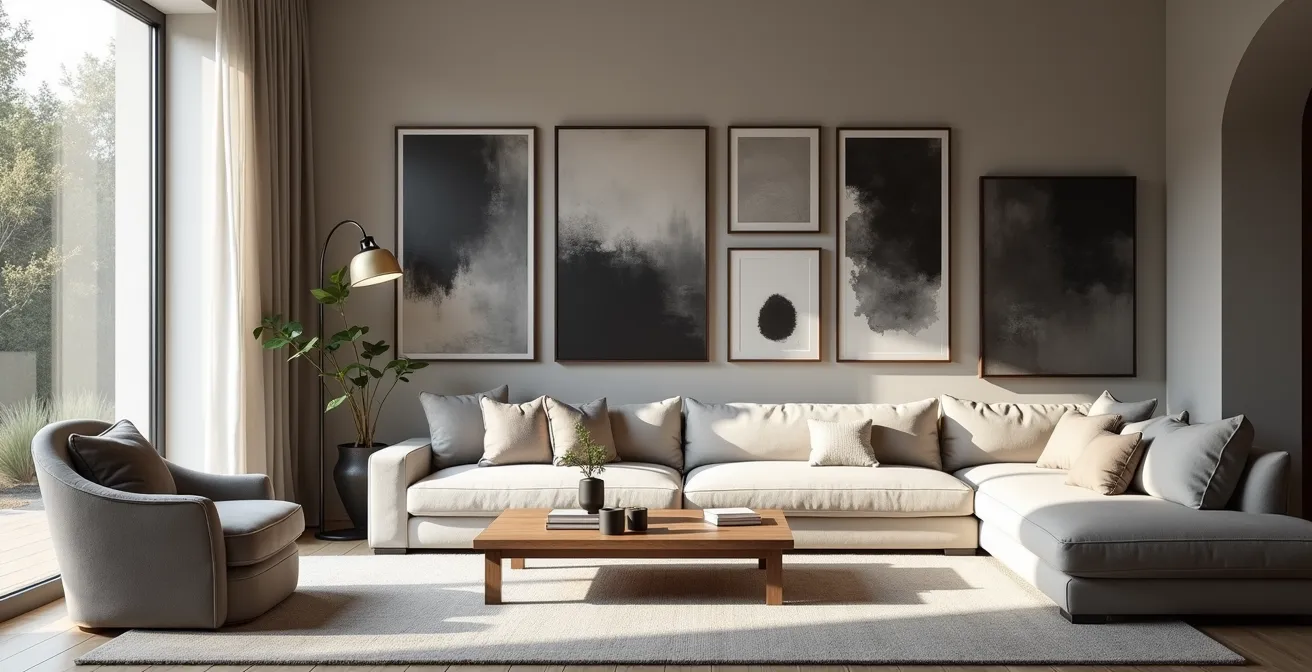
The shift to matte surfaces is not a fleeting trend, but a deliberate choice for sensory calm and intellectual depth in our living spaces.
- Matte finishes absorb light rather than reflecting it, reducing “visual noise” and allowing for a more stable, contemplative viewing experience.
- The authenticity of a matte surface lies in its “material honesty,” revealing the true texture of pigments and mediums without a distorting layer of gloss.
Recommendation: Embrace the anti-gloss aesthetic by considering not just the look of an artwork, but its interaction with light and its contribution to the overall sensory environment of your space.
In the world of interior design, a quiet revolution is underway. For decades, gloss, sheen, and high-polish finishes were the undisputed emblems of luxury and newness. From lacquered furniture to high-gloss photography, reflective surfaces promised glamour and vibrancy. Yet, look around today’s most thoughtfully curated spaces, and you’ll notice a distinct shift in the opposite direction. A profound and sophisticated aesthetic is taking hold: the matte form. This is more than a fleeting trend; it represents a fundamental change in our relationship with the objects and images that surround us, a collective yearning for what can be described as sensory quiet.
The common discourse often frames this as a simple preference for a “modern” or “minimalist” look. While true, this observation barely scratches the surface. The move towards non-reflective art and decor is not merely stylistic; it is psychological. In a world saturated with the incessant glow of screens and the visual clamor of polished surfaces, matte objects offer a point of visual respite. But why is this calming effect so powerful? And what are the practical implications of inviting these often-delicate surfaces into our homes?
The truth is, the anti-gloss aesthetic is a conscious choice that engages with the physics of light, the science of preservation, and the philosophy of space. It asks us to look deeper, beyond the initial impression, to appreciate the “material honesty” of an object. This article will deconstruct the matte phenomenon, moving from the practical science of its visibility and care to the profound philosophical principles it embodies. We will explore why a surface that absorbs light is paradoxically so illuminating, and how to master its presence in your own interior landscape.
This guide offers a comprehensive look into the world of matte aesthetics. We will delve into the science of its visibility, the art of its maintenance, and the subtleties that distinguish authentic finishes from artificial ones, helping you make informed and inspired choices for your space.
Summary: The Enduring Appeal of the Non-Reflective Surface
- Why Matte Art Is Visible from Any Angle Regardless of Window Placement?
- How to Clean a Matte Painting Without Creating Shiny Spots by Rubbing
- Natural Matte Paint or Matting Agent Varnish: Which Looks More Authentic?
- The Scuff Mark Issue: Why Touching Matte Black Art Leaves Permanent Oils
- Standard Glass or Museum Glass: Which Preserves the Matte Look Better?
- Hand-Painted Matte or Inkjet Matte: Can You Tell the Difference?
- Why Empty Space (Ma) is as Important as the Ink in Wash Painting?
- Precise Charcoal Arrangements: How to Preserve the Most Fragile Medium in Art?
Why Matte Art Is Visible from Any Angle Regardless of Window Placement?
The primary functional advantage of a matte surface is its relationship with light. Unlike a glossy finish, which acts like a mirror creating specular reflection (a sharp, bright glare from a light source), a matte surface produces diffuse reflection. Its microscopically uneven texture scatters light in all directions. The result is a soft, even illumination across the entire artwork, free from the distracting “hotspots” of glare. This is why a matte painting hung opposite a bright window remains perfectly legible and visually consistent, whether you are standing directly in front of it or viewing it from the side of the room.
This quality is fundamental to achieving sensory quiet. A glossy picture forces the viewer to physically adjust their position to avoid reflections, creating a constant, subconscious negotiation with the environment. The artwork’s message is intermittently obscured by the room itself—a reflection of a lamp, a window, or even the viewer. A matte surface eliminates this visual noise. It is stable, constant, and democratically visible from nearly any vantage point. This stability allows the artwork to exist as a pure object of contemplation, its integrity uncompromised by the transient conditions of the space it inhabits.
The preservation of this viewing quality is a primary concern in museum curation. The Louvre’s display of the Mona Lisa, for example, is a masterclass in light management. Since 2005, it has been housed in a climate-controlled, bulletproof enclosure with lighting precisely engineered to eliminate reflection, ensuring every visitor can experience the work’s subtle details without interference. This level of control demonstrates the core principle: to truly see the art, one must first control the light, a task at which matte surfaces inherently excel.
How to Clean a Matte Painting Without Creating Shiny Spots by Rubbing
The very texture that gives matte art its desirable visual properties also makes it notoriously difficult to clean. The microscopic peaks and valleys that scatter light are also perfect traps for dust and airborne particles. The greatest danger, however, is not the dirt itself, but the cleaning process. Rubbing a matte surface, even with a soft cloth, can flatten its microscopic texture. This action, known as burnishing, creates a smoother area that reflects light specularly, resulting in a permanent, unsightly shiny spot.
Therefore, the cardinal rule of cleaning matte art is to avoid friction at all costs. Conservators employ a multi-step, “less is more” approach that prioritizes no-touch methods first. The initial goal is to dislodge loose particles without ever making contact with the surface. Canned air (held at a safe distance to avoid propellant spray) or a low-power, cool-air blower can effectively remove most surface dust. Only if this fails should one escalate to the lightest possible touch.
This introductory paragraph sets the stage for the specific cleaning techniques. The illustration below demonstrates the critical ‘dabbing’ motion required for more stubborn spots, emphasizing the absence of any rubbing or wiping action.
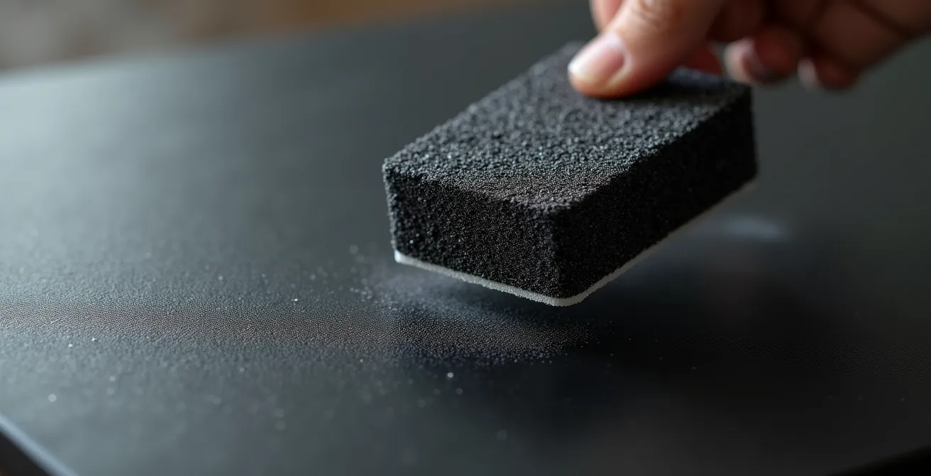
For persistent dust that air alone cannot move, a gentle ostrich feather duster or a high-quality, dry microfiber cloth can be used with minimal pressure. For more stubborn grime, specialized tools like dry cleaning art sponges (such as Absorene) are the professional’s choice. These should be used with a gentle dabbing or blotting motion only—never a wiping or scrubbing action. Ultimately, the best strategy is preventative. Placing matte art away from kitchens, using air purifiers, and maintaining stable humidity levels will significantly reduce the need for cleaning and preserve the integrity of the finish.
Natural Matte Paint or Matting Agent Varnish: Which Looks More Authentic?
The authenticity of a matte finish is a subtle but critical aspect for designers and collectors. A matte appearance can be achieved in two primary ways: intrinsically, through the formulation of the paint itself, or extrinsically, by applying a matting agent varnish over a finished piece. While both reduce gloss, they offer distinctly different visual and tactile experiences. A natural matte paint, such as gouache, tempera, or modern acrylics with a high pigment-to-binder ratio, derives its lack of sheen from its very composition. The pigment particles are not fully encased in a smooth, reflective binder, resulting in an inherently porous and light-scattering surface.
This method offers the highest degree of material honesty. The color you see is raw and unadulterated, presented without the slight haze or desaturation that a topcoat can impart. It connects the artwork to ancient traditions like fresco and egg tempera, where matte was not a stylistic choice but a chemical reality. A matting agent varnish, by contrast, is a modern solution. It contains microscopic solids (like silica or wax) suspended in a clear medium. When applied, these particles create a new, textured top layer that diffuses light. While highly effective and offering better protection, this approach can sometimes feel like a filter, creating a uniform, manufactured low-sheen finish rather than an organic matte quality.
The following table, based on an analysis of various finishing characteristics, breaks down the key differences between these two approaches.
| Characteristic | Natural Matte Paint | Matting Agent Varnish |
|---|---|---|
| Light Reflection | Organic, variable matte quality | Controlled, uniform low-sheen finish |
| Surface Structure | Intrinsic matte from pigment-binder fusion | External matte layer applied on surface |
| Gloss Units (GU) | 2-10 GU (variable) | 5-15 GU (consistent) |
| Color Appearance | Raw, unadulterated pigment presentation | Slight haze effect, subtle desaturation |
| Historical Connection | Links to fresco, tempera traditions | Modern scientific approach |
Ultimately, the choice depends on the artist’s intent and the viewer’s priorities. For absolute pigment purity and a connection to historical techniques, natural matte paint is unparalleled. For durability and a consistent, predictable finish, a matting varnish is a practical and effective modern compromise.
The Scuff Mark Issue: Why Touching Matte Black Art Leaves Permanent Oils
The allure of matte black is potent; it is the ultimate expression of light absorption. Yet, this very quality makes it exceptionally vulnerable. When a finger touches a matte black surface, it’s not dirt that leaves the mark, but oil. The natural oils from our skin transfer to the artwork and fill in the microscopic pores of the finish. This oil-filled area becomes smoother than the surrounding surface, creating a subtle but permanent dark or shiny spot. It is, in effect, a localized burnishing. This phenomenon of haptic vulnerability is the paradox of matte art: its visual softness invites touch, but touch is its greatest threat.
This vulnerability underscores the importance of a holistic approach to art preservation that goes beyond just light. While light damage is a major concern, it is not the only factor. A study referenced by the National Fenestration Rating Council indicates that only 40% of artwork fading is caused by UV radiation. The remaining 60% is attributed to factors like visible light, humidity, pollutants, and, crucially, physical interaction. The permanent mark from a single touch can be more visually disruptive than years of gentle light exposure.
The preservation efforts for historical documents provide a compelling case study. To protect the Declaration of Independence, the US Library of Congress engaged in extensive research, ultimately encasing it behind special yellow Plexiglass that filters both UV and blue spectrum light. This demonstrates an extreme commitment to controlling environmental factors. However, even with such advanced materials, the fundamental vulnerability of the surface to physical contamination remains. For matte artworks in a home, this translates to a simple but non-negotiable rule: create a no-touch zone. This is not about being precious; it is a practical measure to preserve the artwork’s intended aesthetic and its profound, uninterrupted quiet.
Standard Glass or Museum Glass: Which Preserves the Matte Look Better?
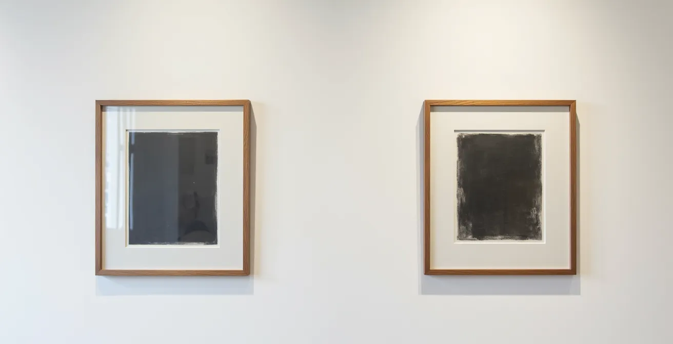
Framing a matte artwork presents a dilemma. You want to protect its delicate surface from dust, humidity, and touch, but placing it behind standard glass introduces the very problem the matte finish was chosen to solve: reflection. Standard picture framing glass can reflect 8% or more of ambient light, creating a mirror-like barrier that reintroduces visual noise and obscures the artwork’s texture and color. This effectively negates the core benefit of the matte aesthetic. The solution to this paradox lies in a technologically advanced product: Museum Glass.
This specialized glazing is engineered with an anti-reflective coating that disrupts light waves. The technology is remarkable; as one leading manufacturer, Tru Vue, explains, they use a “proprietary inorganic, silica-based UV blocking coating with a matte-finish, which is ‘baked’ into the glass producing a permanently bonded coating.” This process allows high-quality Museum Glass to achieve less than 1% of total light reflection, making the glass itself virtually disappear. The artwork appears more vibrant and detailed than it would even with no glazing at all, because the glass also enhances contrast.
This side-by-side comparison starkly illustrates the difference. On the left, standard glass obscures the art with harsh reflections. On the right, Museum Glass provides a crystal-clear, reflection-free view that honors the matte surface beneath.
Beyond clarity, Museum Glass offers another crucial benefit: UV protection. The best products block approximately 99% of harmful UV radiation, the primary culprit behind fading and material degradation over time. However, as conservation specialists often note, this technology is not a standalone solution. As one expert from Wonderful Museums points out in their cost analysis, “Museum glass cost is just one component of a holistic preservation strategy… Using non-archival mats, even with museum glass, defeats part of the preservation purpose.” For the matte look to be truly preserved, the entire framing package—from the mat and backing board to the glazing—must be of archival quality.
Hand-Painted Matte or Inkjet Matte: Can You Tell the Difference?
As digital printing technology has advanced, the line between a hand-painted matte work and a high-quality inkjet (or Giclée) print has become increasingly blurred. A premium Giclée print on archival matte paper like those from Hahnemühle or Canson can replicate the depth and non-reflective quality of a painting with astonishing fidelity. For the non-expert eye, distinguishing between the two can be a significant challenge. However, for a trained observer, there are several subtle clues that reveal the work’s origin.
The most telling signs are found at the micro-level. A hand-painted piece will almost always exhibit minute physical variations. Brush strokes, even if subtle, create micro-variations in surface height that can be detected by viewing the artwork at a sharp angle with a raking light. Pigments applied by hand may show subtle “edge bleed” where they meet, or a slightly thicker pooling in certain areas. An inkjet print, by contrast, is fundamentally uniform. Under magnification with a loupe, the image resolves into a microscopic dot matrix (dithering), a tell-tale sign of its digital creation. The texture you feel is that of the paper, not of the applied medium.
Even professional artists now move fluidly between digital and traditional tools, as noted by matte painting artist Josu Solano, who described a process of “playing with images until I decided which ones were producing the most exciting image look” for a polished 2D matte painting. This blending of techniques makes definitive identification even more complex. The following checklist provides a framework for a more critical examination.
Your Verification Checklist: Identifying Hand-Painted vs. Inkjet Art
- Examine Edges: Look for the organic ‘pooling’ of hand-applied pigments versus the precise, microscopic dot pattern (dithering) characteristic of inkjet prints.
- Analyze Surface with Raking Light: View the artwork at a sharp angle. Do you detect micro-variations in height from brush strokes, or is the surface perfectly uniform?
- Use Magnification: Employ a jeweler’s loupe or magnifying glass to search for a uniform dot matrix (inkjet) versus the random, organic distribution of pigment particles (hand-painted).
- Assess Material Presence: A hand-painted work often has a unique physical history and presence, with subtle variations in paint mixture and application that a print cannot replicate.
- Consider Modern Capabilities: Acknowledge that high-end Giclée prints on textured fine art paper can now mimic the depth of hand-painted works, making a definitive call sometimes difficult without expert consultation.
Why Empty Space (Ma) is as Important as the Ink in Wash Painting?
In Japanese aesthetic philosophy, there is a concept of profound importance: Ma (間). It is often translated as “negative space,” but this translation is incomplete. Ma is not an empty void; it is an intentional, active, and meaningful interval. In a composition, it is the space between objects, the pause between notes, the silence that gives shape to sound. In traditional ink wash painting (sumi-e), Ma is as crucial as the ink itself. The unpainted paper is not merely a background; it is an integral part of the artwork that shapes, balances, and gives power to the painted elements.
The matte aesthetic is uniquely suited to honor the principle of Ma. As one expert in Japanese art philosophy astutely observes, “In a glossy artwork, reflections on the surface create ‘visual noise’ that competes with intentional empty space. A matte surface, by absorbing light and staying quiet, honors the ‘Ma’ and allows the composition to breathe.” The reflective surface of a glossy print or painting can superimpose a layer of unintended information—the room, the viewer, the light—onto the artwork’s intentional empty space, thereby violating its integrity. A matte surface protects the sanctity of Ma, ensuring that the empty space remains purely compositional.
This ancient principle has found a surprisingly modern application in the design of contemporary digital art displays, such as Samsung’s The Frame TV. When not in use, these devices display artwork on a specialized matte screen. As a case study on their use in modern interiors reveals, the combination of a matte finish and the ability to choose minimalist compositions actively leverages the concept of Ma. The non-reflective screen, which maintains its aesthetic from viewing angles up to 178 degrees, allows the “empty” space within a digital artwork to function as a calming, deliberate design element on the wall, rather than appearing as a black, reflective mirror when turned off.
Key Takeaways
- The matte aesthetic is a conscious choice for “sensory quiet,” reducing the visual noise common with glossy, reflective surfaces.
- Preserving a matte finish requires specific no-friction cleaning methods and, ideally, protection with anti-reflective, UV-filtering museum glass.
- The value of a matte surface lies in its “material honesty” and its ability to honor compositional principles like the Japanese concept of Ma (intentional space).
Precise Charcoal Arrangements: How to Preserve the Most Fragile Medium in Art?
Charcoal is perhaps the purest and most fragile expression of the matte aesthetic. Its velvety, deep black is the result of pure carbon particles resting delicately on the surface of the paper. There is no binder to hold them in place, which gives charcoal its unique softness and blendability, but also its extreme fragility. The slightest touch can smudge it, and static charge from glazing can even lift particles directly off the paper. Preserving a charcoal drawing is therefore an act of creating a perfectly stable and untouched micro-environment for an inherently ephemeral medium.
The most critical step is to ensure the artwork’s surface never touches the glazing (the glass or acrylic). This is achieved by using deep mats or spacers to create a “shadow box” effect. This air gap not only prevents smudging from direct contact but also mitigates the risk of static pull. All materials used in this process, from the matting to the backing board, must be of archival quality—acid-free and lignin-free—to prevent chemical degradation of the paper over time.
The question of using a fixative is a contentious one among artists and conservators. While a workable or final fixative can help prevent smudging, it is not without compromise. The spray invariably alters the artwork by slightly darkening the charcoal, reducing the subtlety of its value shifts, and adding a slight sheen that can compromise the very velvety matte quality that makes the medium so appealing. For museum-level display, many conservators opt to forego fixative entirely, relying solely on a perfectly constructed framing environment. This approach embraces the medium’s fragility as part of its intrinsic value, a testament to its haptic vulnerability.
Embracing the matte aesthetic is ultimately an act of curation—not just of objects, but of your sensory environment. It is a choice to prioritize a calm, contemplative atmosphere over one of visual stimulation. By understanding the properties and needs of these quiet surfaces, you can integrate their profound and subtle beauty into your space with confidence and care. To apply these insights, begin by observing the interplay of light and surface in your own home.
Frequently Asked Questions About the Matte Form Aesthetic
Should I use fixative on charcoal artwork?
While fixatives prevent smudging, they invariably alter the art by darkening the charcoal, reducing subtle value shifts, and adding slight sheen that compromises the velvety matte quality unique to charcoal.
What causes static charge damage to charcoal art?
Static charge from acrylic or glass can literally pull loose charcoal particles from the paper, which is why proper spacing with shadow box framing is essential.
Is the fragility of charcoal part of its aesthetic value?
Yes, the medium’s ephemerality is part of its beauty. The conscious act of preserving it aligns with the mindfulness of the broader anti-gloss movement.