Many believe that simply making graphics move is enough to capture attention. The reality is that engagement comes not from movement itself, but from the quality of that movement. Effective motion design is a form of applied psychology, using principles of timing, easing, and rhythm to create a “physics of feeling” that feels natural and satisfying to the human brain. This is the real secret behind visuals that don’t just get seen, but get felt.
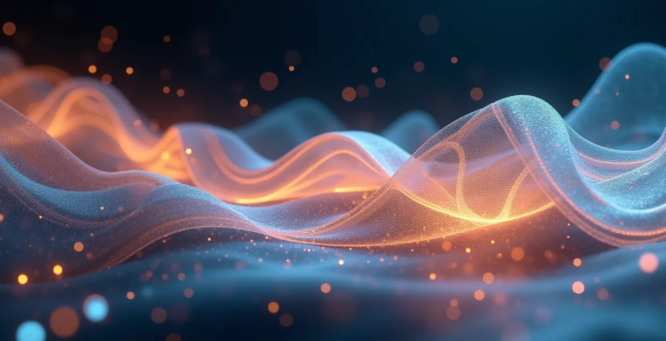
In a scrolling-obsessed world, a static image is a sitting duck. Marketers and artists know that movement is the ultimate thumb-stopper. But why? The common wisdom says, “motion grabs attention.” While true, this barely scratches the surface. We’re told to make things pop, slide, and fade, but we’re rarely told why one pop feels energetic and another feels cheap, or why a smooth slide is mesmerizing while a linear one feels amateurish. This leads to a flood of animations that are technically moving, but emotionally vacant.
The conversation often revolves around basic animation principles or software tutorials. But what if the true power of motion design wasn’t just in the keyframes, but in understanding the viewer’s brain? What if the difference between a forgettable animation and one that gets shared relentlessly lies in mastering the invisible forces of kinetic psychology? The secret isn’t just to add motion; it’s to choreograph emotion. It’s about understanding the physics of feeling, where every curve, every pause, and every acceleration is designed to trigger a specific neurological response.
This guide dives deep into that “why.” We’ll deconstruct the mechanics that make movement compelling, from the life-giving magic of “Easy Ease” to the visceral impact of syncing animation to a beat. We will explore how to choose the right tools and optimize your workflow, transforming your approach from simply animating pixels to directing a powerful visual rhythm that captivates and converts.
To navigate this deep dive into the art and science of engaging movement, here is a breakdown of the core concepts we will cover. This roadmap will guide you through the principles and practices that separate generic animation from unforgettable motion design.
Summary: The Art and Science of Engaging Movement
- Why Linear Movement Looks Robotic and How ‘Easy Ease’ Adds Life?
- How to Cut Your Animation on the Snare Drum for Maximum Impact
- After Effects or Cinema 4D: Which Tool Offers Faster Turnaround for Explainer Videos?
- The Missing Asset Error: Why You Must ‘Collect Files’ Before Sending a Project?
- How to Use Proxies to Preview Your Animation Without Waiting for Renders?
- Still Photo with Movement or Full Video: Which Holds Retention Longer?
- Why Jagged Lines Trigger Anxiety While Curves Create Calm in Composition?
- Loop Movement: Why Are Seamless GIFs So Satisfying to the Human Brain?
Why Linear Movement Looks Robotic and How ‘Easy Ease’ Adds Life?
Linear movement is the default setting of a computer, but it’s the enemy of good animation. When an object starts, moves, and stops at a constant speed, it feels unnatural, jarring, and robotic. Why? Because nothing in the real world moves this way. Real-world objects have mass and are affected by forces like gravity and friction. They need to accelerate to get going and decelerate to a stop. This concept is what animators call digital inertia.
This is where easing comes in. “Easy Ease” in software like After Effects is the digital equivalent of applying physics. It automatically creates acceleration and deceleration, making the motion feel grounded and believable. An object that eases into and out of its movement has perceived weight and intention. It’s no longer just a pixel moving from point A to B; it’s an entity behaving according to rules our brains intuitively understand. This adherence to physical laws is crucial for avoiding what animators call the “uncanny valley.” As confirmed by research on animation physics, the ‘uncanny valley’ effect is often triggered by a loss of expected physical accuracy, making something feel “off” and even unsettling.
Going beyond the default “Easy Ease,” the graph editor allows for meticulous control over these motion curves. You can create a fast, snappy entrance or a slow, graceful drift. This isn’t just a technical tweak; it’s about defining the character and emotion of the movement. A sudden stop can convey surprise or impact, while a long, slow ease can create a sense of calm or wonder. By mastering these curves, you move from being a computer operator to a choreographer of the physics of feeling.
How to Cut Your Animation on the Snare Drum for Maximum Impact
If easing gives movement its soul, then synchronizing it to sound gives it a heartbeat. The human brain is hardwired to find patterns, and the connection between what we see and what we hear is one of the most powerful. When a visual action lands perfectly on a distinct audio cue—like the sharp crack of a snare drum—it creates a moment of profound sensory satisfaction. This is the essence of creating a strong visual rhythm.
Cutting on the beat, especially on percussive hits, provides emphasis and structure to your animation. It acts as a punctuation mark, telling the viewer “pay attention to this.” Think of a product reveal where the final logo appears with a definitive “thump,” or an explainer video where a key fact is highlighted with a crisp “click.” These moments are memorable because the audio and visual elements reinforce each other. To achieve this, animators often import the audio track first and place markers on the timeline at key beats, using them as guides for their keyframes.
But great audio-visual sync is more than just hitting the beats. It’s about building anticipation. A moment before the snare hit, a subtle visual cue—a quick scale-up, a slight shake, or a preparatory bounce—can signal that something is about to happen. This principle, known as anticipation, prepares the audience and makes the final impact feel even more deliberate and powerful. It’s the visual equivalent of a drummer’s wind-up before a crash cymbal, a moment of tension that makes the release all the more satisfying.
As this visual representation suggests, the goal is to make sound and motion feel like two parts of a single entity. The most impactful animations don’t just have a soundtrack; they are visually choreographed to it. This tight integration turns a passive viewing experience into an active, almost visceral one, making the content far more engaging and memorable than visuals and audio that simply coexist.
After Effects or Cinema 4D: Which Tool Offers Faster Turnaround for Explainer Videos?
For marketers and artists diving into motion, choosing the right tool is a critical decision that impacts both the creative possibilities and the production timeline. The two industry titans, Adobe After Effects (AE) and Maxon’s Cinema 4D (C4D), are often mentioned together, but they serve fundamentally different purposes, especially for explainer videos.
After Effects is the king of 2.5D. It operates on a layer-based system, much like Photoshop with a timeline. This makes it incredibly fast and intuitive for creating character animations, kinetic typography, and animating vector graphics (like logos and icons). For the vast majority of explainer videos, which rely on moving flat shapes, text, and simple characters, AE is the faster and more efficient choice. Its tight integration with Adobe Illustrator means you can bring in assets and have them ready to animate in seconds. The philosophy is about manipulating 2D layers in a 3D space.
Cinema 4D, on the other hand, is a true 3D environment. Think of it as building a virtual diorama with models, lights, and cameras. It excels at creating complex 3D objects, realistic textures, and physical simulations (like shattering glass or flowing liquids). While you can create stunning explainer videos in C4D, the workflow is inherently more complex. Modeling, texturing, lighting, and rendering are all extra steps that add significant time to a project. For a simple explainer video, using C4D can be like using a sledgehammer to crack a nut.
The choice ultimately depends on the creative vision. If the video requires a spinning 3D logo, a photorealistic product model, or complex environmental scenes, C4D is the superior tool. However, for speed and efficiency in the world of 2D-style explainer videos, After Effects is almost always the faster path from concept to completion.
This table offers a clear breakdown of the core differences in workflow and application, highlighting why the choice of software is a strategic one.
| Aspect | After Effects | Cinema 4D |
|---|---|---|
| Philosophy | 2D layer manipulation | 3D virtual diorama approach |
| Best For | Character animation, 2D motion | Complex 3D motion, simulations |
| Learning Curve | Focused on animation principles: timings, easing, and emphasis | Requires understanding of 3D modeling, texturing, and lighting |
| Render Time | Faster for 2D content | Longer for complex 3D |
The Missing Asset Error: Why You Must ‘Collect Files’ Before Sending a Project?
There’s a dreaded error message that has haunted every motion designer, junior and senior alike: “Missing Files.” You’ve spent days crafting the perfect animation, you send the project file to a client or collaborator, and they’re met with a screen of colorful bars because the source files—images, videos, audio—are not linked. This happens because a project file (like an After Effects .aep) doesn’t contain the assets themselves; it only contains pointers to where those assets are located on your computer.
When someone else opens that file on their machine, those pointers lead to nowhere. This is where the “Collect Files” command becomes the most important, yet often overlooked, step in a professional workflow. This function acts like a super-powered packer. It analyzes your entire project, finds every single asset you’ve used (no matter how many different folders they’re in), and copies them all into one new, neatly organized folder alongside a new copy of your project file. This new project file is automatically updated to point to the assets within its own folder, making the entire package self-contained and portable.
Failing to do this is not just an inconvenience; it can grind a project to a halt, damage client relationships, and make you look unprofessional. As one professional motion design workflow study highlights, a core part of a scalable creative process involves auditing and collecting information, including “where assets lived,” to create a reliable and repeatable system. The “Collect Files” function is the practical application of that principle. It’s the final, crucial step that ensures your work can be opened, rendered, or edited by anyone, anywhere, without a single missing file error.
Your Pre-Flight Checklist: Delivering a Flawless Motion Project
- Asset Audit: Review your project panel. Are there any unused assets? Delete them to keep the final collection clean and lightweight.
- File Naming Convention: Check if all your files have clear, logical names. “Final_v3_USE_THIS.aep” is a recipe for disaster. Use a consistent system like “ProjectName_V01_YYYYMMDD”.
- Run ‘Collect Files’: In After Effects, go to File > Dependencies > Collect Files. Ensure the setting is “For All Comps” to gather everything.
- Create a ZIP Archive: Once the collection is complete, compress the entire collected folder into a single .zip file. This prevents file corruption during transfer.
- Include Render Notes: Add a simple text file (.txt) in the folder with any specific instructions, such as the main composition to render, required plugins, or contact information.
How to Use Proxies to Preview Your Animation Without Waiting for Renders?
In motion design, time is everything. Nothing kills creative momentum faster than waiting minutes for a few seconds of animation to render just to see if your timing works. This is especially true when working with high-resolution footage, complex effects, or 3D elements. The solution to this workflow bottleneck is the use of proxies.
A proxy is essentially a low-resolution stand-in for a high-resolution file. Think of it as a stunt double for your assets. Instead of forcing your computer to process a heavy 4K video file every time you hit the spacebar, you can tell After Effects to use a much smaller, lower-quality version for the preview. This allows you to scrub the timeline, adjust timing, and preview your animation in real-time or near real-time. The best part? When you’re ready for the final, high-quality export, After Effects automatically switches back to the original high-resolution files.
Creating a proxy is simple. In After Effects, you can right-click any piece of footage in your project panel and select “Create Proxy > Movie.” This will open the render queue, allowing you to export a low-resolution version (like a low-bitrate H.264 or a Draft-quality ProRes). Once rendered, a small square icon will appear next to your footage, indicating that a proxy is active. You can toggle it on and off with a click, instantly switching between speed and quality.
As one professional animator notes regarding workflow efficiency, even simple functions can be optimized. While “Easy Ease” is quick, the graph editor offers more control. The same logic applies to previews. A standard preview might suffice for simple projects, but for complex ones, proxies are essential. They give you the “control” to work efficiently without sacrificing the final quality. This workflow is a game-changer, allowing you to iterate faster, make better creative decisions, and spend more time animating and less time waiting.
Still Photo with Movement or Full Video: Which Holds Retention Longer?
The battle for attention on social media has led to a fascinating evolution in content formats. While full-scale video production is powerful, a hybrid format has emerged as a surprisingly effective contender: the cinemagraph, or a still photo with subtle, isolated movement. The question for marketers and creators is, which one truly holds a viewer’s attention longer?
Full video has the advantage of narrative potential. It can tell a story, show a process, or feature a person talking. However, its effectiveness is often front-loaded. Viewers make a snap judgment in the first 2-3 seconds to decide if they will continue watching. If the opening isn’t compelling, they scroll on. In contrast, studies demonstrate that motion-based content generates up to 400% more views than static images, but this doesn’t distinguish between formats.
This is where the cinemagraph shines with its unique psychological hook. A mostly still image with a single, looping element of movement—like steam rising from a coffee cup, wind blowing through hair, or water rippling—creates a hypnotic effect. The eye is drawn to the motion, but the brain is intrigued by the impossibility of the scene. It’s a visual puzzle that encourages longer viewing times as the user tries to process what they’re seeing. It isolates the most captivating element and lets it play in an endless, satisfying loop.
While a full video might get an initial 10-second view, a well-executed cinemagraph can hold a user’s gaze for much longer as they become mesmerized by the seamless loop. For brand advertising on platforms like Instagram or Facebook, where the goal is often to create a lasting impression in the feed, the cinemagraph can be more effective for “dwell time.” It’s less demanding than a video but infinitely more captivating than a static photo, occupying a powerful middle ground that maximizes retention through subtlety and intrigue.
Why Jagged Lines Trigger Anxiety While Curves Create Calm in Composition?
The shapes and paths of our animations are not just decorative; they are a direct line to the viewer’s subconscious. Our brains have been conditioned by millions of years of evolution to interpret different types of lines in specific ways. Understanding this kinetic psychology is fundamental to creating motion that elicits the intended emotional response.
Jagged, erratic, and sharp-angled lines are associated with danger and unpredictability. Think of lightning, broken glass, or the teeth of a predator. When our eyes are forced to follow these paths, it creates visual friction and a sense of unease or anxiety. The abrupt changes in direction require more cognitive effort to track, putting the brain on a subtle state of alert. In motion design, using erratic, linear motion paths can make a composition feel chaotic, aggressive, or stressful—an effect that can be used intentionally for impact, but is often created by accident through poor animation.
In stark contrast, smooth, flowing curves are the language of nature. They are found in rivers, rolling hills, and the human form. Our eyes follow these paths effortlessly, as they represent lines of least resistance. Arcs are the secret ingredient to natural motion. As animators have long known, organic movement rarely happens in straight lines; it follows an arc. Throwing a ball, a person waving, or a bird in flight all follow curved trajectories. This preference for curves is so deep-seated that it can even influence our perception of non-human objects. As studies on the uncanny valley show, a robot’s failure to move with natural, curved motions is a key factor that can trigger a sense of unease in human observers.
By consciously choosing to build our animations around smooth arcs and curves, we create a sense of grace, elegance, and calm. The movement feels organic, intentional, and pleasing. This principle of “Arcs” is one of the original pillars of animation for a reason: it aligns the digital world with the physical and psychological expectations hardwired into our brains.
Key Takeaways
- Linear motion is unnatural; use easing (acceleration/deceleration) to give your animations believable weight and inertia.
- Synchronize key visual moments to strong audio cues, like a snare drum, to create a satisfying and memorable visual rhythm.
- Choose your tools strategically: After Effects for fast 2D/2.5D explainer videos, and Cinema 4D for complex 3D elements.
Loop Movement: Why Are Seamless GIFs So Satisfying to the Human Brain?
In the vast ecosystem of social media content, the seamless loop holds a special, almost magical power. A perfectly looping GIF or video that repeats without a discernible beginning or end can be mesmerizing. This isn’t just a neat trick; it’s a powerful psychological device that taps directly into the brain’s reward system, delivering a dose of neurological satisfaction.
The satisfaction comes from a combination of predictability and perfection. Our brains are prediction machines, constantly trying to anticipate what will happen next. When a loop completes perfectly, it confirms the brain’s prediction, releasing a small hit of dopamine as a reward for being right. The seamlessness is key; a jarring cut at the end of the loop breaks the spell and negates the effect. The goal is to make the last frame flow imperceptibly into the first, creating an endless, hypnotic flow state.
This format is incredibly effective for social media engagement. It encourages repeated viewings, increasing dwell time on a post. This extended engagement signals to algorithms that the content is valuable, boosting its reach. The data backs this up. While not specific to loops, recent industry data reveals that motion graphics grab up to 49% more engagement than static posts and can significantly lift conversion rates. The looping format is a major driver of this success.
Creating a perfect loop requires planning. It involves ensuring the initial and final states of your animation are identical, or using clever transitions to hide the cut. Techniques might include animating an object off-screen just as an identical copy animates on, or using continuous rotational or linear motion that can be mathematically looped. Whether it’s a rotating product, an endlessly flowing pattern, or a character in a repeating action, the seamless loop is a powerful tool for capturing and holding attention in a crowded feed.
Now that you understand the “why” behind what makes movement engaging, it’s time to apply the “how.” Start experimenting with easing, arcs, and audio-sync in your next project. Don’t just make things move—choreograph a visual rhythm and watch your engagement metrics come to life.
Frequently Asked Questions About Motion Design Psychology
Why do linear movements feel unnatural?
Linear movements feel unnatural because objects in the real world rarely, if ever, move at a constant speed. They are subject to forces like inertia, gravity, and friction, meaning they must accelerate to start moving and decelerate to stop. Our brains are wired to expect this, so when a digital object moves linearly, it feels robotic and weightless, breaking the illusion of realism.
How do curves affect perception?
Curves affect perception by creating a sense of flow, grace, and naturalness. Nature itself moves in arcs and curves, not straight lines. Our eyes can follow these smooth paths with minimal effort, which the brain interprets as pleasing and calm. In contrast, sharp, jagged lines require more cognitive effort to track and are often associated with danger or unpredictability, creating a sense of tension or anxiety.
What makes motion feel anxious vs calm?
The feeling of motion is primarily determined by its path and speed. Anxious motion is typically characterized by jagged, erratic paths, abrupt changes in direction, and inconsistent speed, which create visual friction and force the eye to work harder. Calm motion, on the other hand, uses smooth, predictable curves (arcs) and controlled easing, allowing the eye to follow the action effortlessly and creating a sense of stability and grace.