Painting & Drawing
Painting and drawing represent humanity’s oldest forms of visual expression, yet they remain among the most dynamic and accessible art forms today. Whether you’re standing before a centuries-old oil portrait or a contemporary charcoal study, understanding what makes these works compelling—and how to care for them—transforms appreciation into genuine connoisseurship. The world of fine art can seem daunting at first, with its specialized vocabulary and unspoken conventions, but the fundamental principles are surprisingly approachable once you know where to look.
This resource introduces the essential knowledge every collector, enthusiast, and newcomer needs to confidently engage with painted and drawn works. From decoding the visual language artists use to communicate emotion, to making informed decisions about acquisition and preservation, these foundational concepts will sharpen your eye and deepen your connection to the art you encounter. The journey from casual observer to informed collector begins with understanding not just what you’re looking at, but how it was made, why it matters, and how to protect it for future generations.
Understanding the Visual Language of Art
Every painting and drawing speaks through a visual vocabulary that transcends written language. Before you can truly appreciate a work or make informed collecting decisions, you need to recognize the fundamental elements artists manipulate to create meaning and emotion.
The Emotional Power of Line
Lines do far more than define shapes—they convey psychological states and direct the viewer’s emotional response. A jagged, aggressive line creates tension and anxiety, while fluid, curving lines suggest grace and calm. Artists consciously choose line quality the way writers choose words. When examining a drawing, notice whether the artist used confident, unbroken strokes or tentative, searching marks. A Renaissance anatomical study displays precise, controlled lines that communicate scientific certainty, whereas an expressionist sketch might employ frantic, overlapping lines that transmit urgency or distress. This emotional language of line operates below conscious awareness but profoundly affects how a work makes you feel.
Color Harmony and Psychological Impact
Developing your eye for color relationships transforms how you experience painted works. Harmonious color schemes aren’t accidents—they’re deliberate choices based on color theory principles. Complementary colors (opposites on the color wheel, like blue and orange) create vibration and energy, while analogous colors (neighbors like blue, blue-green, and green) produce serene, cohesive compositions. When evaluating a painting, ask yourself whether the color relationships feel resolved or intentionally discordant. A sunset landscape might use warm oranges and cool purples to create atmospheric depth, while a portrait might employ subtle skin tone variations that reveal the artist’s observational skill. Understanding these relationships helps you articulate why certain works resonate with you beyond simple preference.
Texture and Surface Quality
Texture serves dual purposes in fine art: it can be depicted (illusionistic texture that looks rough or smooth) or actual (physical relief on the surface). Oil paintings often feature visible brushwork that adds tactile dimension, while smooth, blended surfaces create different viewing experiences. Lighting dramatically affects how texture reads—raking light across a heavily impastoed surface reveals topography invisible under flat illumination. When considering a textured work for acquisition, examine it under various lighting conditions. A painting that appears flat under gallery lighting might come alive with properly angled home lighting that catches every ridge and valley of paint.
Exploring Traditional and Modern Mediums
The material an artist chooses profoundly affects a work’s appearance, longevity, and care requirements. Learning to identify mediums by sight—and understanding their distinct characteristics—is essential for informed collecting.
Charcoal: Fragility and Expressive Depth
Charcoal produces some of the most dramatic blacks available to artists, but this intensity comes with vulnerability. Unlike graphite, charcoal never fully binds to paper—it sits on the surface, making it susceptible to smudging, vibration damage, and even falling away over time. The fixative process, where artists spray a protective coating over finished charcoal works, provides essential stabilization but can never make charcoal completely permanent. When acquiring charcoal art, verify that proper fixative has been applied, and understand that these works require more protective framing than other mediums. Transportation poses particular risks—even slight friction can mar a charcoal surface, so works should never be transported unframed or without protective interleaving.
Charcoal vs. Graphite: Choosing the Right Black
While both create monochromatic works, charcoal and graphite behave fundamentally differently. Graphite produces a reflective, slightly metallic surface with a harder edge, while charcoal yields velvety, light-absorbing blacks with softer transitions. Charcoal excels at atmospheric effects and dramatic chiaroscuro, whereas graphite allows for meticulous detail and precise line work. For collectors, graphite works generally prove more stable and require less protective intervention, while charcoal offers unmatched depth of tone. Consider which qualities align with your display environment—matte charcoal surfaces work beautifully in spaces where glare from windows might wash out more reflective mediums.
Oil vs. Acrylic: Identifying Paint by Sight
These two painting mediums can appear deceptively similar, but knowing the differences matters for care and valuation. Oil paint dries slowly through oxidation, allowing extended blending time that produces characteristically smooth gradations. Acrylics dry through evaporation within minutes, resulting in faster execution but sometimes harsher transitions. Visually, oils tend to have greater luminosity and depth—light penetrates multiple translucent layers before reflecting back. Acrylics, while versatile, often appear slightly flatter and more plastic when dry. Examining the surface closely can reveal clues: oil paintings develop a subtle patina and may show slight craquelure (fine cracking) over decades, while acrylics remain more stable but can appear slightly rubbery. For preservation purposes, oils require longer curing times before varnishing (sometimes a full year), while acrylics can be varnished immediately.
Preserving and Displaying Your Collection
Acquiring art is only the beginning—proper care ensures your investment remains beautiful and stable for generations. The most common preservation failures stem from well-intentioned but misinformed decisions about framing, lighting, and maintenance.
The Framing Decisions That Matter
One framing mistake ruins more charcoal and pastel works than any other: allowing the art to contact the glazing. Without adequate spacing, charcoal particles transfer to glass through vibration and humidity changes, permanently marring the image. Always insist on spacers or deep mats that create at least an eighth-inch gap between artwork and glazing. For matte surfaces generally, choose anti-reflective museum glass that preserves viewing clarity without distracting glare. The frame itself should complement without overwhelming—high-contrast, dramatic works often benefit from simple black frames that enhance rather than compete with the art’s inherent intensity.
Lighting Artwork to Reveal True Character
Proper lighting transforms how art reads in your space. Textured surfaces demand directional lighting at a 30-degree angle to reveal their topography—flat, frontal lighting flattens relief and diminishes visual interest. Matte black surfaces, particularly in charcoal or matte-varnished paintings, benefit from controlled lighting that prevents “crushing the blacks”—when insufficient illumination renders dark passages as undifferentiated voids. Picture lights or adjustable track lighting allow you to dial in the perfect angle and intensity. Theatrical lighting principles apply directly to fine art display: establish a focal point through light, create depth through controlled shadows, and avoid harsh glare that obscures rather than reveals. When photographing such works, bracket your exposures to ensure deep blacks remain visible while highlights don’t blow out.
Cleaning and Maintaining Different Surfaces
Matte surfaces require special care—attempting to clean them with traditional methods can create permanent polish marks or “marring” where the sheen becomes uneven. Never use glass cleaner on matte varnish or matte-glazed frames. Instead, use a barely damp, lint-free microfiber cloth with distilled water, working in straight lines rather than circles. For the artwork itself, never attempt to clean the painted or drawn surface—this is strictly conservator territory. Dust frames gently with a soft brush, and ensure your hanging location avoids direct sunlight, which fades pigments over time, and high-humidity areas like bathrooms, which promote mold growth and paper degradation.
Navigating the Contemporary Art Market
Collecting work by living artists offers unique rewards and challenges. Unlike historical pieces with established provenance and market records, contemporary purchases require research, intuition, and strategic timing.
Researching Emerging Artists
An emerging painter’s resume reveals crucial information about their trajectory and potential. Look for consistent exhibition history at increasingly prestigious venues, awards from recognized institutions, and representation by established galleries. Educational background matters—not because academic training guarantees quality, but because it indicates serious commitment and often provides technical foundation. Be wary of artists whose presence exists primarily on social media; the “Instagram artist” phenomenon has created a bubble where follower counts sometimes substitute for genuine artistic development. Viral popularity doesn’t always translate to enduring value or museum-quality work. Instead, seek artists showing work in physical spaces, receiving critical attention in art publications, and demonstrating progression in their practice over multiple years.
Figurative vs. Abstract: Market Dynamics
Current market demands fluctuate between representational and non-representational work, influenced by interior design trends, economic conditions, and generational preferences. Figurative work, particularly portraiture and narrative painting, has experienced renewed interest recently after decades of abstract dominance in the contemporary market. However, quality trumps category—exceptional abstract work holds value regardless of trending preferences, while mediocre figurative work remains mediocre. When timing your entry into a particular artist’s market, consider purchasing before major career milestones like museum acquisitions or retrospectives, when prices typically increase substantially. That said, never buy purely for investment—collect what genuinely moves you, because the art market’s future directions remain inherently unpredictable.
Understanding Artist Career Trajectories
Artists develop along varied timelines. Some peak early with youthful energy, while others mature slowly, hitting their stride in middle age. When evaluating a living artist, examine whether their recent work shows continued evolution or stagnation. Has their technical skill progressed? Are they exploring new territory or endlessly repeating a formula? Artists who continually challenge themselves tend to sustain long-term careers, while those who exploit a successful formula often experience market corrections when collectors tire of repetition. Attend studio visits when possible—seeing an artist’s working methods and in-progress pieces provides insights no finished work can offer.
Classical Training vs. Contemporary Vision
The tension between traditional skill and conceptual innovation defines much contemporary dialogue about painting and drawing. Understanding this relationship helps you evaluate work more comprehensively.
Recognizing Academic Lineage
Artists trained in classical methods—life drawing, anatomy, composition theory, color mixing—carry forward centuries of accumulated knowledge. When examining a figurative work, anatomical precision signals this foundation: do the proportions convince? Does the weight distribution look plausible? Can you sense the skeletal structure beneath the skin? Classical training doesn’t guarantee great art, but it provides tools for accurate observation and depiction. Connecting contemporary work to classical roots reveals influences and conversations across time. A modern painter employing chiaroscuro techniques pioneered by Caravaggio participates in a four-hundred-year dialogue about dramatic illumination.
Where Value Resides: Skill vs. Concept
The question “classical skill vs. modern concept—where lies the value?” has no universal answer because it presents a false choice. The most compelling contemporary work often unites technical mastery with conceptual depth. A beautifully executed painting that says nothing substantial becomes decorative, while a conceptually rich work rendered clumsily fails to communicate effectively. Beware of derivative classical pastiches—paintings that mimic old master techniques without bringing contemporary perspective or personal vision. These works may demonstrate skill but lack the essential quality that makes art vital: something genuine to express. Conversely, concept alone without adequate execution risks appearing amateurish. Seek the synthesis: artists who can both think deeply and render skillfully.
The Power of Light and Shadow in Composition
Value—the lightness or darkness of tones—may be the most critical element in successful composition. Understanding how artists manipulate value relationships deepens your appreciation and guides display decisions.
High Contrast for Dramatic Impact
Leveraging extreme light and dark creates immediate visual impact and emotional intensity. High-contrast works draw the eye powerfully, establishing clear focal points through value contrast. A well-executed value scale—the full range from pure white to absolute black with gradations between—demonstrates technical control and creates depth. When integrating high-contrast art into interiors, consider wall colors carefully. Mid-tone neutral walls (grays, taupes) allow dramatic black-and-white work to pop, while very dark or very light walls can flatten the effect. Be aware that high-contrast images can cause visual fatigue if placed where you’ll see them constantly—reserve these powerful works for spaces where you engage intentionally rather than passively.
Chiaroscuro: Theatrical Lighting in Static Images
Chiaroscuro—the bold contrast of light and shadow—creates three-dimensional form and psychological drama on flat surfaces. This technique, perfected during the Baroque period, applies theatrical lighting principles to painting. A single light source, strong shadows, and carefully controlled value gradations model form while creating mood. The link between painting and cinema becomes clear when you recognize how both mediums use lighting to direct attention and emotion. When displaying chiaroscuro works, avoid dim rooms that crush the blacks, rendering shadow areas as formless voids. These works need sufficient ambient light to reveal the subtle gradations within dark passages, where much of the artistry resides. The frame itself should recede—simple black or dark wood that doesn’t interrupt the work’s internal light logic.
The world of painting and drawing rewards careful attention and informed curiosity. As you develop your eye for visual elements, understand material properties, and learn to ask the right questions about artists and their work, your confidence grows. Each encounter with art becomes richer when you can recognize the decisions behind what you see—the choice of charcoal over graphite for atmospheric depth, the deliberate color harmony that creates psychological resonance, or the classical training visible in anatomical precision. Whether you’re beginning a collection or simply deepening your appreciation, these foundational concepts provide the framework for a lifetime of meaningful engagement with visual art.
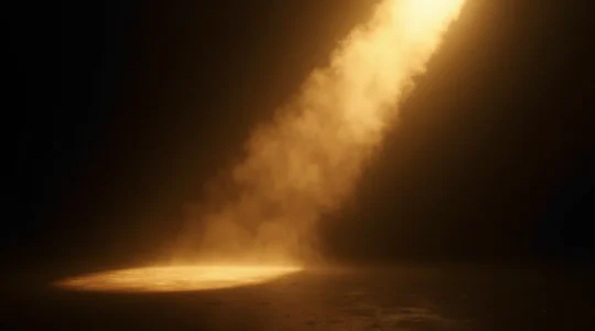
Chiaroscuro Composition: Why Dramatic Lighting Triggers Deeper Emotional Responses
Chiaroscuro is far more than a simple technique of high-contrast light and shadow. It is a psychological technology that manipulates the viewer’s primal brain. By creating a clear perceptual hierarchy that directs the eye and manufacturing a sense of mystery…
Read more
Matte Form Aesthetic: Why Non-Reflective Art is Taking Over Modern Interiors?
The shift to matte surfaces is not a fleeting trend, but a deliberate choice for sensory calm and intellectual depth in our living spaces. Matte finishes absorb light rather than reflecting it, reducing “visual noise” and allowing for a more…
Read more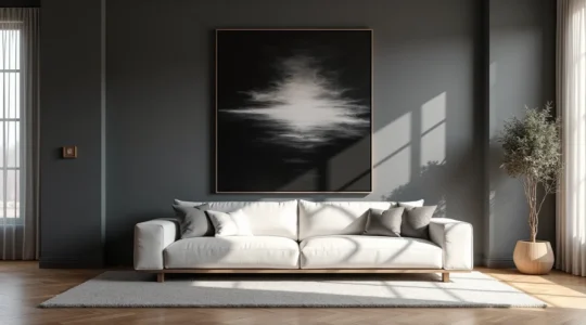
Tonal Contrast in Art: Why High-Contrast Pieces Anchor Modern Interiors Best?
The most impactful interiors use high-contrast art not as decoration, but as a tool of tonal architecture to command visual weight and anchor a space. A full value scale (true black to pure white) creates depth and sophistication that mid-tones…
Read more
Centuries-Old Draftsmanship: Why Modern Collectors Are Returning to Classical Skill?
The return to classical draftsmanship is a conscious investment in verifiable artistic skill over conceptual ambiguity. Atelier training provides a direct, traceable link to historical mastery, creating what collectors value as a “pedagogical lineage.” Technical proficiency, including anatomical accuracy, tonal…
Read more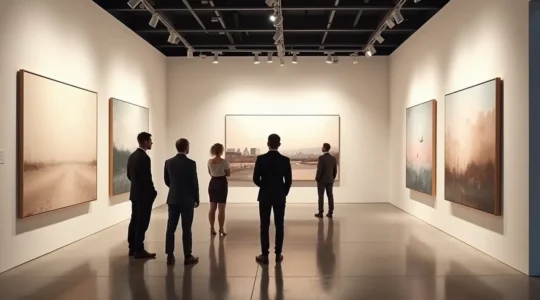
Contemporary Painters: How to Identify Future Blue-Chip Artists Before They Blow Up?
The key to smart art investment isn’t tracking auction records; it’s identifying an artist’s “pre-validation pivot point” just before their value becomes irreversible. Institutional validation, like a museum show, is the ultimate value accelerator, not the starting line. An artist’s…
Read more
Precise Charcoal Arrangements: How to Preserve the Most Fragile Medium in Art?
Preserving charcoal art goes far beyond common advice; true stewardship requires understanding the physics of its fragility. The medium’s inherent weakness stems from microscopic forces, making every touch a potential act of erasure. Standard framing with acrylic can actively destroy…
Read more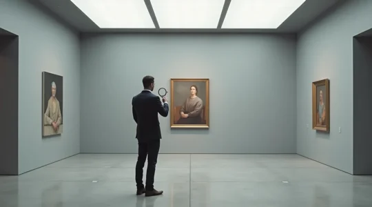
Texture, Color, and Line: How to Analyze a Painting Like a Museum Curator
To truly understand a painting, you must look past the subject and decode the visual language the artist used to evoke emotion and create value. The brain is hardwired to react differently to jagged lines (anxiety) versus smooth curves (calm),…
Read more