
In summary:
- Photorealism in stencil art is achieved through engineering and methodical precision, not just cutting skill.
- Material choice is foundational; 10 mil Mylar offers the best balance of durability and flexibility for repeated professional use.
- Mastering aerosol physics—the triad of adhesive, can distance, and pressure—is what separates crisp, professional lines from amateur, fuzzy edges.
- Digital path optimization and strategic bridge placement are non-negotiable steps to ensure your complex design is both cuttable and structurally sound.
You’ve spent hours perfecting a complex, multi-layered design on your computer. You print it, meticulously cut for what feels like days, and then the moment of truth arrives. You lift the blade and a crucial piece—an eye, a letter’s center, a delicate detail—falls out. Or worse, you get to the wall, you spray, and you’re left with a blurry, undefined mess. This frustration is the barrier that separates aspiring artists from the sharp, photorealistic work of masters like Blek le Rat or Banksy. The common advice to “be careful” or “add a few bridges” is fundamentally incomplete.
The truth is that creating high-impact stencil art is less about a steady hand and more about a systematic, engineering-based approach. It’s a discipline where material science, digital optimization, and aerosol physics are as critical as the artistic vision itself. The integrity of your final piece is determined long before the spray can is ever shaken. It’s decided when you choose your material thickness, when you clean your vector paths, and when you strategically plan your bridges not as afterthoughts, but as integral parts of the design’s structure.
This guide demystifies the process. We will move beyond generic tips and into the specific methodology required to transform a digital image into a stunning, multi-layered piece of street art. We will cover the structural planning, material selection, digital preparation, and aerosol techniques that ensure your vision survives the journey from screen to wall, with the crisp, clean lines that define professional work.
Summary: A Methodical Guide to Complex Stencil Creation
- Why Your Stencil Falls Apart When You Cut It and Where to Add Bridges?
- Cardboard or Acetate: Which Stencil Material Lasts for 100 Sprays?
- Black & White or 5 Colors: Is the Extra Cutting Time Worth the Depth?
- The Fuzzy Edge: Why Spray Adhesive is Critical for Crisp Stencil Lines?
- How to Paint a 3-Layer Stencil in Under 60 Seconds?
- How to Clean Up Your Paths to Reduce File Size by 40%
- Cut-and-Paste Original or Digital Composite Print: Which is Worth More?
- Aerosol Mastery: How to Control Can Pressure for Laser-Sharp Lines?
Why Your Stencil Falls Apart When You Cut It and Where to Add Bridges?
The most common failure point in stencil creation is a misunderstanding of structural integrity. Any isolated interior shape—the center of an “O”, the space between a figure’s legs, or an eye within a face—is known as an “island.” Without a connection to the main body of the stencil, this piece will simply fall out the moment it’s cut, destroying the design. The solution is the bridge, but its application must be strategic, not random. The goal is to integrate these connections so they feel like a natural part of the image’s texture or lines.
A professional approach treats this as an engineering problem. Instead of one large, obvious bridge, use several smaller “chain bridges” that follow the contours of the design, like strands of hair or folds in fabric. This maintains the visual flow while providing robust support. Furthermore, in complex, multi-layer work, the bridges themselves can serve a dual purpose.
Case Study: Using Registration Marks as Structural Bridges
In multi-layer stencils, precise alignment is critical. Artists achieve this using registration marks—typically small circles or ‘+’ symbols placed in the corners of each layer. A highly effective professional technique is to use these registration marks as permanent, structural bridges. By design, they are present on every layer and connect the outer frame to the inner design area. This not only guarantees perfect alignment during painting but also provides four robust anchor points that prevent the entire stencil from warping or collapsing during cutting and repeated use, making them a cornerstone of complex project planning.
Before committing to a full cut on an intricate piece, always perform a test. Isolate a small, complex section of your design and cut it first. This small-scale test will immediately reveal if your bridging strategy is sufficient to maintain the stencil’s integrity under stress. Auditing your design for these structural needs is the first and most critical step in the physical creation process.
Essential Bridge Placement Checklist
- Identify Islands: Systematically scan your design and highlight all isolated areas (the negative spaces) that will detach if not supported.
- Verify Bridge Frequency: Ensure you have added a bridge at least every 2-3 inches on long, thin lines or large open sections to prevent sagging or tearing.
- Integrate Aesthetically: Check if your bridges are integrated into natural texture lines (e.g., wood grain, hair strands, fabric folds) to make them invisible in the final spray.
- Assess Bridge Type: Evaluate if “chain bridges” (multiple small connections) could replace a single, large, and more obvious bridge for better structural and visual results.
- Perform a Test Cut: Before the full cut, choose a small, representative section with complex islands and bridges, and cut it to physically verify its strength and stability.
Cardboard or Acetate: Which Stencil Material Lasts for 100 Sprays?
The choice of material is a foundational decision that dictates your stencil’s durability, reusability, and the crispness of its lines. While cardboard is cheap and accessible for a one-off project, it deteriorates quickly, absorbing moisture from the paint and tearing easily after just a few uses. Acetate sheets offer a step up in durability and can be cleaned, but they are often thin and prone to warping, making them unsuitable for professional, repeated use.
The industry standard for photorealistic and high-volume stencil work is Mylar. This polyester film is solvent-proof, incredibly durable, and flexible enough to conform to uneven surfaces. However, not all Mylar is created equal. Its performance is directly tied to its thickness, measured in “mils.” For artists seeking longevity and professional results, understanding these grades is key. A thin 4 mil sheet may be good for curved surfaces but won’t stand up to heavy use, while a thick 14 mil sheet is industrial-grade and often too rigid for fine art.
The image below shows a visual comparison of how different materials hold up to wear, highlighting the clear superiority of thicker Mylar for long-term projects.
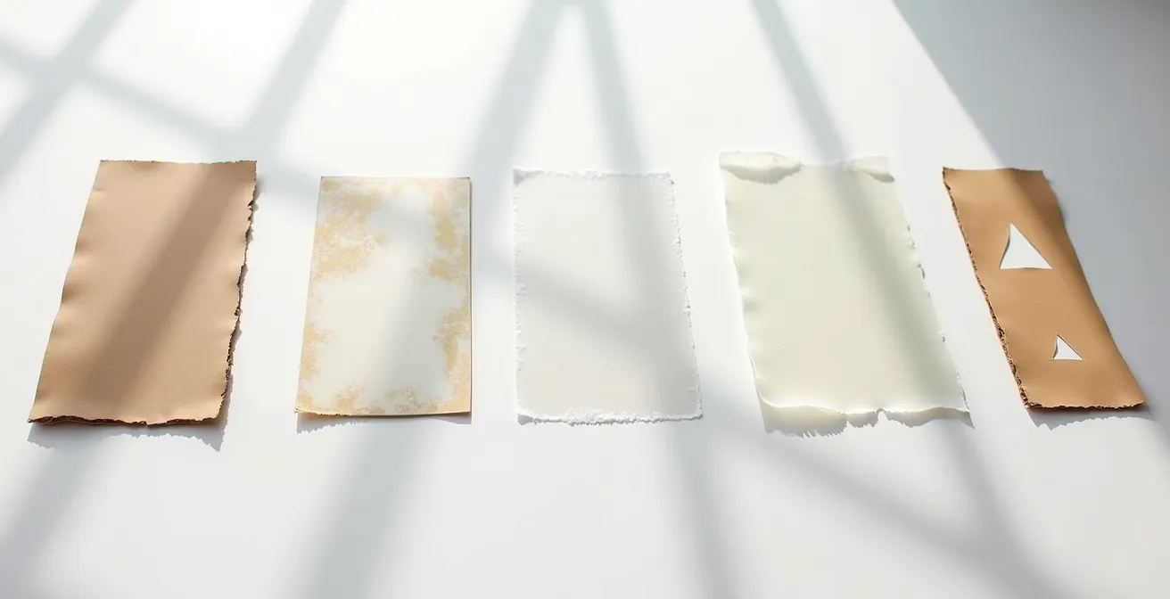
According to durability testing, a 10 mil Mylar sheet can withstand over 100 uses when properly cared for, making it the sweet spot for serious artists. This thickness provides the perfect balance of rigidity for sharp lines and flexibility for handling, establishing it as the go-to material for creating a library of reusable stencils.
This comparative analysis from Stencilsonline.com breaks down the performance characteristics of common materials, reinforcing why Mylar is the superior investment for professional work.
| Material | Thickness | Durability (Uses) | Best For |
|---|---|---|---|
| Cardboard | 1-2mm | 1-5 uses | Single projects |
| Acetate | 5 mil | 10-20 uses | Small details |
| Mylar (thin) | 4-7 mil | 20-50 uses | Curved surfaces |
| Mylar (medium) | 10 mil | 100+ uses | Professional work |
| Mylar (thick) | 14 mil | 500+ uses | Industrial use |
Black & White or 5 Colors: Is the Extra Cutting Time Worth the Depth?
The leap from a single-layer, black-and-white stencil to a multi-layer color piece is significant, both in labor and in final impact. A single layer is fast and graphically powerful. It’s the essence of punk-rock aesthetics and the origin of much of modern street art. However, it is inherently limited in its ability to convey depth, shadow, and photorealism. Each additional layer represents an exponential increase in cutting time, but it also adds a new dimension of visual information—mid-tones, highlights, shadows, and color fields.
So, is it worth it? From a market and artistic perspective, the answer is a resounding yes. The ability to render complex images with nuance and depth is what separates iconic works from simple tags. The market clearly values this complexity, with $20.1 million in Banksy auction sales in 2024 alone, where his more intricate, multi-layer stencil works consistently command premium prices. The extra cutting time is not just an investment in labor; it’s an investment in the artwork’s ultimate value and visual power.
Creating a 5-color piece requires you to think like a screen printer, breaking your image down into separate color channels. Typically, this involves a layer for black (keyline/shadows), a dark mid-tone, a light mid-tone, a highlight color, and a background or spot color. While the cutting process is demanding, the result is a piece with a richness and realism that a single layer can never achieve. The decision ultimately comes down to intent: are you aiming for a quick, graphic statement or a detailed, lasting work of art?
The Fuzzy Edge: Why Spray Adhesive is Critical for Crisp Stencil Lines?
You can have the most perfectly cut, structurally sound stencil in the world, but if it doesn’t sit perfectly flush against the painting surface, the result will be a disaster. The tiny gap between the stencil and the wall acts as a channel for aerosol particles, causing “paint bleed” or “overspray.” This is the primary culprit behind fuzzy, undefined edges, and it instantly marks a piece as amateur. Simply holding the stencil down with your hands or using tape on the corners is not enough to combat the high pressure of an aerosol can.
The non-negotiable solution is repositionable spray adhesive. A light, even coat applied to the back of the stencil transforms it into a giant, low-tack sticker. When pressed firmly against the surface, it creates a complete seal along every cut edge, leaving no room for paint to seep underneath. This ensures that every line is as crisp and sharp as the cut itself. The “repositionable” quality is key, as it allows you to lift and reset the stencil without leaving residue or damaging the surface.
The proper application method is a technique in itself:
- Hold the adhesive can 10-15 inches away from the back of the stencil.
- Apply the adhesive in a light, even, sweeping motion to cover the entire surface. Do not oversaturate.
- Wait 30-60 seconds for the solvent to evaporate and the adhesive to become tacky, not wet.
- Press the stencil firmly onto the surface, working from the center outwards to eliminate any air bubbles.
Case Study: Adhesive-Backed Mylar vs. Standard Mylar
Performance tests show a clear winner for certain applications. For interior wall murals, 5 mil adhesive-backed Mylar provides the absolute crispest lines, virtually eliminating all paint bleed when applied correctly. However, its strong, single-use adhesion makes it unforgiving. For large-scale outdoor work, standard 10 mil Mylar with a separate repositionable spray adhesive is often preferred. While it may offer only 90% of the absolute crispness, its ability to be repositioned multiple times is crucial for aligning massive stencils where a perfect placement on the first try is highly unlikely.
How to Paint a 3-Layer Stencil in Under 60 Seconds?
In the world of street art, speed is often a necessity. But painting quickly doesn’t have to mean sacrificing quality. The key to executing a multi-layer piece in under a minute is not frantic, rushed spraying; it’s methodical preparation and economy of motion. As the legendary artist Blek le Rat suggests, the work is done before you even arrive on site. Every movement is pre-planned, and all materials are laid out in a precise sequence.
The rapid-fire technique involves having all your layers and corresponding spray cans ready to go. You work from the lightest color to the darkest, or from the largest background shape to the smallest detail. The process is a fluid dance: spray layer one, immediately set it aside, pick up and align layer two using your registration marks, spray, and repeat. You do not wait for each layer to fully dry; the aerosol paint dries to the touch almost instantly, allowing you to stack layers in quick succession without smudging.
This image captures the dynamic energy of a rapid application, where the artist is already reaching for the next layer while the paint from the first is still settling.
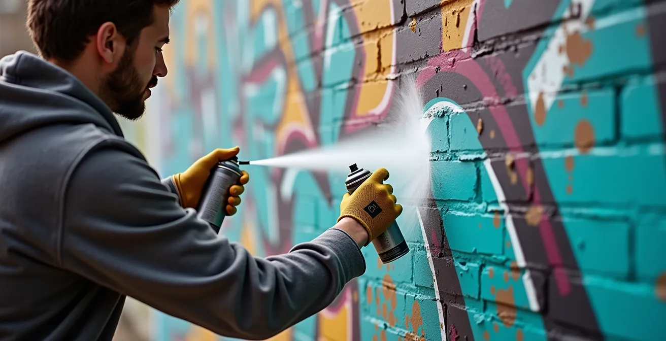
To achieve this level of efficiency, you must have your layers numbered and oriented correctly beforehand. Keep your spray cans in the same order as your stencils. The motion should be smooth and deliberate: align, one or two quick spray passes, and move on. Over-spraying is the enemy of both speed and quality. The goal is a thin, even coat. This disciplined workflow transforms a complex, 60-second operation into three simple, 20-second steps.
How to Clean Up Your Paths to Reduce File Size by 40%
In the digital age of stencil art, proficiency with vector software like Adobe Illustrator is as vital as knife skills. Many artists, especially those starting out, create their designs using automated tools like “Image Trace.” While fast, this process often generates messy vector files filled with thousands of unnecessary anchor points, stray paths, and overlapping shapes. This “digital clutter” has real-world consequences: it dramatically increases file size and, more importantly, can confuse or even crash a vinyl cutter or laser cutter, resulting in jagged lines and failed cuts.
Digital optimization is the professional step of cleaning and simplifying these paths to create a lean, efficient cutting file. A clean file is not just smaller; it’s a precise set of instructions that your cutting machine can follow flawlessly. The goal is to retain the visual integrity of your design while using the absolute minimum number of anchor points required to define the shapes. A smooth curve should be defined by two anchor points and their handles, not twenty.
This workflow is a non-negotiable part of preparing a professional stencil file:
- Simplify Paths: Use the ‘Simplify Path’ command (Object > Path > Simplify) in Illustrator to intelligently remove redundant anchor points. A 30-50% reduction is often possible without any visible change to the design.
- Delete Strays: Hunt down and delete all stray points and invisible paths. These often hide in your file and can send a cutter on a pointless journey.
- Unite and Merge: Convert all text to outlines and use the ‘Unite’ function in the Pathfinder panel to merge any overlapping shapes into a single, clean path.
- Optimize Export: When saving as an SVG for a cutting machine, select “Presentation Attributes” and set the decimal precision to 1. This significantly reduces file size by stripping out unnecessary code.
By implementing this digital hygiene, you can often reduce a file’s size by 40% or more. This results in faster processing, cleaner cuts, and less wear and tear on your equipment, making it a critical step in the modern stencil artist’s process.
Cut-and-Paste Original or Digital Composite Print: Which is Worth More?
In the contemporary art market, the line between process and product has blurred. This raises a crucial question for stencil artists: what holds more value, the paint-splattered Mylar sheet used to create the work, or a perfect digital print of the final image? The answer, increasingly, lies with the authenticity and physicality of the original tool.
A digital composite print, no matter how high the quality, is a reproduction. It can be printed infinitely, diluting its scarcity and inherent value. While it represents the final, perfected vision, it lacks a direct connection to the artist’s physical process. It is a picture of the event, not the event itself.
Case Study: The Rise of Physical Stencils as Collectible Art
The street art market has seen a dramatic shift where the tools of creation are becoming as collectible as the final works. Leading artists are now selling their used, paint-covered stencils as standalone artworks, often accompanied by certificates of authenticity. These artifacts, bearing the residue, imperfections, and history of their use, are seen by collectors as holding the “DNA” of the artwork. They are a direct, tangible link to the artist’s hand and the physical act of creation, and as such, they often command premium prices that can surpass those of a signed print from the same series.
The cut-and-paste original—the Mylar stencil itself—is a unique, one-of-a-kind object. It is the matrix from which the art was born. Every layer of overspray, every small tear, and every bit of tape tells the story of its creation. It embodies the artist’s labor and intent. For collectors and connoisseurs, this physical artifact represents a more authentic and valuable piece of the artistic journey than a clean, detached digital print. Therefore, saving your used stencils, especially from significant works, is not just good practice; it’s the preservation of a potentially valuable asset.
Key Takeaways
- Bridge placement is an act of structural engineering, essential for the integrity of any complex design. Integrate bridges into the natural lines of your artwork.
- For durability and professional results, 10 mil Mylar is the optimal material, providing the best balance of rigidity for crisp lines and flexibility for handling.
- The crispness of a stencil line is determined by a triad of factors: a perfect seal with spray adhesive, a consistent can distance of 6-8 inches, and controlled pressure.
Aerosol Mastery: The Final Step to Laser-Sharp Lines
You can perfect every preceding step—design, bridging, material selection, and adhesion—but it can all be undone in the final seconds by poor can control. Mastering the aerosol can is a physical skill, a form of “aerosol physics” where you learn to manipulate pressure, distance, and angle to achieve specific effects. This is the final and most crucial element that translates all your preparation into a laser-sharp final product.
The most common error is spraying from too far away or for too long. Holding the can more than 10-12 inches from the surface causes the atomized paint particles to partially dry in the air, landing as a dusty, fuzzy texture rather than a crisp line. Conversely, spraying too close or too heavily floods the area, causing drips and bleeding under the stencil edge, even with adhesive. The sweet spot for sharp lines is a consistent 6-8 inch distance, applied in quick, light passes.
Beyond distance, professional artists actively manage the can’s properties to ensure consistent results:
- Temperature Control: In cold weather, warm your cans in a bucket of warm (not hot) water. A cold can has lower pressure, leading to spatter and uneven coverage.
- Initial Pressure Burst: The first spray from a full can is always the most powerful. Always release this initial burst on a test surface, not on your artwork.
- Proper Mixing: Shaking the can for a full two minutes is not a suggestion; it’s a requirement to properly mix the pigment and propellant for a consistent spray.
- Cap Hygiene: A clean cap is essential. Use different caps for different effects (e.g., skinny caps for detail, fat caps for fills) and clean them after each use to prevent clogging that leads to drips and splatters.
Ultimately, aerosol mastery is about control and consistency. It’s the practiced, physical execution that honors the hours of methodical preparation. It is the final, decisive action that determines the quality of your work.
Now that you understand the complete methodology, the next step is to apply it. Start engineering your next piece by auditing your design for structural integrity and choosing the right materials for the job.
Frequently Asked Questions about Stencil Spraying Techniques
Why do my spray paint lines appear fuzzy even with adhesive?
Fuzzy lines, or “dusting,” typically result from holding the can too far away from the surface (over 12 inches) or using a can with low pressure. When the paint has too far to travel, the aerosolized particles begin to dry in mid-air, landing as a soft, powdery edge instead of a wet, crisp line. Maintain a 6-8 inch distance for optimal results.
Should I use different caps for different effects?
Absolutely. Caps are the “paintbrushes” of aerosol art. A fat cap delivers a wide spray for quickly filling in large areas. A skinny cap provides a much thinner line for precision and detail work. Specialty stencil caps offer a soft, wide, and low-pressure output, which is ideal for achieving the crispest possible edges with minimal risk of paint bleed.
How do I prevent drips when working on vertical surfaces?
Drips are caused by applying too much paint in one area too quickly. The key is to use multiple, light, and quick passes rather than holding the spray in one spot. It is always better to build up color with several thin coats than to apply one single heavy, wet coat. Keep the can moving at a steady pace across the stencil.