Frustrated that your digital strokes don’t feel natural? The disconnection often isn’t just a poorly set pressure curve. Achieving a tactile response on screen requires building a complete sensory feedback loop. This guide deconstructs the entire system, from hardware bottlenecks like screen lag and surface friction to the physics of your software’s brush engine, giving you the tools to bridge the gap between your hand gesture and the digital response.
For every digital painter, there’s a moment of profound frustration. You execute a perfect, flowing stroke in the air, but the line that appears on screen feels sterile, delayed, or disconnected. It’s a common complaint that sends many artists down a rabbit hole of tweaking pressure curves, a process that often yields marginal improvements. The conventional wisdom to “just practice more” or “adjust the driver settings” ignores a fundamental truth: a natural feel isn’t born from a single setting. It’s the result of a complex interplay between hardware, software, and your own physical technique.
The disconnect you feel is often a symptom of a broken sensory feedback loop. Your brain expects a certain resistance, a specific delay, and a predictable result based on decades of experience with physical media. When the digital tool fails to provide that feedback, the illusion shatters. We often blame the pressure sensitivity alone, but what if the real culprits are the imperceptible lag of your screen, the slickness of the glass, or the way your software interprets the physics of a brush?
This guide moves beyond the basics of the pressure curve. We will dissect the entire chain of command, from your hand to the final pixel. We’ll explore the hardware bottlenecks that sabotage your gestures, the ergonomic habits that can make or break your career, and the advanced software settings that allow you to emulate the beautiful chaos of real-world media. By understanding each link in this chain, you can stop fighting your tools and start building a digital workspace that feels like a true extension of your creative intent.
This in-depth exploration will provide a technical and practical roadmap to achieving that coveted natural feel. The following sections break down each component, offering expert insights and actionable steps to transform your digital drawing experience.
Summary: Tablet Mastery: How to Configure Pressure Sensitivity for a Natural Feel?
- Why a 60Hz Screen Creates Lag That Ruins Your Fast Sketching Gestures?
- How to Hold Your Stylus to Prevent Carpal Tunnel After 8 Hours of Painting
- Slippery Glass or Textured Film: Which Surface Improves Line Precision?
- The Diagonal Line Test: Why Your Budget Tablet Draws Wavy Lines Instead of Straight
- How to Use Tilt Sensitivity to Mimic Real Charcoal Shading Digitally?
- Can Digital Tablets Replicate the Chaos of Spilled Ink on Paper?
- Why a 9B Pencil Creates Depth That an HB Simply Cannot Achieve?
- Pixel Art Lines: Why Are 8-Bit Aesthetics Making a Comeback in High-End Art?
Why a 60Hz Screen Creates Lag That Ruins Your Fast Sketching Gestures?
One of the most significant yet least-discussed hardware bottlenecks in the digital artist’s toolkit is display refresh rate. You may have a powerful computer and a top-tier tablet, but if you’re drawing on a standard 60Hz screen, you are fighting an invisible enemy: latency. A 60Hz display refreshes its image 60 times per second, meaning there’s a minimum delay of 16.67 milliseconds between frames. When you factor in processing time and input lag from the stylus, this total “photon-to-photon” latency can easily become a major issue. For fast, sweeping gestures common in sketching, this delay creates a noticeable “drag” where the line appears to chase your pen tip.
This isn’t just a feeling; it’s a measurable phenomenon. The gap between your physical action and the on-screen reaction breaks the sensory feedback loop your brain relies on. This forces you to slow down and draw more deliberately, stifling fluid motion and intuitive sketching. For complex tasks involving rapid hatching or energetic strokes, the perceived disconnect can be maddening. In fact, on some consumer-grade displays, display lag has been measured as high as 68 ms, which is the equivalent of dropping 3-4 frames in a video game—a gap that is impossible to ignore during high-precision work.
While the ultimate solution is upgrading to a 120Hz or higher display, which cuts that inherent delay in half, there are compensation strategies you can adopt to mitigate the issue on a 60Hz screen. These techniques focus on reducing the processing load and adapting your drawing style to work with the hardware’s limitations, rather than against them. By making these adjustments, you can reclaim some of the immediacy lost to display latency.
How to Hold Your Stylus to Prevent Carpal Tunnel After 8 Hours of Painting
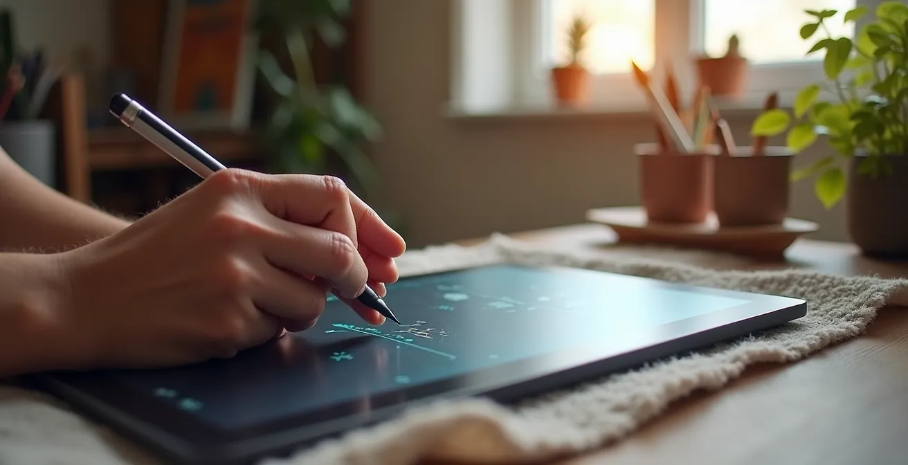
The pursuit of a natural feel is not just about technology; it’s deeply rooted in ergonomics. A digital artist’s career can be cut short by repetitive strain injuries (RSI) like carpal tunnel syndrome, often caused by poor posture and an improper stylus grip. After an eight-hour painting session, pain and numbness are clear signals that your technique is unsustainable. The “death grip”—clenching the stylus with excessive force—is a common habit that puts immense strain on the tendons running through the carpal tunnel in your wrist. This not only leads to long-term injury but also results in stiff, unnatural lines as you’re drawing from your fingers instead of your arm.
Achieving a relaxed, sustainable grip is paramount. The ideal hold is light and balanced, similar to how one might hold a traditional paintbrush. The stylus should rest gently between the thumb, index, and middle fingers, without creating white knuckles. A fascinating technique reported by some professionals, especially those using screenless tablets, is the “vertical grip.” This hold, while initially feeling awkward, keeps the wrist in a neutral position and allows for broader strokes originating from the elbow and shoulder. This not only reduces wrist strain but also improves line control and prevents your hand from obscuring the work on a display tablet.
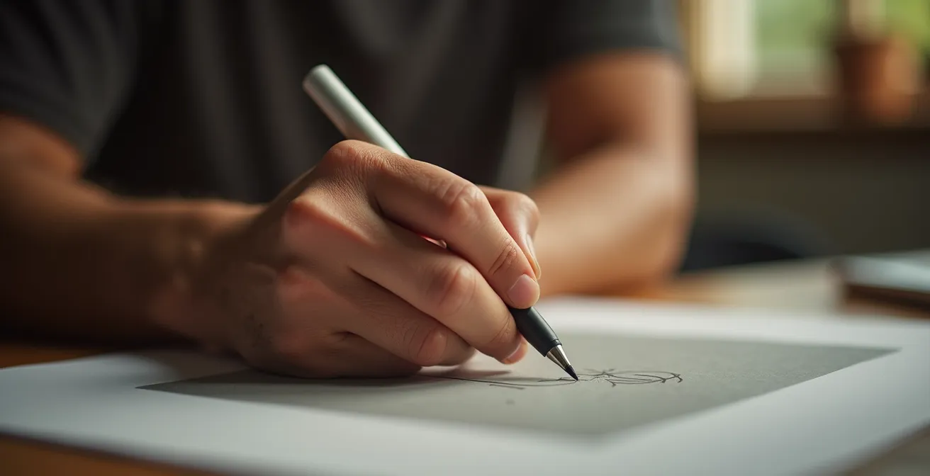
As the image demonstrates, a relaxed hand is a key component of sustainable digital art. But the grip is only one part of the equation. Your entire workstation must be configured to support a healthy posture. Your chair, desk height, and monitor position all contribute to the overall ergonomic system. Neglecting any of these elements means you’re simply shifting the strain from one part of your body to another. A comprehensive approach is the only way to ensure longevity in your craft.
Your Ergonomic Checklist: Drawing for the Long Haul
- Assess your grip and posture: Ensure your wrist is straight, never bent forward, and your elbow maintains a 90-degree angle.
- Inventory your setup: Check that your chair has lumbar support, your feet are firmly on the floor or a footrest, and your work surface is at the correct height.
- Audit your technique for coherence: Are you using the minimum pressure needed, or are you in a “death grip”? Confront bad habits. As one source recommends, you should also take 5-minute breaks every 30 minutes for hand stretches.
- Identify areas for improvement: Consider a larger diameter stylus for an easier grip or adding a footrest to improve posture.
- Create an integration plan: Systematically introduce these changes, allowing your body a two-week adaptation period for new habits like a modified grip or posture.
Slippery Glass or Textured Film: Which Surface Improves Line Precision?
The physical interface between your stylus nib and the screen surface is a critical, yet often overlooked, component of the sensory feedback loop. The debate between a slick, naked glass screen and a matte, textured screen protector is about one core concept: digital friction. A glossy glass surface offers almost zero resistance, allowing the stylus to glide effortlessly. While this is excellent for fast, fluid gestures and painterly strokes, it can be a nightmare for precise line art. The lack of friction can make the nib feel “skittish” and hard to control, often leading to overshot lines and wobbly curves.
On the other hand, a textured screen protector, often marketed as “paper-like,” introduces a controlled level of resistance. This friction mimics the feeling of a pencil on paper, providing tactile and auditory feedback—that subtle “scratch”—that helps your brain gauge pressure and speed. This increased control is invaluable for detailed work, hatching, and achieving clean, deliberate lines. However, this friction comes at a cost. The most significant drawback is accelerated nib wear; you can expect to replace nibs two to three times more frequently than on a glass surface. It also requires a slightly higher initial activation force to get a line started, which demands a period of adjustment.
The choice is not about which is universally “better,” but which is better for your specific workflow. Many artists use both, swapping a screen protector on or off depending on the task at hand. As the Mighty Deals Review Team notes, a smooth screen offers incredible “pixel precision” for certain tasks, but that smoothness can be a hindrance for others. The key is to understand the trade-offs.
This comparative analysis highlights the fundamental differences in the drawing experience. To make an informed decision, it’s essential to understand how each surface directly impacts your stroke mechanics, as detailed in an analysis of different stylus and surface combinations.
| Aspect | Glass Surface | Textured Film/Matte |
|---|---|---|
| Friction Level | Very Low | Medium to High |
| Stylus Glide | Extremely smooth | Controlled resistance |
| Acoustic Feedback | Silent | ‘Scratch’ sound provides feedback |
| Nib Wear | Minimal | Accelerated (2-3x faster) |
| Best For | Rapid gestures, fluid strokes | Precise details, controlled shading |
| Initial Activation Force | Very light | Requires adjustment (+10-20%) |
| Tilt Control | Less stable | More controlled |
The Diagonal Line Test: Why Your Budget Tablet Draws Wavy Lines Instead of Straight
If you’ve ever used a budget-friendly graphics tablet and noticed your slow diagonal lines come out wavy or “jittery,” you’ve encountered a classic hardware bottleneck. This phenomenon, easily revealed by the “diagonal line test,” is a tell-tale sign of a lower-quality digitizer. The digitizer is the sensor grid beneath the surface that tracks the pen’s position. In less expensive tablets, this grid can have lower resolution or slower polling rates, causing it to struggle with accurately plotting a smooth line between two diagonal sensor points. When you draw slowly, the tablet’s firmware “connects the dots” in a slightly staggered way, resulting in a wobbly line instead of a perfectly straight one.
This jitter is one of the most significant differentiators between entry-level and professional-grade hardware. While high-end tablets from manufacturers like Wacom have engineered their digitizers to virtually eliminate this issue, it remains a common problem in a crowded market of alternatives. For artists who rely on crisp, clean line art, this can be a deal-breaker, forcing them into a frustrating cycle of undoing and redrawing lines until one randomly comes out straight.
However, the presence of jitter doesn’t automatically render a tablet useless. Many professional artists have built entire careers using budget hardware by developing clever workarounds. These techniques are all designed to bypass the digitizer’s weakness. For instance, drawing strokes much faster can “outrun” the sensor’s sampling error, resulting in a smoother line. Another common professional technique is to work on a canvas two to four times larger than the final output size; when the image is scaled down, the minor wobbles become imperceptible. Leveraging software-based line stabilization or relying on vector layers for final line art are other powerful methods to compensate for this hardware limitation.
Case Study: Professional Workflows on Budget Tablets
Many professional digital artists successfully create commercial artwork on budget tablets despite diagonal line jitter. Their compensation techniques include: working at 2x-4x final resolution then scaling down (which smooths minor irregularities), using vector layers for final lineart (which auto-smooths paths), drawing faster strokes to minimize sensor grid detection issues, and leveraging software smoothing features. These artists report that while high-end tablets are preferable, budget options remain viable with proper workflow adjustments, turning a hardware flaw into a manageable variable.
How to Use Tilt Sensitivity to Mimic Real Charcoal Shading Digitally?
Modern styluses offer much more than just pressure data. Tilt and rotation sensitivity are powerful features that, when properly configured, can elevate a digital tool from a simple line-maker to a sophisticated simulation of a traditional medium. For mimicking a tool like charcoal, tilt is everything. With a real charcoal stick, a vertical hold on its point creates a sharp, dark line, while laying it on its side creates a broad, soft, textured stroke. Replicating this behavior digitally is the key to natural-feeling shading.
This goes far beyond the default settings. A truly granular setup involves diving into your drawing software’s brush engine and linking the tilt angle to multiple parameters simultaneously. Imagine a custom brush where a vertical pen position (0° tilt) gives you 100% opacity and a hard edge, perfect for defining contours. As you begin to tilt the pen to 45°, the brush engine could be configured to automatically soften the brush edge, lower the opacity to 40%, and increase the expression of a paper texture. At an extreme tilt of 60° or more, you could even have it activate a blending or smudging mode, allowing you to seamlessly transition from drawing to blending in a single stroke.
This level of customization creates a deeply intuitive experience where the stroke mechanics of the digital tool directly mirror its real-world counterpart. Instead of manually switching between a hard pencil, a soft shading brush, and a smudge tool, you can perform all these actions with a single, versatile brush. Here are some advanced configurations to try:
- Set vertical pen position (0°) to create sharp, precise lines using the ‘point’ of the virtual charcoal.
- Configure a 30-45° tilt to automatically soften brush edges and introduce texture.
- Link tilt angle to brush opacity: a vertical hold might be 100% opacity, while a 60° tilt drops it to 40%.
- Assign tilt direction to other parameters, like color temperature, to add cool or warm tones as you shade.
- Map extreme tilt (60°+) to activate a blending mode for an instant smudging effect without changing tools.
- Use a combination of tilt and pen rotation (if supported) to control the grain direction in textured brushes.
Can Digital Tablets Replicate the Chaos of Spilled Ink on Paper?
For years, one of the holy grails of digital art has been the replication of “happy accidents”—the unpredictable bleeds, splatters, and pools of wet media like ink or watercolor. Traditional brush engines, based on static stamps and simple jitter settings, often produce results that feel sterile and repetitive. They lack the organic, chaotic nature of real fluid dynamics. The feeling of naturalness, in this context, is not about control, but about a believable lack of it. It’s about engineering a system that can surprise you.
The breakthrough in this area has come from a new generation of painting software that incorporates physics-based brush engines. Programs like Rebelle and ArtRage move beyond simple texture mapping and simulate the actual properties of fluids. In these environments, digital ink has viscosity and flows based on a virtual “wetness” of the canvas. It pools in the valleys of the paper texture, bleeds into adjacent wet colors, and can be tilted to create realistic drips. This gives artists the ability to generate a base of authentic, unpredictable forms, much like traditional artists use ink blot or wash techniques to discover new compositions.
Case Study: Physics-Based Software for Chaotic Effects
Artists using specialized physics-based painting software like Rebelle and ArtRage report achieving authentic spilled ink and wet media effects impossible with traditional digital brushes. These programs simulate actual fluid dynamics, allowing ink to pool, bleed, and flow based on virtual paper texture and tilt angle. Professional illustrators combine these chaotic effects with controlled digital techniques, using the unpredictability as a starting point for discovering unexpected forms and compositions, similar to traditional ink blot interpretation techniques.
Even within more traditional software like Photoshop or Clip Studio Paint, you can “engineer” a degree of controlled chaos into your brushes. By pushing jitter and scattering settings to their limits and linking them to multiple inputs like pen pressure, speed, and tilt, you can create brushes that are deliberately unpredictable. The goal is to set up a system where each stroke is slightly different from the last, introducing the subtle variations that are the hallmark of traditional media. This meticulous setup allows you to harness chaos, making it a deliberate part of your creative process.
Why a 9B Pencil Creates Depth That an HB Simply Cannot Achieve?
In the traditional art world, the difference between a hard HB pencil and a very soft 9B pencil is monumental. The HB glides over the paper’s surface, depositing a light, controlled amount of graphite. The 9B, being much softer, digs into the paper’s tooth, depositing a thick, rich layer of black and revealing the texture of the surface in great detail. It’s not just about making a darker mark; it’s about value range and textural interaction. Replicating this distinction is a core challenge in making digital drawing feel natural, and the solution lies entirely within the pressure curve.
A linear, one-to-one pressure curve is the digital equivalent of using only an HB pencil. It provides a predictable but limited range of expression. To emulate a full set of graphite pencils, you must create custom pressure curves for each “grade.” An HB pencil’s curve would be relatively flat, requiring significant pressure to reach even 70% opacity. In contrast, a 9B curve should be a steep exponential shape. This means even the lightest touch will produce a visible mark (low initial activation force), and the pressure will ramp up to 100% opacity very quickly. As professional artist David Revoy describes it, this is “a curve where the pressure does really fast high effect; giving all presets a very sensitive feeling.”
A curve where the pressure does really fast high effect; giving all presets a very sensitive feeling and fast full 100% pressure effects
– David Revoy, Calibrating stylus pressure – Professional Artist Tutorial
This approach allows you to switch between “digital pencil grades” simply by selecting a different pressure curve, rather than just a different brush preset. This fundamentally changes how you interact with the canvas, forcing you to use a lighter touch for softer “pencils” and giving you the broad value range needed to create real depth and dimension in your work.
The table below illustrates how different curve shapes can be used to simulate the properties of various traditional pencil grades. Understanding this relationship is key to unlocking a more authentic drawing experience.
| Pencil Grade | Pressure Curve Shape | Min Opacity | Max Opacity | Texture Interaction |
|---|---|---|---|---|
| HB (Hard) | Linear/Flat | 10% | 70% | Minimal, glides over texture |
| 2B (Medium) | Slight S-curve | 5% | 85% | Moderate texture pickup |
| 6B (Soft) | Steep exponential | 3% | 95% | Heavy texture interaction |
| 9B (Very Soft) | Extreme exponential | 2% | 100% | Maximum texture reveal |
Key Takeaways
- A natural feel is a complete system: it’s a combination of hardware lag, surface friction, ergonomics, and advanced software settings, not just the pressure curve.
- Acknowledge and compensate for your hardware’s limits, such as 60Hz display lag and diagonal line jitter, instead of simply fighting against them.
- Customize for the specific medium you want to emulate; replicate the unique physics of charcoal tilt, ink chaos, or pencil hardness for truly authentic results.
Pixel Art Lines: Why Are 8-Bit Aesthetics Making a Comeback in High-End Art?
At first glance, pixel art seems to be the antithesis of pressure sensitivity. It is an art form built on the rigid constraint of a single pixel brush with no anti-aliasing or variable line width. In this context, what possible use could a pressure-sensitive stylus have? This is where the geeky, meticulous nature of modern digital artists shines, as they’ve repurposed pressure sensitivity for tasks far beyond its intended design. The comeback of 8-bit aesthetics in high-end illustration and game art is partly fueled by these innovative, hybrid techniques that blend retro limitations with modern hardware efficiency.
Contemporary pixel artists use pressure sensitivity not to control opacity or size, but to toggle between states. For example, an artist might map light pressure to a 1-pixel brush and firm pressure to a 2-pixel brush. This allows them to perform manual anti-aliasing on curves with incredible speed, simply by varying pressure, instead of tediously switching tools or clicking a mouse. Others map pressure to cycle through a limited, pre-defined color palette, enabling them to lay down colors for dithering and shading patterns much faster than traditional methods. As the MediBang Paint team points out, drawing without pressure sensitivity creates uniform, flat lines; these new techniques re-introduce a degree of “human” variation and speed, even within a restrictive medium.
Case Study: Modern Pixel Art Pressure Sensitivity Techniques
Contemporary pixel artists are revolutionizing the medium by using pressure sensitivity in unexpected ways. Rather than controlling line thickness (impossible in true pixel art), they map pressure to toggle between 1px and 2px brushes for manual anti-aliasing, or to cycle through limited color palettes for faster dithering. Professional game artists report this hybrid approach allows them to maintain pixel-perfect control while dramatically speeding up their workflow compared to traditional clicking methods.
This inventive use of technology demonstrates the core thesis of this guide: achieving a “natural feel” is about building a personalized sensory feedback loop that makes your tools an extension of your intent. For a painter, that might mean replicating the feel of a 9B pencil. For a pixel artist, it means creating a system that lets them place pixels faster and more intuitively. It proves that pressure sensitivity is a versatile data input, limited only by our imagination and our willingness to dig into the settings and experiment.
The journey to a perfect digital feel is a personal one. Start today by choosing one element from this guide—be it your ergonomics, your screen surface, or a single brush’s tilt settings—and begin experimenting to build a more responsive and intuitive digital workflow.