To truly understand a painting, you must look past the subject and decode the visual language the artist used to evoke emotion and create value.
- The brain is hardwired to react differently to jagged lines (anxiety) versus smooth curves (calm), a principle known as neuroaesthetics.
- An artist’s choice of medium (oil vs. acrylic) and their color mixing technique are critical indicators of technical skill and the artwork’s long-term archival quality.
Recommendation: Next time you view a painting, use the “squint test” to ignore color and detail. If a strong composition of light and dark shapes remains, you are likely looking at a masterfully constructed work.
Standing before a captivating painting, one often feels a pull, a connection that transcends simple appreciation. Yet, articulating *why* a piece works, what gives it its power, can feel like an elusive art in itself. Many self-taught enthusiasts are told to look for the fundamental elements of art: line, color, and texture. This advice, while a valid starting point, is akin to learning the alphabet without understanding how to form words or sentences. It identifies the “what” but completely misses the “how” and, more importantly, the “why.” You can spot the brushstrokes, but can you tell if they are a sign of genius or a lack of skill? You see the colors, but can you differentiate a sophisticated, harmonious palette from an amateurish mixture?
The true curatorial approach lies not in merely listing these components, but in deciphering them. It involves understanding the deep psychological and physical principles that artists manipulate to guide your eye, stir your emotions, and create lasting financial and cultural value. It’s a shift from passive viewing to active analysis. This is not about possessing an innate “eye” for art; it is a learnable skill grounded in observation and knowledge. It requires seeing beyond the image to the very materiality of the paint and the architectural value structure holding the composition together.
This guide will equip you with that curatorial lens. We will move beyond the superficial to explore the underlying mechanics of great art. We will examine how line direction can physically affect your emotional state, how the right lighting can reveal the soul of a painting’s texture, and how to spot the subtle clues in a color palette that separate a master from a novice. By the end, you will not just see a painting; you will be able to read it.
To guide you on this journey from enthusiast to analyst, this article breaks down the core visual elements through a curator’s perspective. The following sections will provide you with the tools to dissect composition, understand materiality, and ultimately, evaluate artistry with confidence.
Summary: A Curator’s Framework for Visual Analysis
- Why Jagged Lines Trigger Anxiety While Curves Create Calm in Composition?
- How to Position Your Home Lighting to Enhance Texture Without Creating Glare
- Oil or Acrylic: Which Medium Offers Better Color Depth for the Price?
- The Dust Trap: Why Heavily Textured Art Requires Professional Cleaning Every 5 Years
- How to Spot Sophisticated Color Palettes vs. Amateur Mixtures in 10 Seconds
- Why a Full Value Scale from 1 to 10 Creates More Visual Impact?
- At What Distance Do the Dots Merge into a Single Image?
- Contemporary Painters: How to Identify Future Blue-Chip Artists Before They Blow Up?
Why Jagged Lines Trigger Anxiety While Curves Create Calm in Composition?
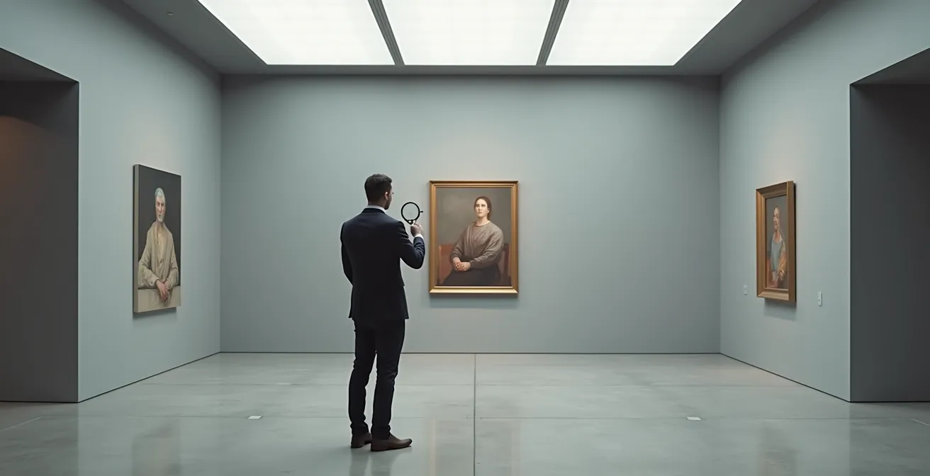
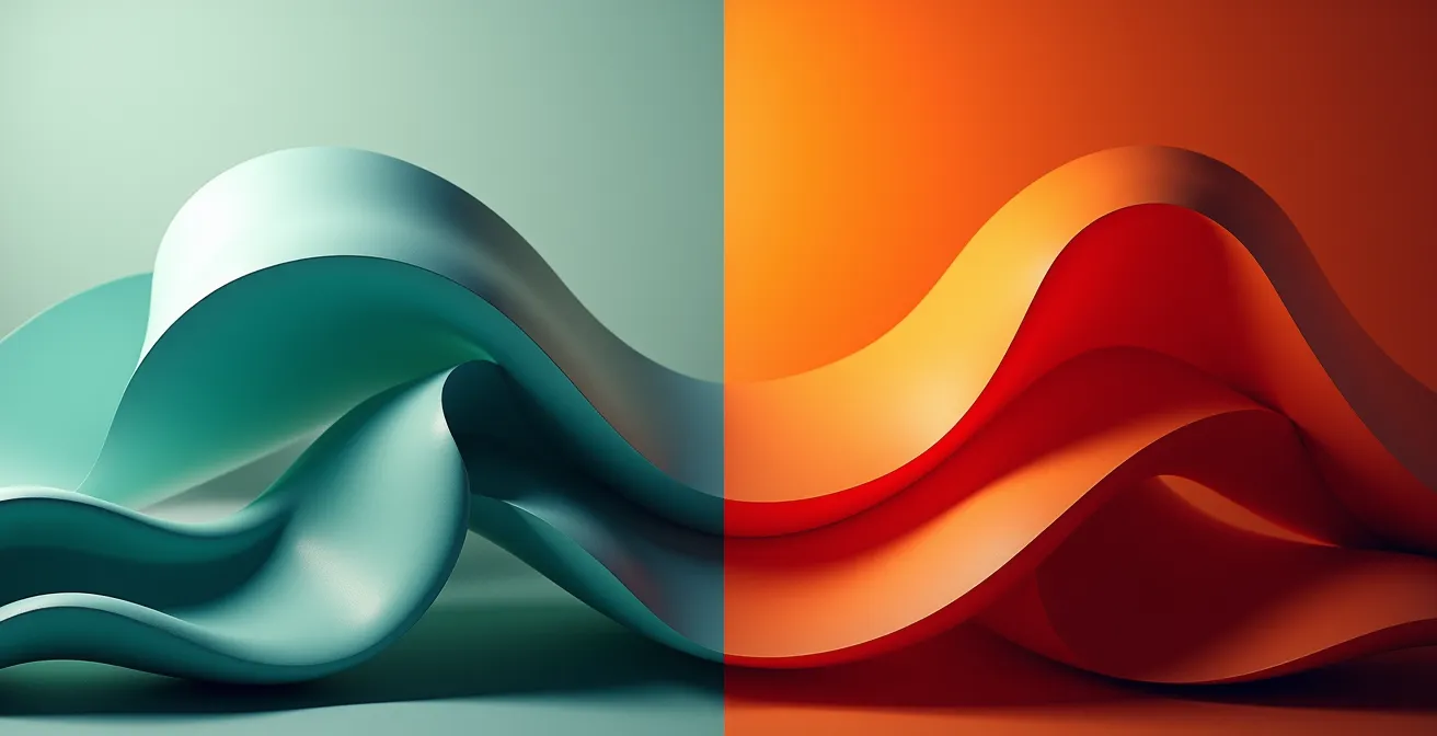
The line is the most fundamental building block of a composition, the artist’s primary tool for directing the viewer’s gaze. However, its function is not merely directional; it is deeply psychological. Our brains are hardwired to interpret the character of a line and assign it an emotional value. This phenomenon, explored in the field of neuroaesthetics, reveals that sharp, angular, and jagged lines often trigger a sense of alertness, excitement, or even anxiety. They are visually “spiky” and can feel aggressive or dynamic, reminiscent of danger signals in nature like thorns or broken glass. Conversely, soft, flowing curves tend to evoke feelings of calm, safety, and fluidity.
This is not an arbitrary cultural association. In fact, research in neuroaesthetics demonstrates that participants consistently associate curved shapes with ‘calm’ emotions. This response is observable in brain activity, where curved forms activate areas linked to positive emotional processing. A master artist understands this intuitively or consciously, using diagonal and jagged lines to create tension in a dramatic battle scene, while employing sinuous, horizontal curves to convey the tranquility of a serene landscape. Analyzing the dominant linear character of a painting is therefore the first step in decoding its intended emotional atmosphere.
Observe the composition in the image above. The visual language is immediate and clear. A skilled curator or collector doesn’t just see lines; they recognize an intentional manipulation of the viewer’s primal neurological responses. When analyzing a work, ask yourself: Is the artist leading my eye with gentle, predictable paths, or are they creating a visual obstacle course of sharp turns and abrupt stops? The answer is a direct insight into the painting’s narrative and emotional core.
How to Position Your Home Lighting to Enhance Texture Without Creating Glare
If line provides the skeleton of a work, texture is its skin. It is the physical surface quality of the painting, from the smooth, glass-like finish of a Renaissance panel to the thick, sculptural terrain of an impasto work. Texture is a tactile quality that we appreciate visually, and its perception is almost entirely dependent on one critical factor: lighting. Improper lighting can flatten a textured masterpiece, while strategic lighting can make it come alive, revealing the artist’s hand and the work’s inherent materiality. The primary goal is to use “raking light”—light that strikes the canvas at an angle—to create subtle shadows in the peaks and valleys of the paint, thus enhancing its three-dimensionality.
The professional standard is to position a light source at a 30-45 degree angle to the surface of the artwork. This angle is the sweet spot for revealing texture without creating distracting glare on varnished surfaces. However, the quality of the light is just as important as its position. The Color Rendering Index (CRI) is a scale from 0 to 100 that measures a light source’s ability to faithfully render colors compared to natural light. For art, a high CRI is non-negotiable. In fact, professional conservation standards specify that museums require a CRI of 95 and above for displaying artwork, ensuring that the colors you see are precisely what the artist intended.
To properly light your own collection, you must balance texture enhancement with color accuracy and glare prevention. This often involves a multi-step process:
- Position your spotlights at the optimal 30-45 degree angle.
- Select bulbs with a CRI of 95 or higher to guarantee true color representation.
- Use diffusers or honeycomb grids on the lights to soften their output and minimize hot spots or glare, especially on glossy paintings.
- Finally, experiment with dimmers. The ideal intensity is one that makes the texture “pop” without washing out the subtle details in the darker passages of the work.
Oil or Acrylic: Which Medium Offers Better Color Depth for the Price?
The choice of medium—the actual substance the artist uses to create the work—has a profound impact on two key attributes: color depth and archival quality. For collectors, the debate often centers on oil and acrylic paints. While both can be used to create stunning works, their physical properties result in a different visual experience. Oil paint is renowned for its superior luminosity and depth. This is due to its higher refractive index; the linseed oil binder refracts light more effectively, making colors appear more saturated and radiant. The pigments seem suspended within a jewel-like depth, allowing for subtle transitions and a glow that acrylics struggle to replicate.
Acrylics, a more modern invention, are pigments suspended in a polymer emulsion. They dry quickly and form a somewhat flatter, more matte surface. While professional-grade acrylics have excellent color vibrancy, they tend to have a lower refractive index than oils, which can result in a less luminous appearance. However, the primary advantages of acrylics are their fast drying time and lower cost for artist-grade materials. The choice is not simply aesthetic but also economic and practical. As a conservation specialist noted in the Museum Conservation Guidelines:
For a collector, the archival quality and pigment load of a professional-grade paint is a far more important indicator of longevity and value than the choice between oil and acrylic itself.
– Conservation specialist, Museum Conservation Guidelines
This highlights a crucial point: the quality *within* a medium is more important than the medium itself. An artist using cheap, student-grade oils will produce a work far less stable and vibrant than one using professional-grade acrylics. The following table breaks down the key differences for a collector’s consideration.
| Property | Oil Paint | Acrylic Paint |
|---|---|---|
| Refractive Index | Higher (approx. 1.5) | Lower (approx. 1.4) |
| Color Depth | Greater luminosity | Can appear flatter |
| Drying Time | Days to weeks | Minutes to hours |
| Blending | Extended work time | Limited blending window |
| Professional Grade Cost | $15-50 per tube | $10-35 per tube |
| Archival Quality | Centuries proven | 50+ years proven |
The Dust Trap: Why Heavily Textured Art Requires Professional Cleaning Every 5 Years
Heavily textured paintings, particularly those using a technique known as impasto where paint is laid on in thick, sculptural layers, offer a rich visual and tactile experience. The artist’s energy is palpable in the deep grooves of a palette knife or the thick bristles of a brush. However, this dramatic topography creates a significant conservation challenge: it is a natural dust trap. Over time, these peaks and valleys accumulate airborne pollutants, dust, and grime. This is not just an aesthetic issue; these particles can chemically bond with the paint surface, leading to permanent discoloration and degradation of the artwork.
For a collector, this means that owning a heavily textured piece comes with a responsibility for its upkeep. While a smooth painting can be lightly dusted with relative ease, an impasto work requires specialized care. Attempting to clean it with a cloth can be disastrous, as fibers can snag on the raised paint, potentially chipping or lifting it from the canvas. Similarly, using water or household cleaners can cause irreversible damage by altering the chemical composition of the paint or varnish layer.

Because of these risks, professional conservators recommend that heavily textured artworks be professionally cleaned approximately every five years. A conservator uses specialized tools, such as soft badger hair brushes and controlled air puffers, to gently dislodge surface debris without abrading the delicate paint structure. While this service represents an ongoing investment—with basic cleaning costs ranging from $500 to $2,000 depending on the piece’s size and condition—it is a minor expense to protect an asset potentially worth many times more. Ignoring this maintenance is a form of passive neglect that can significantly diminish the artwork’s value and visual integrity over time.
How to Spot Sophisticated Color Palettes vs. Amateur Mixtures in 10 Seconds
Color is often the most seductive element of a painting, but it is also where the difference between an amateur and a master is most starkly revealed. A sophisticated artist does not simply use colors; they understand color theory on a deep level, mixing their pigments to create harmony, dimension, and emotional resonance. An amateur, by contrast, often falls into common traps that result in palettes that are either garish or, more often, “muddy” and lifeless. Fortunately, with a trained eye, you can learn to spot these differences very quickly.
One of the most telling signs of an amateur is the overuse of black paint straight from the tube to create shadows. Master painters, from Rembrandt to the Impressionists, rarely used pure black. Instead, they mixed their own rich darks, typically from colors like Ultramarine Blue and Burnt Umber. This creates shadows that are full of color and life, integrating them harmoniously into the rest of the palette rather than looking like dead holes in the canvas. Analysis of paintings by masters consistently reveals a deliberate avoidance of pure black, with artists achieving depth through layered glazes or complex chromatic mixtures.
Another key indicator is the handling of neutral colors like grays and browns. Amateurs often create “mud” by overmixing complementary colors. A professional, however, mixes neutrals with intention, retaining the integrity of the component colors to create nuanced, vibrant grays and browns. They also skillfully manipulate color temperature, using both warm and cool versions of a single color (e.g., a cool, greenish-yellow and a warm, orange-yellow) to create a sense of form and light. These subtle shifts give a painting a pulsating, dimensional quality that is absent in less sophisticated work.
Your 10-Second Color Palette Audit
- Check for Muddy Neutrals: Look at the grays and browns. Are they dull and lifeless? This suggests overmixed complementary colors, a common amateur mistake.
- Inspect the Darks: Do shadows and dark areas look flat and dead? This often indicates the use of straight tube black instead of rich, mixed chromatic darks.
- Assess Temperature Variation: Does the artist use both warm and cool versions of their main colors to model form? Sophisticated palettes are rarely temperature-monotone.
- Examine Shadow Colors: Are shadows simply darkened versions of an object’s color, or do they contain complementary colors (e.g., bluish shadows on a yellow object)? Colored shadows are a sign of mastery.
- Evaluate Overall Harmony: Step back. Do all the colors feel like they belong to the same world and work together? Professional palettes exhibit a clear, intentional relationship between every hue.
Why a Full Value Scale from 1 to 10 Creates More Visual Impact?
There is a classic saying in realist painting circles: “Value does the work, but color gets the credit.” Value, simply put, refers to the lightness or darkness of a color, independent of its hue. It is the underlying structure of a painting, the architecture that creates form, weight, and drama. A painting with a weak value structure—one that lacks a full range from the darkest darks to the lightest lights—will appear flat and unconvincing, no matter how beautiful its colors are. A work that masterfully employs a full value scale, from a 1 (pure black) to a 10 (pure white), will have a powerful visual impact and a strong sense of three-dimensional reality.
This use of strong contrast between light and dark is a technique known as chiaroscuro, famously employed by artists like Caravaggio and Rembrandt to create intense drama and focus. By concentrating the light on the most important parts of the composition and letting the rest fall into deep shadow, the artist commands the viewer’s attention and sculpts form out of the darkness. A strong composition is not random; it is a carefully designed arrangement of light, mid-tone, and dark shapes that remains clear and compelling even when the color is removed.
A simple yet profoundly effective technique for assessing a painting’s value structure is the “squint test.” It’s a method used by artists for centuries to filter out distracting details and see the foundational composition. As one traditional painting instructor put it, “Value does the work, color gets the credit – a full value range creates three-dimensional form, weight, and drama through chiaroscuro.”
To perform the test yourself, follow these steps:
- Stand six to eight feet away from the painting.
- Squint your eyes until the colors and details blur together, leaving only the main shapes of light and dark.
- Analyze what you see. Does a clear and powerful design of distinct light, mid-tone, and dark areas remain?
- If the composition dissolves into a confusing, muddled field of mid-tone gray, it has a weak value structure.
- Finally, check if the work contains both very bright highlights and very deep darks, indicating the artist has utilized the full expressive power of the value scale.
At What Distance Do the Dots Merge into a Single Image?
The late 19th-century movements of Pointillism and Divisionism, pioneered by artists like Georges Seurat and Paul Signac, represent a scientific approach to color and perception. Instead of mixing colors on a palette, these artists applied small, distinct dots of pure color directly onto the canvas. Their theory was that the viewer’s eye would then perform the mixing from a distance, a process called optical mixing. This technique aimed to create more vibrant and luminous colors than could be achieved by physically blending pigments, which can dull each other. The result is a shimmering, vibrating surface that is fascinating up close and coalesces into a cohesive image from afar.
For the collector and analyst, this presents a unique challenge: a Pointillist work has an optimal viewing distance. Stand too close, and you see only a chaotic field of dots and dabs of color. Stand too far, and the shimmering, energetic quality is lost. The magic happens at a specific distance where the dots begin to merge in the eye, creating new, blended colors while retaining a sense of vibrancy that physical mixing cannot match. This distance is not fixed; it depends on the size of the dots and the scale of the painting. Part of the curatorial analysis of such a work is to find and understand this optimal viewing position.
This physical requirement makes Pointillist art notoriously difficult to appreciate on a screen. The fixed resolution and emitted light of a monitor cannot replicate the delicate interplay between pigment, reflected light, and the human eye. As one digital art curator noted in a study on contemporary viewing practices, this is a critical limitation of digital viewing:
A pointillist work is impossible to evaluate online – a screen cannot replicate the specific viewing distance needed for optical mixing to occur.
– Digital art curator, Contemporary Viewing Practices Study
When you encounter a Pointillist painting in person, make a conscious effort to move back and forth. Pinpoint the exact distance at which the image snaps into focus. Experiencing this moment of optical fusion is essential to understanding the artist’s scientific and aesthetic achievement. It is a powerful reminder that some art demands a physical, spatial relationship with its viewer.
Key Takeaways
- Decode the Emotion in Lines: Don’t just see lines, interpret them. Curves often signal calm, while sharp, jagged lines are used to create tension and anxiety, a direct line to our neuroaesthetic responses.
- Value Structure Over Color: A painting’s true strength lies in its value structure (the arrangement of light and dark), not its color palette. Use the “squint test” to see if a strong composition holds up.
- Materiality is a Clue to Mastery: The choice and handling of paint (oil vs. acrylic, mixed darks vs. tube black) are critical indicators of an artist’s skill, intent, and the artwork’s long-term archival quality.
Contemporary Painters: How to Identify Future Blue-Chip Artists Before They Blow Up?
Transitioning from analyzing a single painting to evaluating an artist’s entire career is the final step in developing a curatorial eye. For a collector, the ultimate goal is often to identify “blue-chip” artists—those whose work has achieved significant critical acclaim and stable, high market value. Spotting these artists before they reach peak market saturation is both an art and a science, requiring an analysis that goes beyond the canvas to include institutional validation, critical reception, and market momentum.
A key indicator of future success is an artist’s educational pedigree and gallery representation. Graduating from a top MFA program (like Yale, Columbia, or UCLA) often signals a high level of conceptual rigor and provides access to a powerful network of critics, curators, and collectors. Equally important is an artist’s gallery trajectory. Tracking their progression from a small, emerging gallery to representation by an established, “blue-chip” gallery (like Gagosian, David Zwirner, or Hauser & Wirth) is a clear sign of increasing market validation.
Beyond the market, critical and institutional validation are crucial. Is the artist’s work being written about in major art publications like Artforum or the Frieze? More importantly, is their work being acquired by museums or included in significant curated exhibitions, such as the Whitney Biennial or the Venice Biennale? Museum inclusion signifies that the artist is part of a broader cultural dialogue, a strong indicator of lasting relevance. When these factors align with consistent price appreciation and high sell-through rates at auction, you have a powerful set of indicators suggesting an artist is on a blue-chip trajectory.
Your Checklist for Identifying Blue-Chip Potential
- Educational Pedigree: Did the artist attend a top-tier MFA program? This provides a foundation of institutional validation.
- Gallery Representation: Is the artist represented by a reputable gallery? Track their progression up the gallery ladder.
- Critical Coverage: Are they being featured in major art publications, academic papers, or critical reviews?
- Museum Inclusion: Has their work been acquired by or exhibited in a reputable museum? This is a huge marker of cultural significance.
- Market Momentum: Does their work show consistent price appreciation and strong sell-through rates at major auctions? Check data from leading art market analysts for this.
- Conceptual Rigor: Does the artist have a strong, consistent thematic focus and intellectual depth across their body of work?
By applying this multi-faceted analysis, you move from being a passive buyer to an active, informed collector, capable of making strategic decisions grounded in the same principles used by museum curators and top-tier art advisors. Your next gallery or museum visit is no longer just a walkthrough; it is a field for research and discovery.
Frequently Asked Questions About Art Analysis and Conservation
How often should impasto paintings be professionally cleaned?
Every 5 years for heavily textured works, as the peaks and valleys trap airborne pollutants that can chemically bond with the paint.
What is the average cost of professional art conservation?
Basic cleaning ranges from $500-2000 depending on size and condition, a small investment to protect artwork worth thousands or millions.
Can I clean textured paintings myself?
Only use a soft badger brush or air puffer from a distance. Never use water, household cleaners, or cloths that can snag on raised paint.