The most impactful interiors use high-contrast art not as decoration, but as a tool of tonal architecture to command visual weight and anchor a space.
- A full value scale (true black to pure white) creates depth and sophistication that mid-tones alone cannot achieve.
- Strategic use of contrast avoids visual fatigue, while mastery of lighting prevents dramatic pieces from disappearing into the shadows.
Recommendation: Assess artwork by its tonal range, not just its subject, to ensure it has the structural power to define your design rather than just complement it.
In the world of luxury interiors, a common frustration persists: a meticulously designed room that, despite perfect furniture and flawless finishes, feels strangely unresolved. The instinct is often to fill the void with a “statement piece” or a “pop of color,” treating art as a final decorative flourish. This approach, however, fundamentally misunderstands the power of a truly exceptional artwork. It mistakes the symptom—a lack of a focal point—for the disease: a poorly defined tonal structure.
The conventional wisdom to simply hang something bold on the wall is a platitude that leads to generic results. The real key to an interior with presence and authority does not lie in the subject of the art, but in its command of light and dark. What if the secret to anchoring a room wasn’t about the art itself, but about the tonal architecture it introduces? This is the power of high-contrast composition. It’s a deliberate act of design that manipulates visual weight and guides the emotional response of anyone who enters the space.
This guide moves beyond surface-level advice. We will dissect the mechanics of visual impact, exploring why a full value scale is non-negotiable for sophisticated design. We will cover the precise strategies for integrating these powerful pieces, from hanging black and white art on dark walls to understanding the psychological line between drama and mystery. Ultimately, you will learn to wield tonal contrast not as a decorative afterthought, but as the primary architectural tool it is.
This exploration will provide a clear framework for selecting and placing high-contrast art with intention and authority. The following sections break down the essential principles for transforming any space from merely decorated to truly designed.
Summary: Mastering Tonal Contrast in Art for Interior Design
- Why a Full Value Scale from 1 to 10 Creates More Visual Impact?
- How to Hang High-Contrast Black & White Art on Dark Walls Successfully
- Drama or Mystery: Which Tonal Strategy Suits a Bedroom Environment?
- The ‘Strobe Effect’: Why Too Much High Contrast Art Can Exhaust the Eye
- How to Ensure Your Print Has ‘Dmax’ Blacks That Don’t Look Grey
- How to Spot Sophisticated Color Palettes vs. Amateur Mixtures in 10 Seconds
- The Visibility Issue: Why Chiaroscuro Art Disappears in Low-Light Dining Rooms?
- Chiaroscuro Composition: Why Dramatic Lighting Triggers Stronger Emotional Responses?
Why a Full Value Scale from 1 to 10 Creates More Visual Impact?
The single greatest differentiator between amateur and professional visual composition is the command of the full value scale. An artwork that utilizes the entire spectrum from pure white (value 1) to true black (value 10) possesses an inherent visual weight and depth that pieces limited to mid-tones can never achieve. This isn’t a matter of taste; it’s a principle of visual perception. According to professional art education principles, a full value range is fundamental for creating depth, form, and visual interest.
When an artwork contains both brilliant highlights and deep, anchoring blacks, it creates a dynamic tension that draws the eye and holds attention. The highlights pull forward, creating points of immediate focus, while the darks recede, carving out a sense of three-dimensional space even on a two-dimensional plane. This is the essence of tonal architecture. Art that lives only in the grey mid-tones (values 4-7) appears flat, timid, and ultimately forgettable. It lacks the structural integrity to anchor a wall, let alone an entire room.
To assess an artwork’s power, one must look beyond its color and subject matter and analyze its tonal structure. A simple three-step mental test can reveal its potential impact:
- Identify the Lightest Light: Scan the piece for areas that approach pure white. These highlights are critical for creating energy and a focal point.
- Locate the Darkest Dark: Find the shadows and forms that are true black. These areas provide the composition’s anchor and give it gravitational force.
- Assess the Mid-Tone Bridge: Ensure there are compelling middle values that connect the extremes. These tones create the nuanced form and prevent the piece from feeling like a stark, binary graphic.
An artwork that successfully navigates these three points has the foundational strength to become a commanding presence in an interior. It offers a complete visual journey, engaging the viewer with a richness and complexity that commands respect.
How to Hang High-Contrast Black & White Art on Dark Walls Successfully
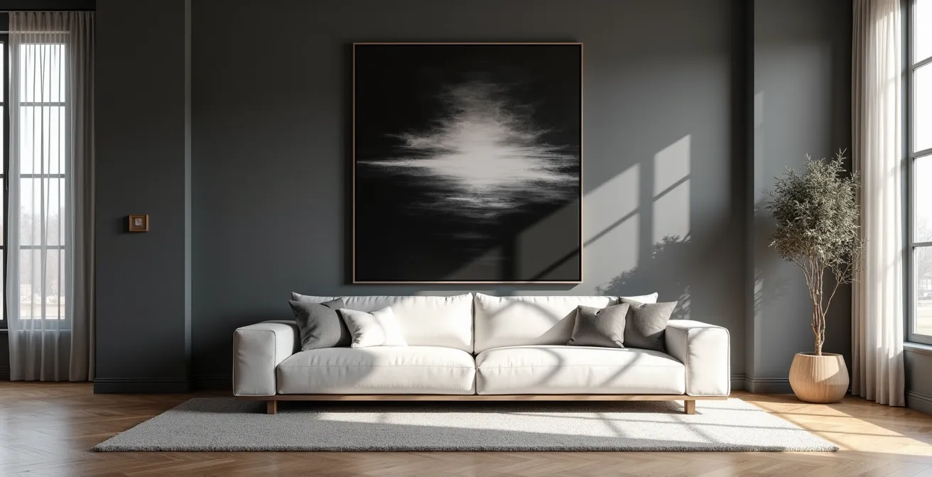
Placing high-contrast, black-and-white art on a dark wall—such as charcoal, navy, or deep green—is a sophisticated design move that can yield spectacular results. However, it is also a choice fraught with peril. Executed poorly, the artwork can be visually consumed by the wall, its dark values bleeding into the background and its impact neutralized. The secret to success lies not in the art itself, but in the deliberate creation of a visual “buffer” zone.
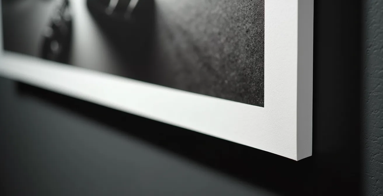
The most effective tool for this is the frame and mat. A crisp, wide, white or off-white museum-quality mat serves as a critical zone of light, creating a clean separation that allows the artwork to breathe. This band of white acts as a hard stop, forcing the eye to recognize the artwork as a distinct entity. It prevents the darks of the print from merging with the darks of the wall, ensuring the piece retains its powerful graphic identity. The frame itself should then be chosen to either complement the art (a simple black frame) or the wall (a frame that matches the wall color for a “floating” effect).
As this detail shows, lighting is the second critical component. A dark wall absorbs light, so the artwork requires dedicated illumination. A single, focused spotlight or a picture light with a high Color Rendering Index (CRI) is essential. This targeted light should be positioned to graze the surface of the art, picking up the texture of the paper and the subtle gloss of the blacks, further distinguishing it from the matte finish of the wall. This combination of strategic matting and precision lighting transforms a potential design failure into a confident, dramatic statement.
Drama or Mystery: Which Tonal Strategy Suits a Bedroom Environment?
The bedroom is a sanctuary, a space that must be calibrated for rest and intimacy. The choice of art, and specifically its tonal strategy, plays a decisive role in setting this mood. High-contrast art is not a monolithic category; it can be deployed to create either uplifting drama or enveloping mystery, depending on whether it employs a “High Key” or “Low Key” approach. Understanding the difference is critical to designing a bedroom that aligns with its intended function.
As art educator Alvalyn Lundgren notes, the core principle is straightforward: “Darker values can be used to create a somber or serious mood, while lighter values can be used to create a light-hearted feel.” This directly translates to the bedroom environment. A High Key artwork, dominated by bright whites and light greys with sharp black accents, creates an energizing and airy atmosphere. It is ideal for a bedroom that gets ample morning light and is used by someone who thrives on a bright, uplifting start to the day. Conversely, a Low Key piece, characterized by deep, rich darks and spare, dramatic highlights, fosters a cocooning, intimate, and contemplative mood. It is perfectly suited for creating a restful haven for evening relaxation.
The choice is not merely aesthetic but psychological. The following table breaks down the characteristics and effects of each strategy, providing a clear guide for selecting the right tonal approach for a bedroom. The data is drawn from an analysis of fundamental value contrast in art.
| Aspect | High Key Drama | Low Key Mystery |
|---|---|---|
| Dominant Values | Light tones (1-4) with dark accents | Dark tones (6-10) with light highlights |
| Mood Created | Energizing, uplifting feel | Intimate, cocooning atmosphere |
| Best For | Morning people, active spaces | Evening relaxation, restful sleep |
| Visual Impact | Bright, airy, expansive | Moody, contemplative, focused |
The ‘Strobe Effect’: Why Too Much High Contrast Art Can Exhaust the Eye
While high-contrast art is a powerful tool, it must be wielded with precision and restraint. An overabundance of high-contrast elements in a single space—multiple graphic artworks, a geometric rug, and patterned textiles—can create a phenomenon known as the “strobe effect.” This is a state of visual overstimulation where the eye is given no place to rest, constantly darting between competing points of high contrast. The result is not drama, but visual chaos and mental fatigue.
The power of this effect was powerfully demonstrated during the Op Art movement of the 1960s. As artistic analysis reveals, artists like M.C. Escher used stark juxtapositions of light and dark to create remarkable illusions of movement and vibration. While fascinating in a gallery, translating this unrelenting intensity into a living space is a critical design error. A home must provide moments of visual calm. High contrast is the focal point, the crescendo; it cannot be the entire symphony.
To avoid visual exhaustion, a designer must create a sense of rhythm by curating “piano” moments—areas of low contrast that act as visual pauses. These could be a solid-colored wall, a softly textured sofa, or a piece of art with a more compressed tonal range. The key is to orchestrate the interior so the eye is guided, not assaulted. Follow these professional principles to maintain control:
- Isolate the Impact: A single, large-scale high-contrast artwork should be the hero. Do not place it in direct competition with a high-contrast rug or busy wallpaper.
- Create Resting Zones: Surround the high-impact piece with areas of lower contrast. A quiet wall and simple, solid-colored furniture will amplify the art’s power by giving it space.
- Limit Pattern Density: If you have a graphic artwork, keep other patterns in the room minimal and at a different scale. A large-scale art piece might pair with small-scale textile patterns, but never two large, bold patterns.
How to Ensure Your Print Has ‘Dmax’ Blacks That Don’t Look Grey
The authority of a high-contrast photograph or print hinges on the quality of its blacks. A piece that aims for dramatic impact but delivers muddy, charcoal-grey tones where true black should be is an immediate failure. It lacks conviction and visual weight. For a connoisseur or designer, ensuring the integrity of these dark values is paramount. The key metric for this is Dmax, or maximum black density.
Dmax is a technical measurement of how black a print can get. A higher Dmax value indicates a deeper, richer, and more complete black. This is not something one should leave to chance. When acquiring a significant piece, it is your right and responsibility to inquire about the technical specifications of the print. A professional gallery or artist should be able to answer these questions without hesitation. Their answers will reveal the true quality and longevity of the artwork.
Before any acquisition, a discerning buyer must pose the following questions to verify the print’s integrity:
- What specific paper and printer combination was used? The answer reveals intent. A professional will specify a fine art paper, such as a matte Hahnemühle Photo Rag known for its deep, velvety blacks, or a glossy Canson Baryta, which produces rich, reflective blacks.
- What is the typical Dmax value for this combination? This is the crucial question. Quality pigment prints should achieve a Dmax of at least 2.3 on matte paper and can reach 2.5 or higher on glossy or baryta papers. Anything less indicates a compromise in quality.
- Is this a pigment or dye-based print? Pigment inks are the professional standard. They are composed of solid particles suspended in liquid, offering superior archival quality and depth. Dye-based inks, which are absorbed into the paper, are prone to fading and rarely achieve the same Dmax.
Asking these questions elevates the conversation from decoration to investment. It ensures the artwork you select has the technical foundation to deliver the powerful, anchoring presence your design requires, not just for today, but for decades to come.
How to Spot Sophisticated Color Palettes vs. Amateur Mixtures in 10 Seconds
The sophistication of a color palette, whether in an artwork or an interior scheme, has less to do with the specific hues chosen and more to do with their underlying value structure. Amateur palettes often feel flat and uninspired because the colors, while different, all share a similar mid-tone value. A professional palette, in contrast, is built on a robust foundation of varied tonal values, creating depth and rhythm. As demonstrated in professional color theory, tonal variation is essential for creating dynamic and realistic compositions.
There is a quick, decisive technique to assess this: the “Greyscale Goggle” test. By mentally converting a color palette to black and white (or using a phone’s monochrome filter), you can instantly strip away the distraction of color and see its true tonal architecture. In a sophisticated palette, you will still see a clear and pleasing arrangement of light, medium, and dark shapes. In an amateur palette, everything will collapse into a single, monotonous field of grey.
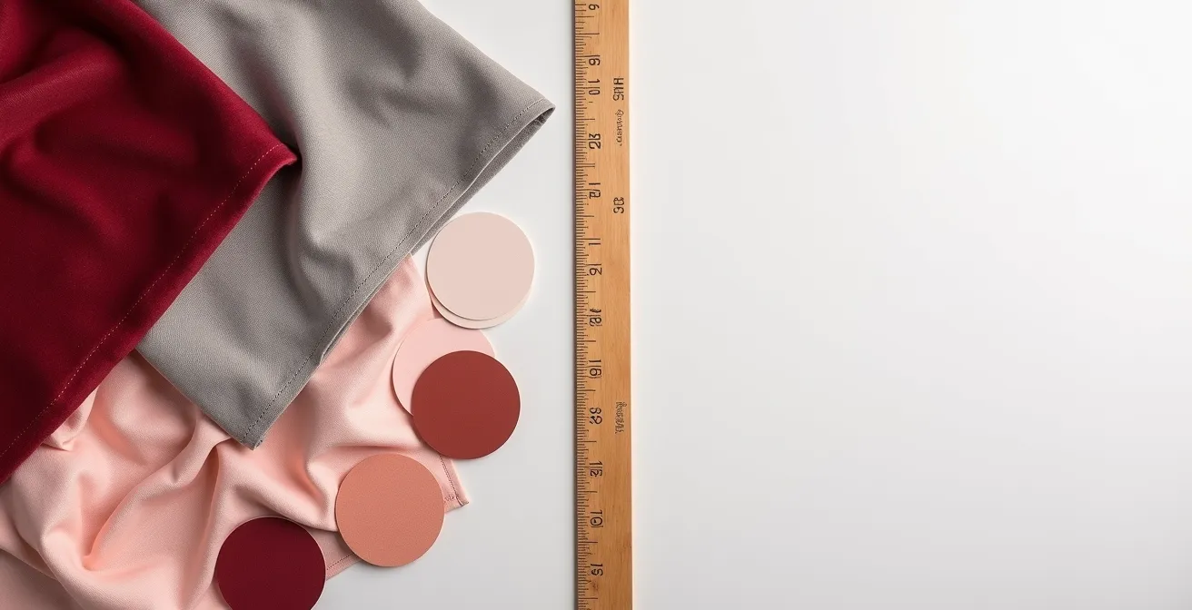
This image perfectly illustrates the concept. On the left, the sophisticated palette retains its structural integrity in greyscale due to varied values. On the right, the amateur palette becomes a flat, indistinguishable mass. This simple test exposes the underlying strength or weakness of any color composition. Use it as your secret weapon for instant analysis.
Action Plan for Assessing a Palette’s Tonal Integrity
- Points of Contact: View the artwork or color scheme through your phone camera’s black and white filter to get an objective reading of its values.
- Collecte: Inventory the main tonal masses. Can you clearly identify dominant light, mid-tone, and dark areas, or does it all blend together?
- Coherence: Confront the values with the 60-30-10 rule. A sophisticated palette will typically have 60% dominant value, 30% secondary, and 10% accent value, creating a clear hierarchy.
- Mémorabilité/Émotion: Check for temperature consistency. Even with varied values, professional palettes maintain a cohesive warm or cool undertone throughout.
- Plan d’Intégration: If a palette fails this test, identify the “missing” value. Does it need a true black to anchor it or a bright white to lift it? This reveals the path to correction.
The Visibility Issue: Why Chiaroscuro Art Disappears in Low-Light Dining Rooms?
Chiaroscuro, the dramatic interplay of intense light and deep shadow, is one of the most powerful techniques in the history of art. As noted by art historian Francesca Sciandra, masters like Caravaggio used it to “create emotional impact beyond mere representation.” Placing such a piece in a dining room, often a space of low, ambient lighting, seems like a natural fit to enhance intimacy and drama. However, this is a classic design trap. Without precise and strategic lighting, a masterpiece of Chiaroscuro will simply disappear into the gloom.
The problem is one of perception. Chiaroscuro works are, by definition, dominated by dark values. In a dimly lit environment, the human eye loses its ability to distinguish between the subtle dark tones of the painting and the shadows of the room itself. The very forms the artist worked to create collapse into an indecipherable dark mass. The dramatic highlights, meant to burst forth from the darkness, lose their context and power. The artwork, intended to be a commanding focal point, becomes a murky void on the wall.
To successfully display Chiaroscuro in a low-light setting, you cannot rely on ambient room light. The artwork requires its own dedicated, high-quality light source. The solution lies in two key elements:
- A Narrow-Beam Spotlight: A ceiling-mounted fixture with a tight beam angle (10-15 degrees) is essential. It must be aimed precisely to illuminate the artwork and nothing else, recreating the directional light that is the very subject of the painting.
- High CRI Bulb: The quality of the light is non-negotiable. A bulb with a high Color Rendering Index (CRI) of 95+ is required to accurately render the subtle shifts in tone and color within the shadows. Standard LED lighting will flatten the image and kill its depth.
By treating the artwork as a stage and lighting it accordingly, you preserve its internal drama. The piece becomes a self-contained world of light and shadow, a luminous jewel within the intimate darkness of the dining room, just as the artist intended.
Key Takeaways
- True visual impact comes from a full value scale (1-10), not just hue or subject matter.
- High-contrast art requires strategic placement, often using white mats as a buffer and dedicated, high-CRI lighting to preserve its integrity.
- Avoid the “strobe effect” by balancing high-contrast hero pieces with areas of visual rest and low-contrast textures.
Chiaroscuro Composition: Why Dramatic Lighting Triggers Stronger Emotional Responses?
The enduring power of Chiaroscuro is not merely a stylistic flourish; it is a direct conduit to human emotion. This technique, which according to art history scholarship was revolutionized by Caravaggio into an extreme form called tenebrism, leverages fundamental aspects of human psychology. Our brains are hardwired to pay attention to high-contrast signals. In nature, the sharp line between light and shadow often signifies shelter or danger, a boundary or an opening. It triggers a primal state of heightened awareness.
When an artist employs Chiaroscuro, they are hijacking this innate response. By plunging most of a scene into shadow and illuminating only the most critical elements, they force the viewer’s focus with surgical precision. There is no room for ambiguity. The artist dictates exactly what you see and, by extension, what you feel. The intense darkness creates a sense of mystery, intimacy, or foreboding, while the brilliantly lit subjects take on an almost divine or revelatory significance. This creates a powerful psychological resonance that a fully and evenly lit scene cannot replicate.
The emotional weight comes from what is concealed as much as what is revealed. The shadows invite the viewer to project their own feelings and interpretations into the void, making the experience deeply personal and participatory. As one design analysis puts it, “By adjusting tone, artists communicate depth, emotion, and emphasis, affecting how we interact with and understand their work.” A Chiaroscuro composition is therefore not a passive depiction of a scene; it is an active emotional trigger, a masterclass in psychological manipulation through light.
Therefore, the selection of art transcends decoration. It is an act of architectural and psychological curation. By prioritizing tonal structure over mere subject matter, you move from filling a space to defining it. The principles of value, contrast, and lighting are the tools you use to build visual authority and craft an environment that resonates with genuine power. This approach is what separates a forgettable room from an unforgettable experience.