
Contrary to common belief, infinite scalability isn’t an automatic feature of vector graphics; it’s a professional discipline. This guide moves beyond the basic “pixels vs. math” debate to explore the technical craftsmanship required for high-value commercial art. We’ll cover the essential practices—from path integrity and strategic styling to performance-focused exporting—that ensure your illustrations are flawless and efficient, whether on a massive billboard or a tiny mobile screen.
Every graphic designer has felt the cold dread of a client email with the subject line “Pixelated Logo.” You send off what you believe is a perfect design, only to see it distorted and blurry when scaled up for a trade show banner or a billboard. The common advice is simple: “You should have used a vector.” While true, this statement barely scratches the surface. The reality is that simply using a vector-based program like Adobe Illustrator doesn’t automatically guarantee quality or performance.
The digital art landscape is vast, encompassing everything from detailed photo manipulation in Photoshop to the chunky, nostalgic charm of pixel art. Yet, vector illustration occupies a unique and critical space in commercial design. Its foundation isn’t in pixels, but in mathematical equations—points, lines, and curves that can be scaled infinitely without losing a shred of clarity. This is the promise of vector art.
However, the true mastery of this medium lies not in the software’s default capabilities, but in the artist’s discipline. The difference between an amateur vector graphic and a professional one is hidden in the structure: the cleanliness of its paths, the efficiency of its shapes, and the intentionality of its construction. True scalability is a craft. It’s about building an illustration with such structural purity that it remains sharp, lightweight, and editable, regardless of its final context.
This article demystifies that craft. We will deconstruct the techniques that separate generic “clip art” from high-value commercial illustrations, exploring how to build, refine, and deploy vector art that meets the demanding standards of modern branding and digital media.
This guide provides a structured path to mastering the art and science of professional vector illustration. Below is a summary of the key areas we will explore to elevate your work from simply scalable to strategically superior.
Summary: A Guide to Professional Vector Craftsmanship
- Why Your Photoshop Logo looks Pixelated on a Billboard while Illustrator works?
- How to Clean Up Your Paths to Reduce File Size by 40%
- Solid Shapes or Realistic Gradients: Which Vector Style sells best in Stock Art?
- The ‘Clip Art’ Trap: How to Avoid Your Vector Art Looking Generic and Cheap
- How to Export SVGs That Load Instantly on Mobile Devices?
- Why You Must Avoid ‘Doubles’ to Keep Your Pixel Art Looking Clean?
- Why Closer Lines Create Darker Values Without Changing Ink Color?
- Tablet Mastery: How to Configure Pressure Sensitivity for a Natural Feel?
Why Your Photoshop Logo looks Pixelated on a Billboard while Illustrator works?
The fundamental difference lies in how the two types of software build an image. Adobe Photoshop is a raster-based editor, meaning it creates images from a fixed grid of pixels. When you enlarge a raster image, you’re essentially stretching those pixels, which causes the familiar blocky, pixelated effect. This is why a logo created for a business card in Photoshop will fall apart when printed on a billboard.
In contrast, Adobe Illustrator is a vector-based editor. It doesn’t use pixels. Instead, it defines shapes using mathematical equations called Bézier curves. Your logo is a set of instructions—”draw a curve from point A to point B with this much curvature”—that can be recalculated for any size. Whether the final output is 50 pixels or 50 feet wide, the software simply redraws the shape with perfect fidelity. This makes vector the non-negotiable standard for logos, icons, and any design element that requires versatility.
The challenges of large-format printing highlight this distinction. A designer working on a 4×8 meter billboard must think in terms of scale from the very beginning. As a real-world example, a print shop’s workflow was halted because a designer provided low-resolution files. Even in Illustrator, the maximum canvas size is limited, so professionals must work at a proportional scale, such as 1:10, knowing the vector data will scale up flawlessly. Any raster elements, like photographs, must have their resolution carefully calculated for the final print size to avoid becoming the weak, pixelated link in the design.
How to Clean Up Your Paths to Reduce File Size by 40%
Once you’ve committed to a vector workflow, the next level of mastery is achieving path integrity. The “infinite scalability” of vectors comes with a hidden cost: complexity. An illustration built with messy, redundant, or overly complex paths will not only be difficult to edit but can also result in larger file sizes and slower rendering times, especially on the web. A clean path is an efficient path.
Every vector shape is composed of anchor points connected by lines. The goal is to define a shape with the fewest possible anchor points without sacrificing its form. Unnecessary points, especially on straight lines or smooth curves, add “data noise” to the file. Using your software’s simplification tools to remove these redundant points is the first step toward optimization. This process can often reduce file size significantly, in some cases by up to 40% or more, while also making future edits far more intuitive.
This illustration demonstrates the concept of simplifying a vector path. On one side, a curve is defined by numerous, poorly placed anchor points, resulting in a slightly bumpy and inefficient line. On the other side, the same curve is rendered perfectly with a minimal number of strategically placed anchor points and smooth Bézier handles.
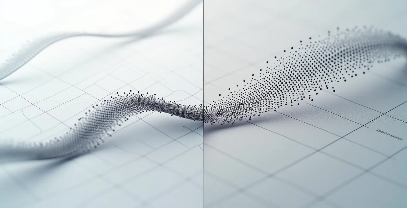
Beyond simplification, path cleanup involves ensuring all shapes are closed, converting smooth points to corner points where sharp angles are needed, and regularly testing the design at various sizes. A design that looks clean at 100% might reveal subtle imperfections when scaled to 500% or shrunk to 10%. This discipline of building with structural purity is what separates a robust, professional graphic from a fragile one.
Solid Shapes or Realistic Gradients: Which Vector Style sells best in Stock Art?
The choice of vector style is not merely an aesthetic decision; it’s a strategic one with technical implications for file size, scalability, and usability. Different styles are suited for different commercial applications, and understanding this can make your work more valuable and marketable, especially in the world of stock illustration.
The two main camps are solid, flat-color shapes and more complex, realistic gradients. Each has a distinct role and performance profile. For example, creating artwork for a brand identity requires a different approach than illustrating a character for a web banner. The following matrix, based on an analysis of vector art applications, breaks down these considerations.
| Style Type | Best Use Case | File Size Impact | Scalability |
|---|---|---|---|
| Solid Shapes | Logos, Icons, Brand Identity | Minimal | Perfect |
| Linear Gradients | Web Illustrations, Modern SaaS | Moderate | Excellent |
| Mesh Gradients | Character Art, Complex Illustrations | Heavy | Good with limitations |
As the table shows, solid shapes are the undisputed champions for logos and brand identity systems. Their minimal file size and perfect scalability ensure brand consistency across all media. Linear gradients offer a modern feel for web illustrations without a significant performance hit. However, mesh gradients, which allow for photorealistic color blending, create much heavier and more complex files. While visually stunning for character art, they can be difficult to edit and may not scale as reliably in all environments.
The ‘Clip Art’ Trap: How to Avoid Your Vector Art Looking Generic and Cheap
The technical precision of vector software can be a double-edged sword. While it allows for clean lines and perfect shapes, leaning too heavily on its default settings can lead to illustrations that feel sterile, cold, and generic—the hallmark of cheap “clip art.” Professional vector art distinguishes itself through character, personality, and intentional imperfections.
One of the most effective ways to inject life into your work is to start with a loose, expressive sketch. As the Big Red Illustration Design Team notes, this initial freedom is crucial. In their guide, they state:
The key to maintaining quality is ensuring that your design remains consistent when scaled up or down
– Big Red Illustration Design Team, Big Red Illustration Vector Guide
This principle applies not just to technical clarity but also to artistic intent. To preserve the energy of a sketch, you must learn to translate its spirit into the vector medium. This involves several key techniques:
- Line Weight Variation: Use stroke profiles and custom art brushes to create lines that swell and taper, mimicking the pressure of a real pen.
- Intentional Imperfections: Avoid perfect geometric primitives. Instead, introduce minor asymmetries and subtle, organic variations to your shapes. A hand-drawn circle is almost always more interesting than a mathematically perfect one.
- Sophisticated Composition: Move beyond simple arrangements. Use negative space, visual hierarchy, and the principles of composition to guide the viewer’s eye and create a more dynamic image.
By consciously breaking away from the software’s rigid defaults, you infuse your work with a unique personality that cannot be replicated by a template. This is the essence of moving from a technician to an artist in the vector medium.
How to Export SVGs That Load Instantly on Mobile Devices?
Creating a beautiful, well-structured vector illustration is only half the battle. The final, critical step is exporting it for its intended medium, and for modern web design, that means mastering the Scalable Vector Graphic (SVG) format. An unoptimized SVG can be surprisingly heavy and slow to load, defeating its purpose. Ensuring your SVGs are lean and performant is crucial for a good user experience, especially on mobile devices.
First, it’s vital to run your exported SVG through an optimization tool like SVGO. These tools strip out unnecessary data—like editor metadata, comments, and redundant information—without affecting the visual output. This step alone can lead to a 30-50% file size reduction, which has a direct impact on page load times. Beyond file size, the way you implement the SVG in your code also dramatically affects performance.
| Method | Render-Blocking | Caching | CSS/JS Interactivity | Best For |
|---|---|---|---|---|
| Inline SVG | Yes | No | Full | Interactive graphics |
| <img> tag | No | Yes | None | Static images |
| CSS background | No | Yes | Limited | Decorative elements |
As the comparison shows, there is no single “best” method; the choice depends on the graphic’s role. For a logo or static icon, using an `<img>` tag is often ideal because it doesn’t block page rendering and can be cached by the browser. For a complex, animated illustration that needs to be manipulated with JavaScript, inline SVG (pasting the SVG code directly into the HTML) is necessary, but this comes at a cost: it cannot be cached and can block rendering, so it should be used judiciously.
Why You Must Avoid ‘Doubles’ to Keep Your Pixel Art Looking Clean?
While the title mentions “Pixel Art,” the concept of “doubles” is a structural flaw rooted in vector design that has serious consequences for any final pixel-based output (like a PNG, JPG, or screen display). Doubles refer to duplicate objects, paths, or anchor points stacked directly on top of each other. They are invisible to the naked eye but add unnecessary complexity and weight to your file, leading to potential rendering errors and a lack of professional polish.
These hidden flaws are the enemy of structural purity. A “double” can be a complete copy of a shape pasted in the same place, or it can be a more subtle issue like two anchor points occupying the exact same coordinates on a path. In either case, they force the rendering engine to do twice the work for no visual benefit. Identifying and eliminating them is a crucial part of the vector cleanup process.
The most effective way to hunt for these issues is to switch your software to Outline Mode (Cmd/Ctrl+Y in Illustrator). This view strips away all fills, strokes, and effects, revealing the raw vector “skeleton” of your artwork. In this mode, stacked lines become obvious, and stray points that are invisible in the final art suddenly appear as isolated dots. Systematically cleaning your file in this view ensures that what you deliver is as efficient as it is clean.
Your Audit Checklist: Hunting for Hidden Flaws
- Switch to Outline Mode: Use your software’s outline or wireframe view (Cmd/Ctrl+Y) to reveal the underlying structure and spot hidden issues.
- Hunt for Stacked Points: Zoom in on path intersections and vertices to find and merge any stacked anchor points creating invisible complexity.
- Identify Unclosed Paths: Look for shapes that should be solid but have small gaps in their paths. Close them to ensure clean fills and reduce file size.
- Remove Stray Points: Select and delete any isolated anchor points that aren’t part of a shape. They add to the file size without contributing to the art.
- Ensure Flawless Alignment: Check that paths meant to be contiguous align perfectly. Even a microscopic gap can cause rendering artifacts.
Why Closer Lines Create Darker Values Without Changing Ink Color?
This principle, borrowed from traditional printmaking and ink drawing, is a powerful technique for creating depth, shadow, and form in vector art without resorting to complex gradients. The concept is based on optical illusion: the human eye perceives a dense concentration of lines as a darker value than a sparse arrangement of the same lines. By varying the spacing and density of lines—a technique known as hatching and cross-hatching—you can build up tonal values with remarkable sophistication.
In vector software, this classic technique is given a digital upgrade. Instead of painstakingly drawing each line, you can leverage powerful tools to create perfectly controlled patterns. This allows you to simulate light and shadow with mathematical precision while maintaining a clean, graphic aesthetic.
Here are some professional methods for achieving this effect in vector art:
- Use the Blend Tool: For perfectly spaced hatching, draw two lines and use the blend tool to generate a specified number of steps between them. This creates clean, uniform shading patterns.
- Create Custom Art Brushes: For a more organic, hand-drawn feel, create a brush from a single line or a group of lines. Applying this brush to a path allows you to create textured shading that follows any contour.
- Vary Line Spacing and Direction: The key to defining form is to vary both the density and the direction of your hatching. Follow the contours of the object with your lines to create a sense of volume and dimensionality.
By mastering these techniques, you can add a rich, textural quality to your illustrations that elevates them beyond simple flat shapes. It’s a method that combines the timeless principles of traditional art with the precision and scalability of the vector medium.
Key Takeaways
- Scalability Is a Discipline: True scalability is achieved through deliberate craftsmanship, not by default. It requires attention to path integrity, structural purity, and optimization.
- Cleanliness Is Performance: Every redundant anchor point and hidden “double” adds weight and complexity. A clean vector file is a high-performing and easily editable asset.
- Style Is Strategic: The choice between flat color, gradients, or line art is not just aesthetic. It’s a technical decision that impacts file size, scalability, and the artwork’s final application.
Tablet Mastery: How to Configure Pressure Sensitivity for a Natural Feel?
For many artists, the drawing tablet is the essential bridge between hand and screen. Achieving a natural, intuitive feel is critical for creating fluid, expressive line art. The key lies in mastering pressure sensitivity settings, which translate the physical pressure of your stylus into variations in your digital strokes. Configuring this correctly allows you to create dynamic, variable-width lines that feel organic rather than mechanical.
In Adobe Illustrator, there are two primary workflows for pressure-sensitive drawing, each with its own strengths. The Blob Brush tool offers a workflow similar to digital painting, creating merged solid shapes as you draw. In contrast, using the Pen or Pencil tool with pressure sensitivity enabled creates variable-width strokes that remain fully editable paths. This offers superior control for technical line art and detailed illustration.
The following table compares these two powerful approaches, helping you choose the right tool for your artistic style and project needs.
| Tool | Workflow Style | Path Type Created | Best For | Editability |
|---|---|---|---|---|
| Blob Brush | Painting-like | Merged solid shapes | Organic forms, character art | Moderate |
| Pen Tool + Pressure | Drawing-like | Variable-width strokes | Line art, technical illustration | Superior |
To truly master your tablet, you must fine-tune the pressure curve in your driver settings. A steep “S” curve, for instance, is excellent for calligraphic styles, creating high contrast between thin and thick strokes with minimal pressure change. A flatter, more linear curve provides a controlled, consistent response, ideal for precise technical line work. It’s crucial to test your settings frequently, even switching to Outline Mode to see how your pressure is affecting the actual path generation. A well-calibrated tablet should feel like an extension of your hand, enabling you to create with both precision and personality.
Start applying these principles of vector craftsmanship to your next project. By focusing on structural purity, strategic styling, and performance-driven exports, you will see a marked improvement in the quality, versatility, and professional value of your work.